Catalan Association of Classical Music Interpreters
Catalan Association of Classical Music Interpreters
The new website of the Catalan Association of Classical Music Interpreters (ACIMC), a non‑profit trade union created over 30 years ago to defend the professional interests of interpreters and teachers of classical music in Catalonia, represented an important challenge.
Client
Catalan Association of Classical Music Interpreters
Year of creation
Project areas
Website
We started from an existing website that presented various issues, many of them related to its age, affecting design criteria, usability and accessibility.
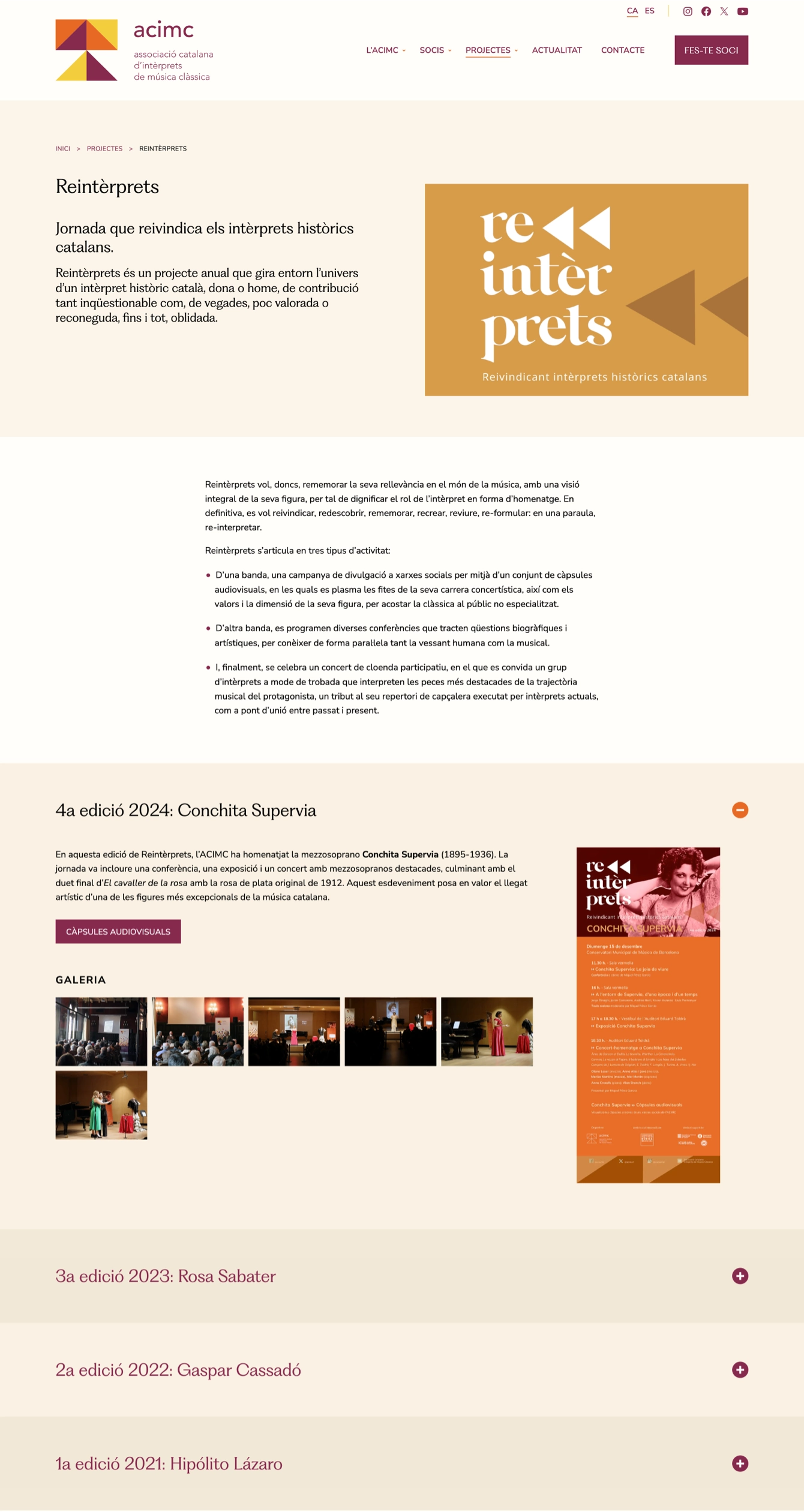
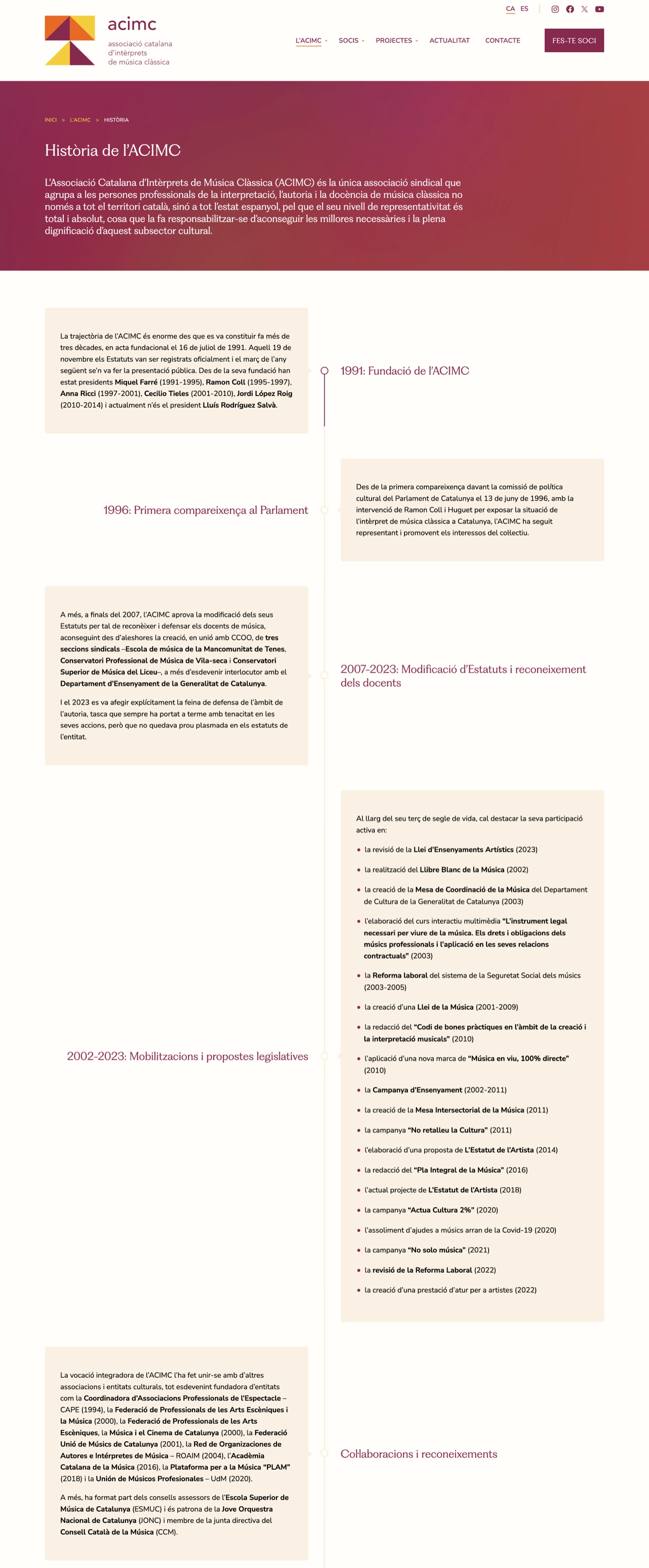
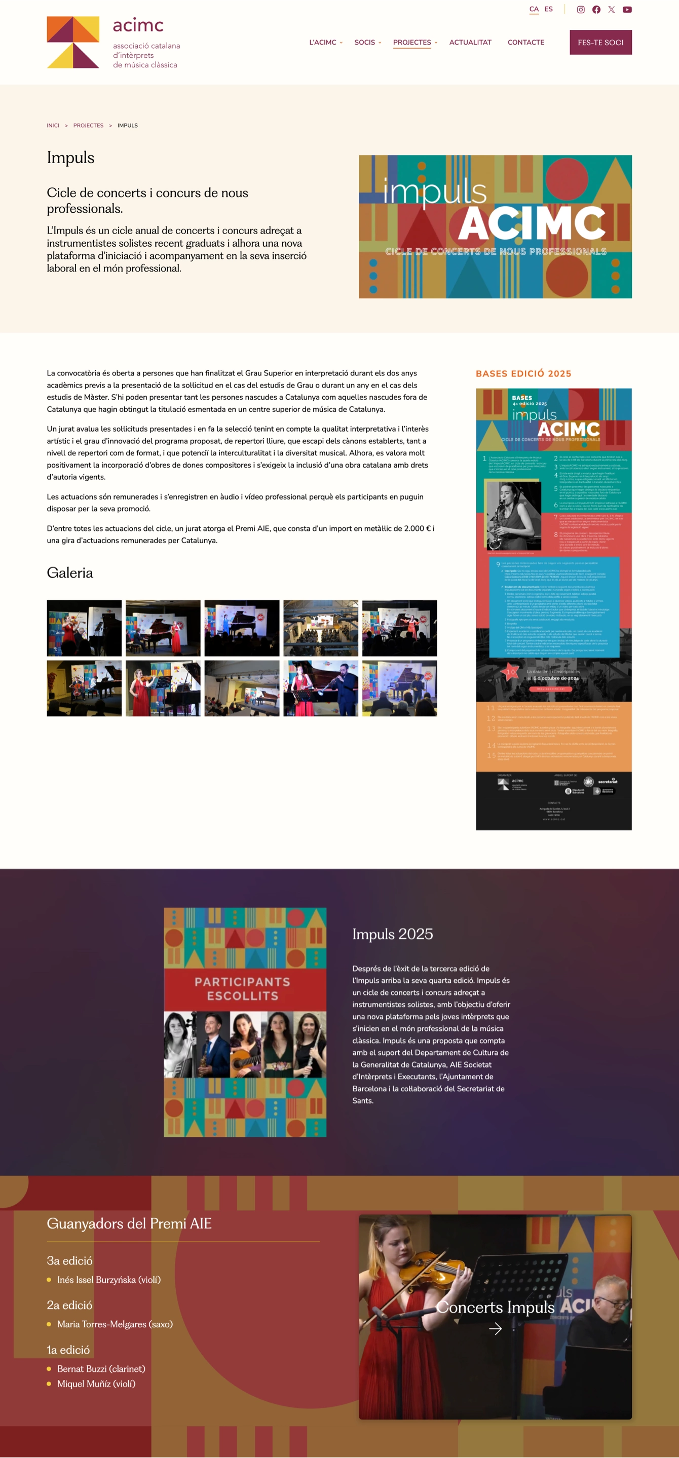
The result was a much more usable, accessible and dynamic website that made it possible to showcase the association’s main activities: InformeACIMC, ImpulsACIMC, Reintèrprets, Training and the new podcast Classificats. In addition, the platform now includes a much more complete member profile where, as a new feature, users can add videos, Spotify playlists and an image gallery. A well-structured homepage was also designed, featuring the latest news and providing quick and direct access to organised activities, facilitating transversal navigation through a carefully curated content structure.
From a structural perspective, the page design was conceived to support horizontal flexibility and adapt to any device, following a responsive approach. It also allows easy content editing by ACIMC, which was a key requirement given the constant production of news and activities.
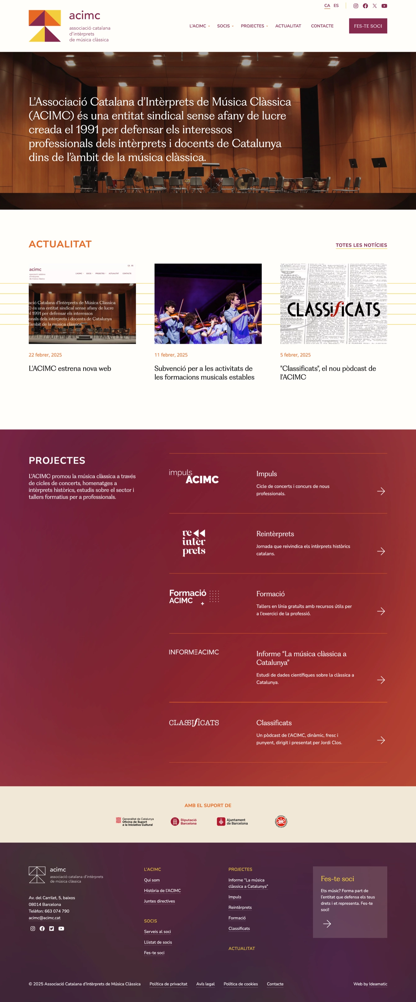
To ensure comfortable reading, with clear contrast between headings and body text while minimizing vertical scrolling, we opted for a typographic scale of 1.125 Major Second and worked with 20‑px texts to guarantee a comfortable and accessible reading experience.
Regarding typography, although the original corporate identity used the Avenir font, we chose Nunito Sans for the body text and display PP Fragment for the headings, thus achieving a balance between elegance and functionality.
In terms of color, the palette was based on the tones of the ACIMC logo: we decided to use violet as the primary color for links and buttons, applying orange tones sparingly and complementing them with muted shades to guarantee the necessary contrast for good accessibility.
With this approach, the new ACIMC website greatly improved user experience and SEO, becoming a key tool for showcasing the association’s services and projects, and demonstrating a firm commitment to innovation and quality in its digital communication.