Rehab-lab
Rehab-lab
For the new Rehab-Lab website, a project promoted by the iSocial Foundation, we started from a client-defined structure to develop the entire creative identity. The website highlights a non-profit initiative that provides personalized 3D-printed solutions to improve autonomy and quality of life for people with functional support needs.
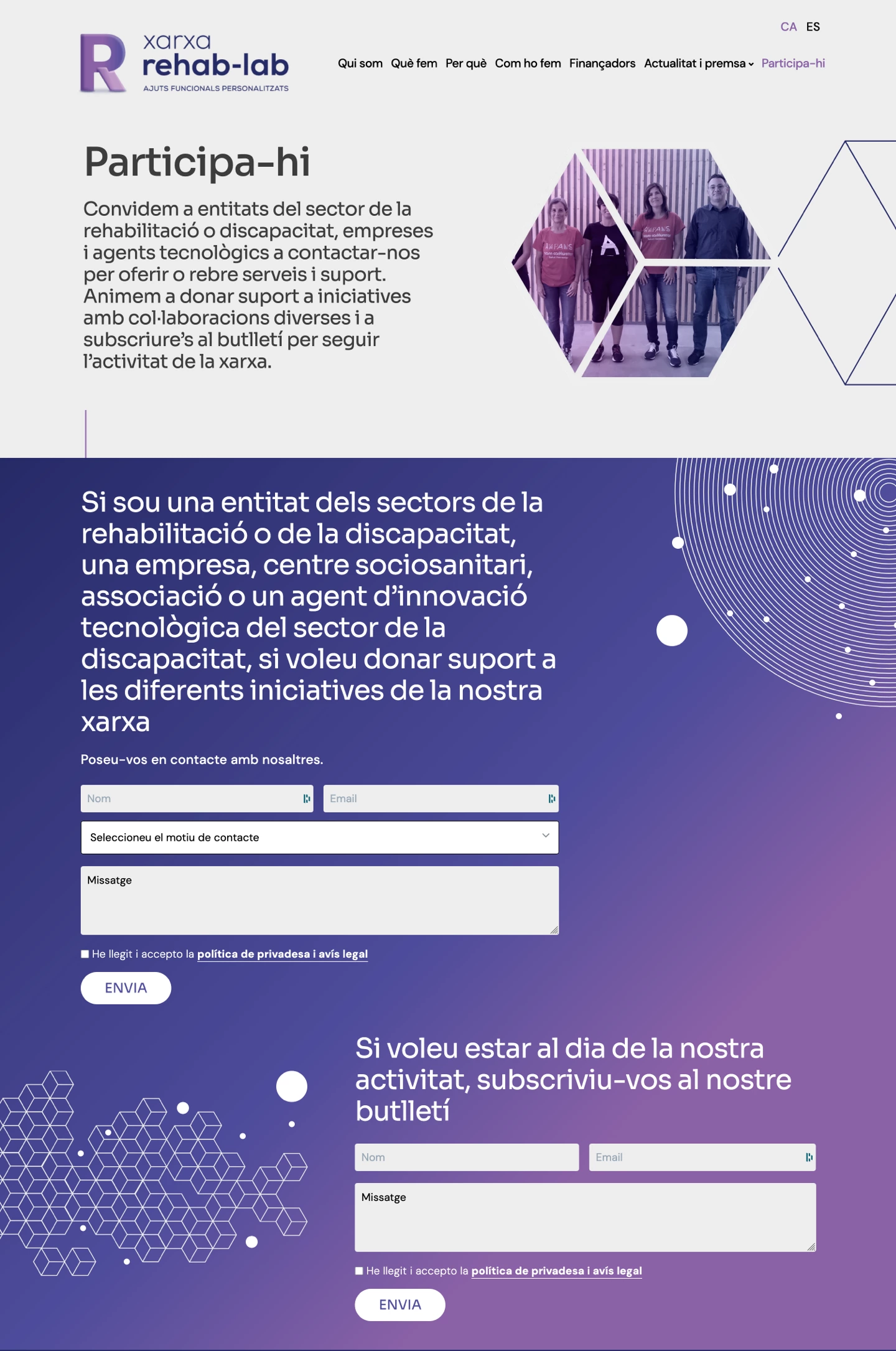
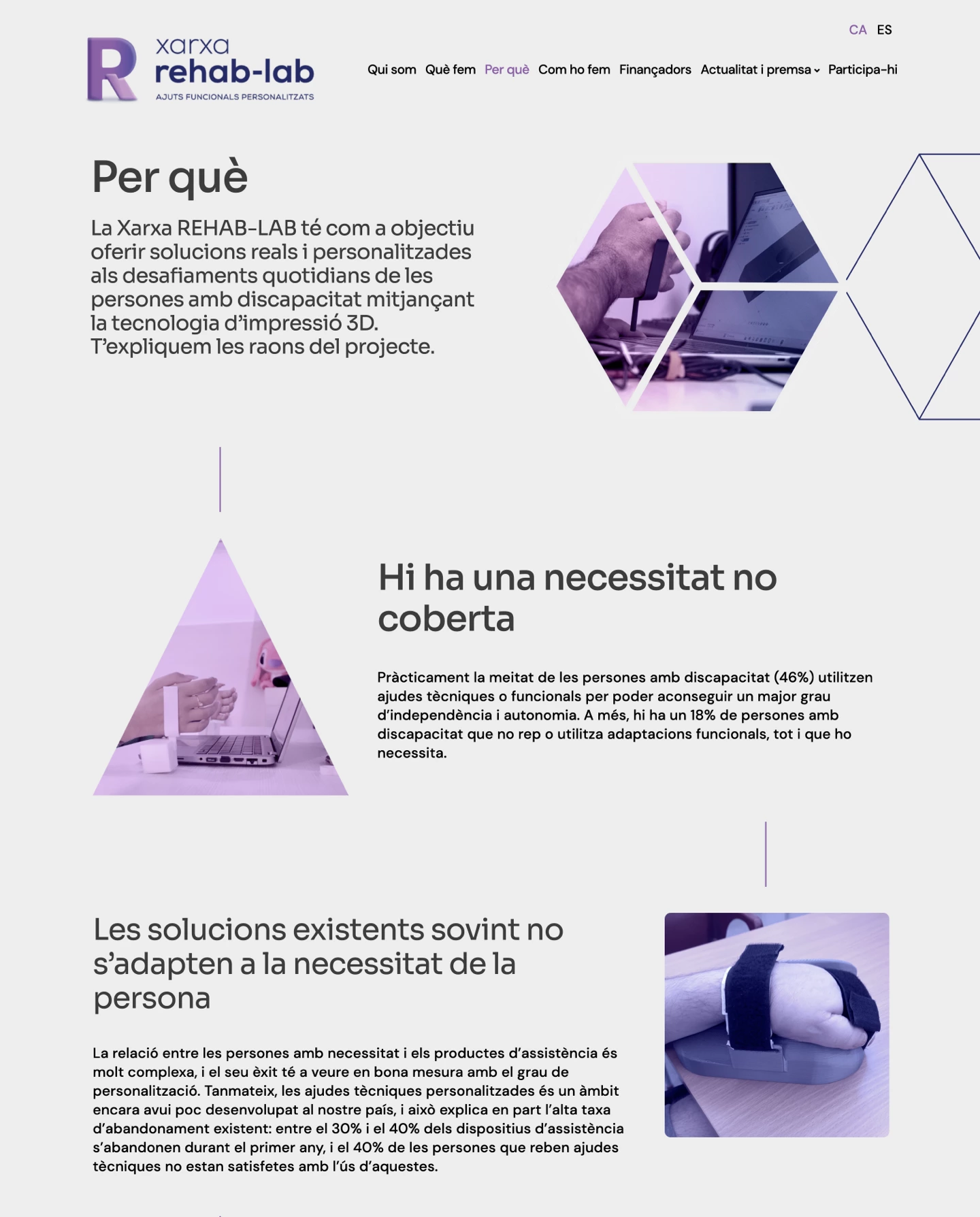
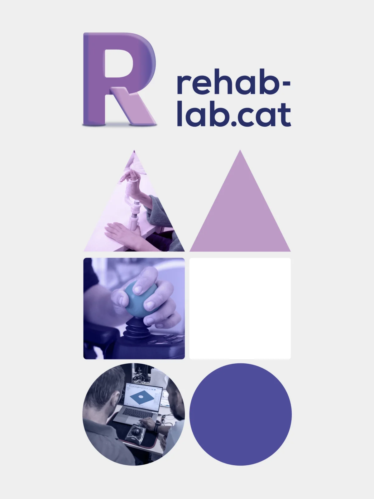
The design was built from the logo and corporate colors, establishing a coherent and recognizable visual language. Rehab-Lab designs and manufactures personalized functional aids through 3D printing, with the aim of improving the autonomy and quality of life of people with functional support needs. From this central idea, a graphic system was created based on basic geometric shapes such as the square, triangle and circle, used as a visual structure to integrate images and generate clear, functional compositions aligned with the innovative nature of the project.
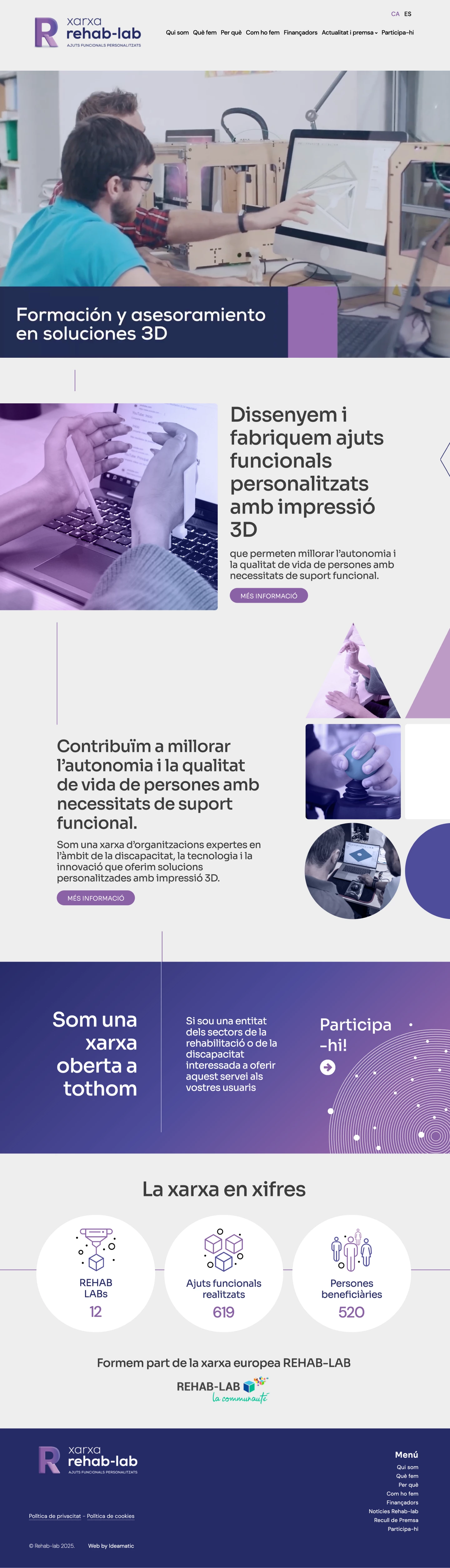
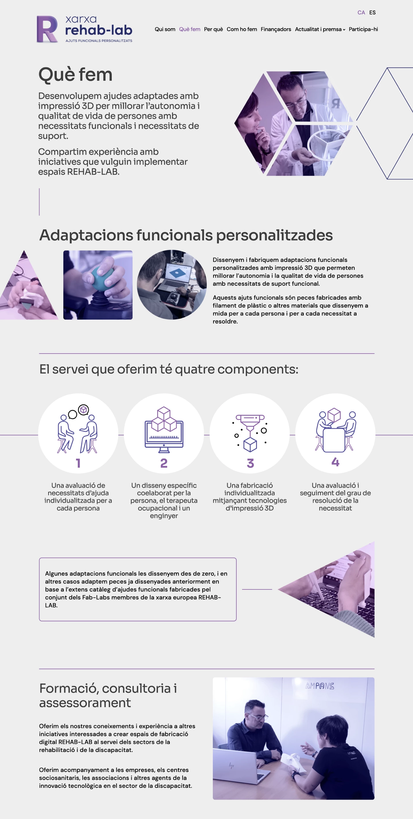
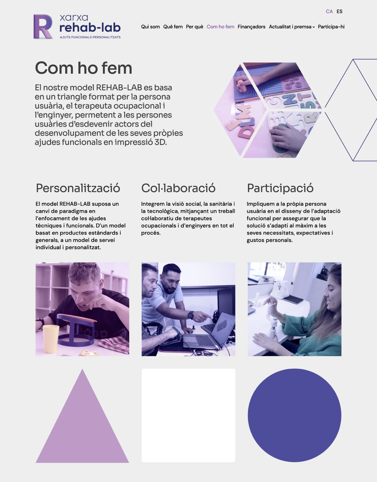
The website’s color scheme was resolved using a soft gray background, conceived as a neutral base that provides balance and facilitates reading. On this background, the lines that structure the geometric elements are drawn, combined with blocks of color in a gradient between blue and purple, used occasionally to highlight certain calls to action.
The images were worked on following this same chromatic criterion, applying the gradient as a visual integration resource. In this way, the graphic contents are incorporated naturally into the composition, reinforcing the coherence of the whole and providing a visual identity of its own to the project.