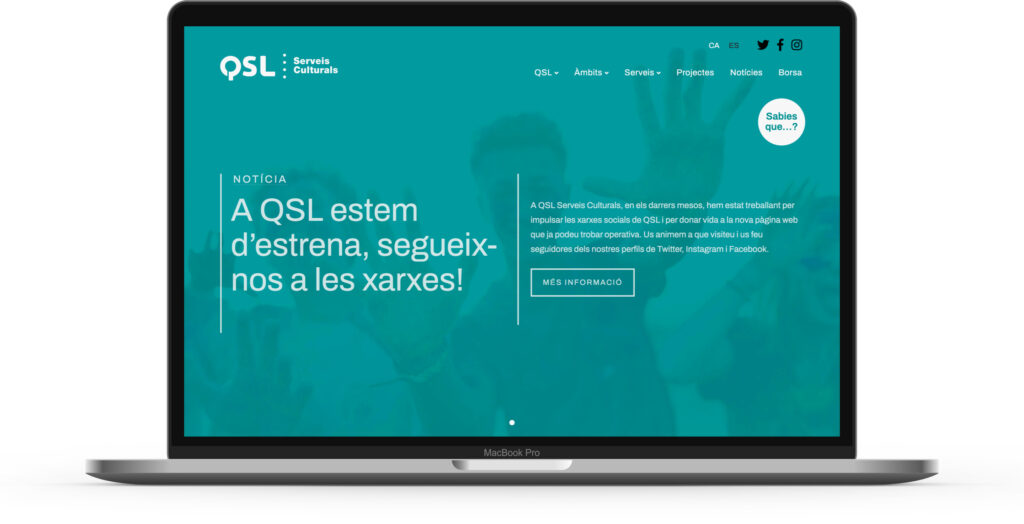
Càritas Andorrana

Experiences

Càritas Andorrana

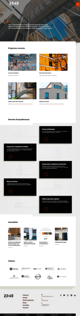
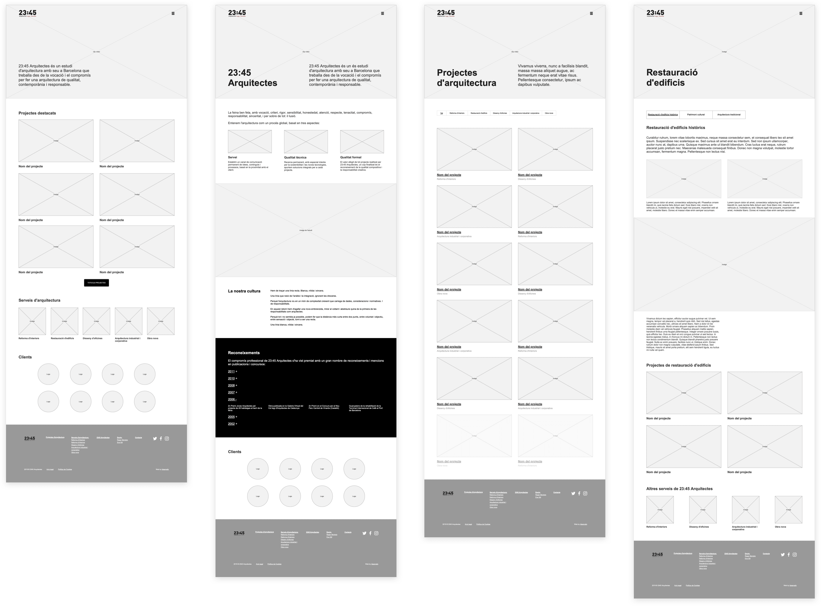
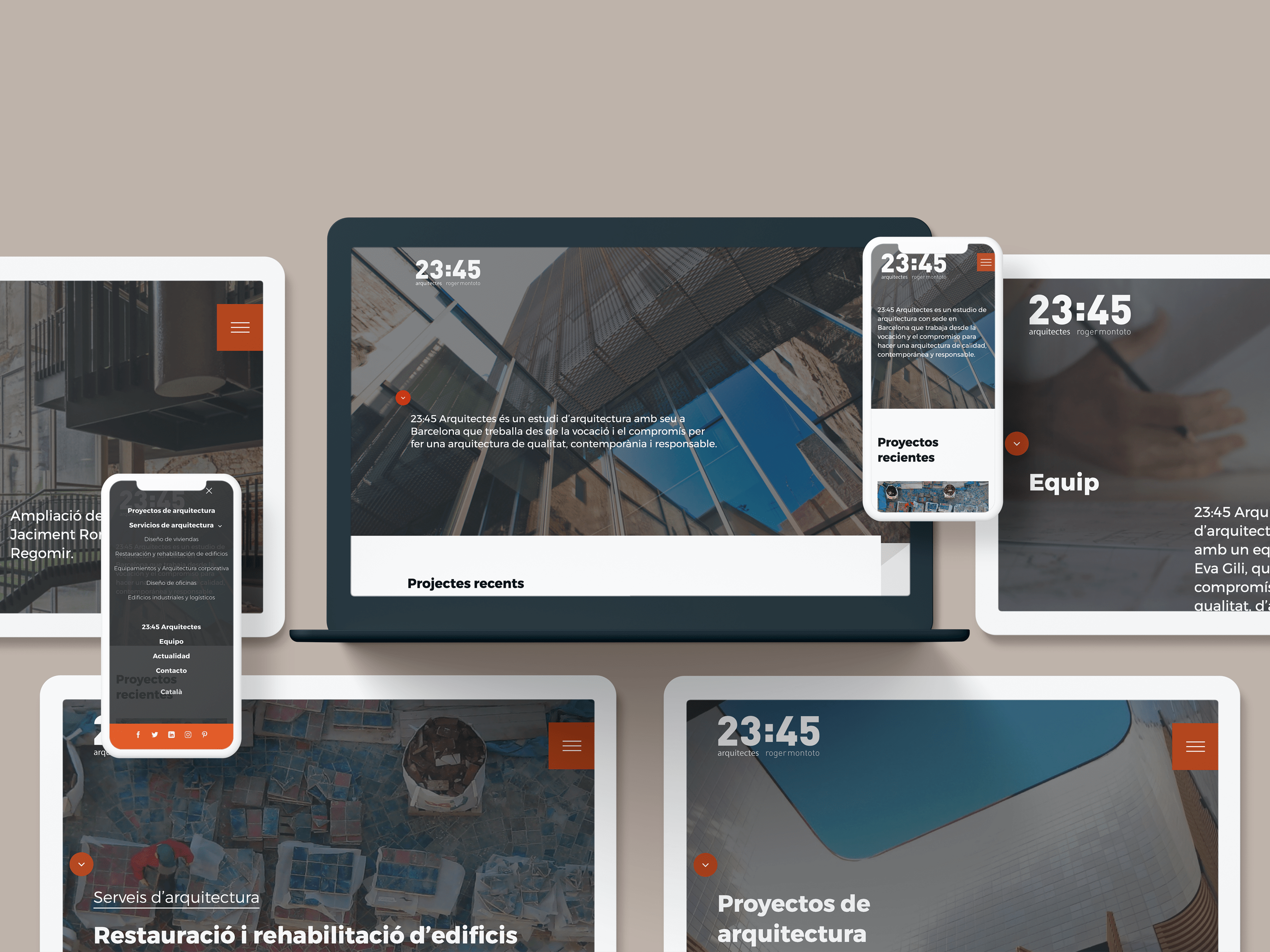
Creation of the website and the online donation system of Càritas Andorrana, an institution belonging to the Catholic Church whose mission is to help and accompany the more underprivileged.

Càritas Andorrana

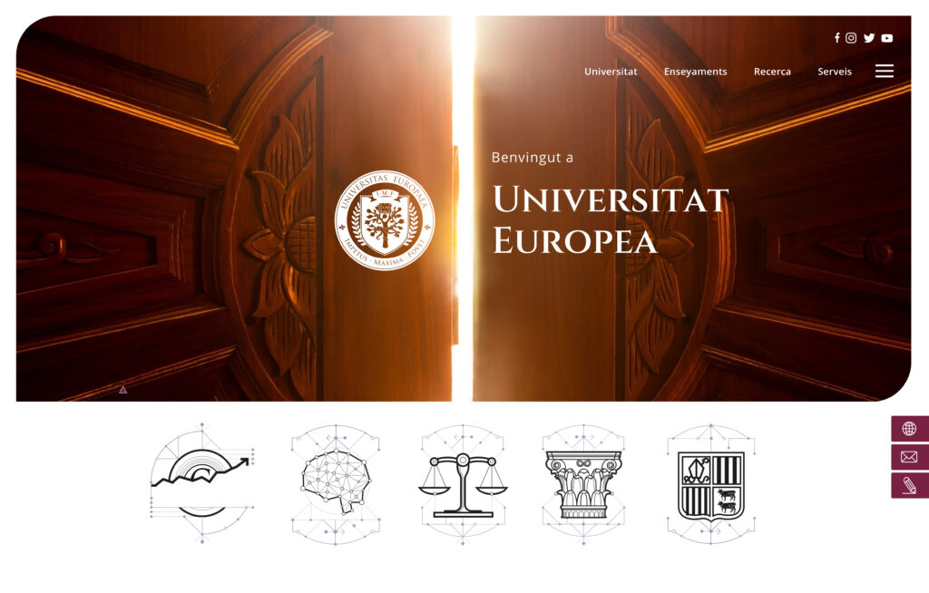
The project for the design and development of the Càritas Andorrana web came through Pampliega & Associats, which had created the structure and the content. The previous web was very outmoded, it had not been updated for years and neither was it aligned with the current guidelines of the Càritas websites or many of the current web standards.

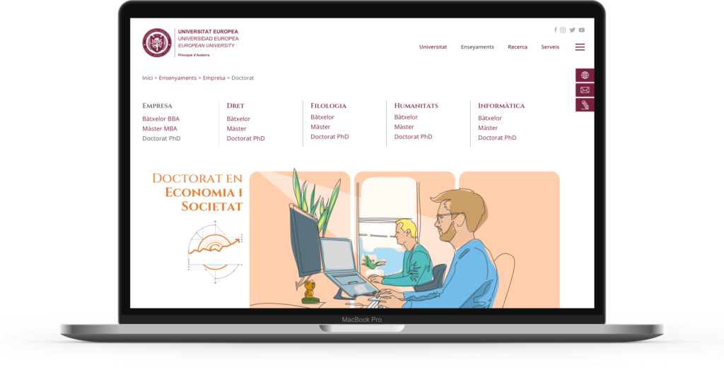
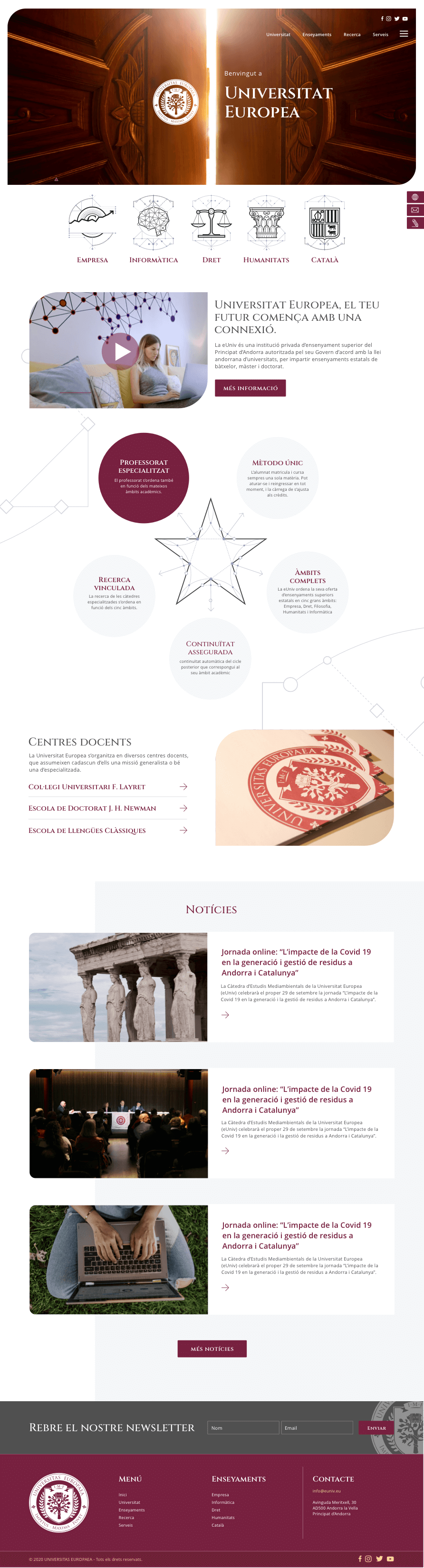
Since we did not have a corporate document, the reference we took were the Càritas’ websites in Spain, analysing the colours, typography and graphic features that could be useful in designing the new web. Once we had performed our own study of the graphic line, we designed the user interface for the different pages. Basically, it is a highly-structured composition of blocks of photographs and plain colours with large blank spaces and headings to improve the readability of the message.

Càritas Andorrana

We also developed the online donation system, a core element for the institution, since it is a way of collaborating directly with the users, while also making all off-line management easier. The presentation of the services was also improved through constant calls to action to request aid or information.

Similar projects

Circular Bioeconomy Alliance

Experiences

Circular Bioeconomy Alliance

This web project was performed for the European Forest Institute to promote the Circular Bioeconomy based on healthy, biodiverse and resilient forest ecosystems.

Circular Bioeconomy Alliance

To design the web, we availed ourselves of the corporate image manual provided by the EFI, to which we added new graphic elements in order to enhance the visual impact, plus specific icons to explain certain sections.

It is a very clean design, with circular items all over the web to foster the organisation’s core idea, as well as figures joined together by lines to enhance the concept of unity. This all made the content much easier to read.

The colour palette and typography used in the design, and adapted to the different web elements, are aligned with the corporate image manual requirements.

Circular Bioeconomy Alliance

All the graphic material currently created for the EFI (leaflets, brochures, etc.) is being designed to match the web’s graphic line.

Similar projects

Associació Catalana de Professionals de Joventut (ACPJ)

Experiences

Associació Catalana de Professionals de Joventut

Creation of the new website of the ACPJ, an association that defends and promotes the regularisation and the rights of youth professionals.

Associació Catalana de Professionals de Joventut

Our collaboration with the Association, began in 2018, initially to perform maintenance work on its old website. Finally, in 2021 we were commissioned with creating the new website, coinciding partly with the launch of its new corporate identity.

The old website presented several problems, mainly because it was old. The first and most visible issue was its design, which was very outmoded. Another problem was its lack of clarity, untidiness and scattered content, resulting in a lack of definition of the organisation’s projects, the different news categories or even the Association’s spheres of action.

Associació Catalana de Professionals de Joventut

The objective of the new web is on the one hand to adapt to the new corporate identity and to consolidate a solid brand image by dint of a modern design, while also tidying up all the information thanks to a study of the information architecture, creating a hierarchy of content to make it more readily accessible by visitors.

The new website also solves an issue with the previous one, presenting calls to action much more visibly to recruit new members and to make it easier for them to register via the web.

Associació Catalana de Professionals de Joventut

Similar projects

Atelier de Chronométrie

Experiences

Atelier de Chronométrie

Design and development of the Atelier de Chronométrie website, a company from Barcelona created in 2014 which engages in the manufacture of high-end artisanal timepieces, which draw their inspiration from the past, using only manual and traditional processes.

Atelier de Chronométrie

Our relationship with Atelier de Chronométrie began some years ago when we did the website for Mimandcrocket, a company that specialises in making vintage watches. This longstanding relationship gave us a more comprehensive view of its products and the way it works.

The Atelier website was designed with the aim of delivering its message simply with a new architecture that would make it possible for the pages for future timepieces to be created more flexibly and without being limited to a fixed design.

The client furnished us with high-resolution images, helping us to devise a website where the photographs took centre stage and every last detail of the watches was clearly conveyed. We also attached great importance to the company’s operating processes to depict the delicacy and precision of its work in the utmost detail.

Atelier de Chronométrie

The photographs with a dark background led us to choose a design with a black background and white lettering. The photographs fit together using blocks of text in white and grey, like gear cogs. The way the items move as we scroll vertically also helps to create the sensation that everything is being formed as we view the content.

The overall image of the web is justified through the use of large-format and premium-quality photographs, large texts and the colour palette, since the idea was to transmit exclusiveness, luxury and an eye for a job well done.

Similar projects

Grupo Humact

Experiences

Grupo Humact

Design and creation of the Grupo Humact website, a human resources consultancy that needed to create its website.

Grupo Humact

Grupo Humact had no existing website, so virtually everything was created from scratch: information architecture, wireframes, design and content. The only thing that we had was the logotype. We developed a content architecture that would provide a clear-cut division in which there would be no possibility of generating confusion between their myriad services, particularly training.

The design is based on a white background and the corporate colours in the logotype, blue and green, applied in a joyous and vibrant gamut. We used the logotype, which contains three interlinked circular shapes, as our basis. The photographs are framed in circular forms, like such as windows that open out onto different points of the same photo, showing only the parts that we want to be seen. The lines, in smooth transparent tones, also take on a prominent role as graphic elements, which divide and lead us to the different sections of the same page, always using lines that project beyond the blocks of colours, horizontally and vertically, creating a grid on which the content is deployed.

Grupo Humact

It is an ever-changing and growing website, just like the company, with links to job vacancies and a training campus.

Similar projects

QSL Serveis Culturals

Experiences

QSL Serveis Culturals

Design and development of the new QSL website as part of the revamping of the corporate image of this organisation founded in 1995 that manages public service projects in the areas of culture, education and participation.

QSL Serveis Culturals

The project is the culmination of a relationship that began years back with the design of QSL’s new corporate identity.

We had to deal with a web with multiple shortcomings, since the design was outmoded and also unresponsive, with poor SEO positioning: it had no meta tags, the content was indexable, and while the organisation is an important one, the web enjoyed scant presence in terms of Google search hits.

Our first job was to create a new web using WordPress to solve the above problems, a web that fit the organisation’s new corporate identity perfectly. Above all, we wanted it to display, in a straightforward and user-friendly way, the entire range of its areas of work, the services offered and finally the most outstanding projects executed in each area or service.

QSL Serveis Culturals

What we normally do with this type of project to accomplish the objectives effectively is to restructure the creation of the web into a set of consecutive work stages beginning with the analysis, strategic definition and prototyping (wireframing) of the web.

Wireframes are proposals for the structure and layout of the information before design, enabling us to produce the web with the overall strategy in mind first, as well as content hierarchy and information paths.

QSL Serveis Culturals

The strategic definition and wireframing yield a genuine and personalised design that sits perfectly with the new corporate image and in which the areas that QSL wants to focus on are highlighted: new developments and current events, areas of work, services provided and projects executed.

QSL Serveis Culturals

For the Services section we also designed a set of illustrations that boosts the web’s personality even further and which would have been difficult to achieve using resource pictures.

QSL Serveis Culturals

QSL Serveis Culturals

QSL Serveis Culturals

QSL Serveis Culturals

QSL Serveis Culturals

QSL Serveis Culturals

QSL Serveis Culturals

Similar projects

8 Artist Management

Experiences

8 Artist Management

Creation, using WordPress, of the 8 Artist Management corporate website, designed fundamentally with the portfolio of the artists that the company represents in mind, showcasing their photographic and video projects. The project also included the redesign of the logotype, defining an overall corporate image.

8 artist management

8 Artist Management is an agency that represents photographers, videographers and stylists in Spain and abroad. The company’s website had encountered problems in adapting to the new WordPress formats whereby, making the most of an evolution inside the actual company, a new web was produced, with a structure that enables new artists to be added while also making it easier to include their projects on a continuous basis.

The new web’s architecture was designed to group artists into categories according to their speciality, each one with their own individual page and projects based on a data card-type format.

A very simple design style was chosen, because the web is intended to present a great deal of graphic information depicting the clients’ portfolios. One of the main graphic aspects taken into account was line spacing between titles, which was adjusted so that the lines of text were joined together, forming a logotype-like graphic unity with the name of each one of the artists.

The logotype was also redesigned using a thinner font body and a bigger separation between letters. This afforded the web’s overall design greater consistency.

8 artist management

8 artist management

8 artist management

Similar projects

Euniv, European University

Experiences

Euniv, European University

Design and development of the European University (eUniv) website using WordPress. The objective of the project is to afford greater visibility to this online university and to help to display all its training information in a structured fashion.

eUniv, Univesitat Europea

The eUniv website project was undertaken on the premise that it had to be a platform that would enable them to grow and also display a whole ensemble of content they had restructured from their old web, particularly the University’s organisational model and its entire training offer.

We used this content to deploy a forward-looking website, with total flexibility to be able to display new content or to adapt the importance of certain sections as the project gradually grew.

Pantalla web de eUniv, Univesitat Europea

We were given some corporate design guidelines that had to be observed, such as the icons representing training or drop caps (initials).

We used this to develop other graphic elements: backgrounds with lines and dots, items with rounded edges, colour palette, etc.

Página principal de eUniv, Univesitat Europea

The client needed an individual colour gamut for each area in the training section, as well as an illustration created specifically for each sector. Therefore, each drawing received a different graphic treatment, and the leitmotif used was the three base rectangles that would correspond to the courses in ascending order: Bachelor, Master and PhD.

These shapes change colour according to the type of training. We used vector graphics, pencil, marker pens or watercolour for the illustrations.

Ilustración web eUniv

Ilustración web eUniv

Ilustración web eUniv

Ilustración web eUniv

Ilustración web eUniv

Pantallas web de eUniv, Univesitat Europea

Similar projects

23:45 Arquitectes

Experiences

23:45 Arquitectes

SEO audit and strategic analysis, content creation, design and development of the website using WordPress for the Barcelona 23:45 Arquitectes practice. Two of the challenges we faced here were revamping the web’s design and improving its positioning in order to attract higher-quality traffic.

2345 Arquitectes web

When we were asked to revamp the firm’s web, we faced several challenges, since the site had major issues: an outmoded, non-100% responsive design, pages with hardly any text content and a URL without a keyword, which substantially impacted its positioning.

Another challenge with the new web was to attract quality traffic in order to bring the firm closer to its target client.

2345 Arquitectes web

We began with an SEO audit to identify all the problems that had to be solved and to avoid making the same mistakes. We defined the objectives of the website and the target search segments.

We analysed its position, competitors, keywords, we prepared the SEO on page of the pages, etc. The report served to define the web’s ultimate content tree.

2345 Arquitectes informe SEO

2345 Arquitectes web

Before designing the web, we produced the prototypes or wire frames, proposals for the structure and the layout of information on a by-page basis with the type of resources that will be necessary.

These proposals, which have neither design nor content, allowed us to design the new web with the global strategy in mind, reinforcing the information paths we were most interested in and helped us to achieve our objectives.

2345 Arquitectes responsive

Similar projects

Florcare, online store

Experiences

Florcare, online store

Creation of the website with an online store using WordPress and WooCommerce for Florcare, a social economy and ecological project based on the sale of sustainable plants and products. We created a set of illustrations to lend even greater personality to the website’s design.

Florcare, tienda online | Ideamatic

Florcare is a social economy and ecological project and a site for selling plants and sustainable products. We created a web for them with WordPress plus an online store with a totally customised design.

The illustrations that we produced are based on a comic-like style of plants that transform into superheroes, resulting in not just any old plant store but one with a social benefit for kids at risk of exclusion who grow and sell the flowers, whereas the person who buys from them feels that they have the power to change these kids’ situation.

Pantalla Florcare, tienda online | Ideamatic

Pantalla Florcare, tienda online | Ideamatic

Pantallas Florcare versión responsive, tienda online | Ideamatic

Similar projects