Amics del País

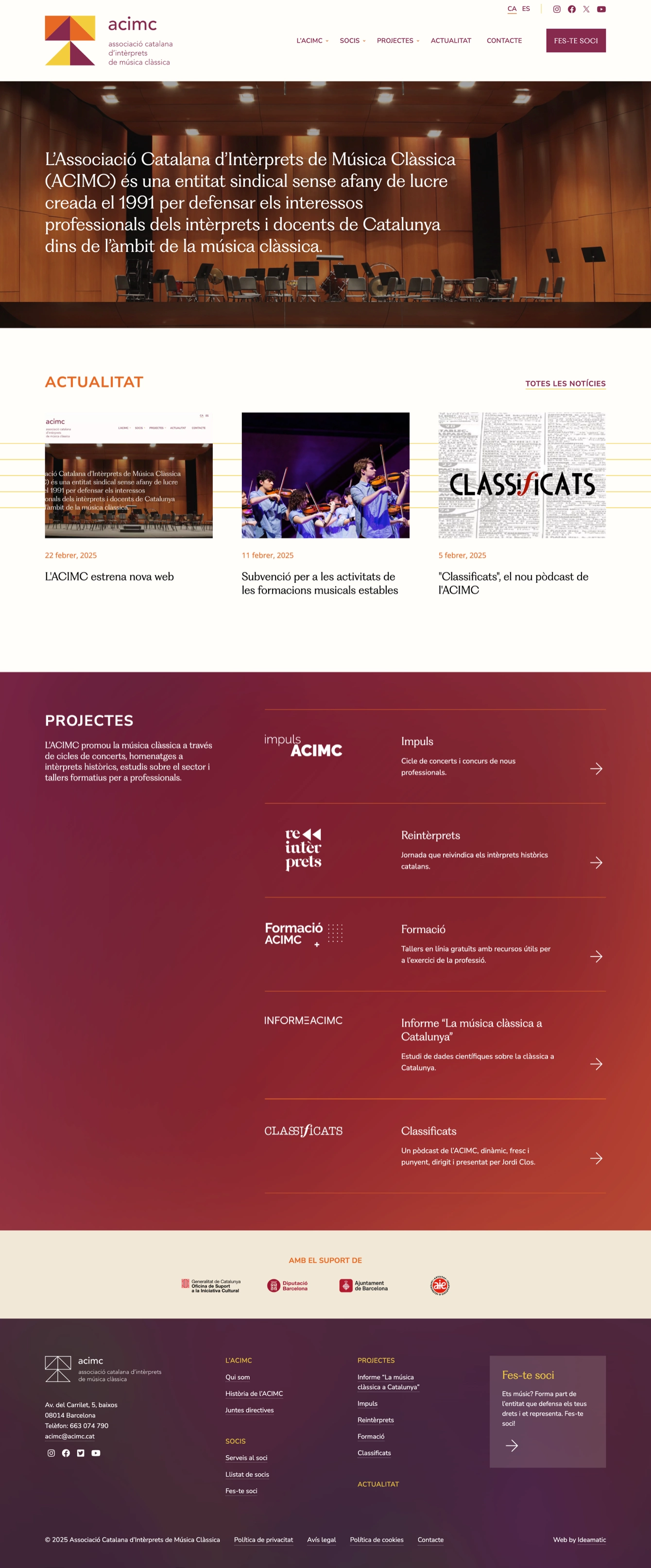
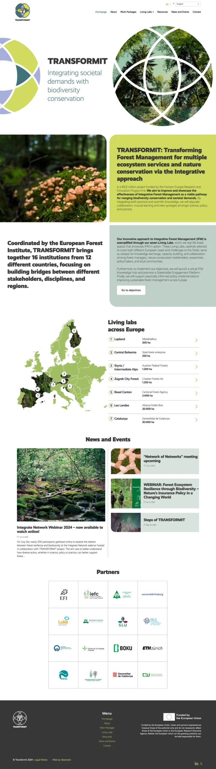
Design and development of the new website for Amics del País, a Barcelona-based institution founded in 1822 that contributes to shaping the country’s key challenges through dialogue and collaboration with social stakeholders.

Client

Societat Econòmica Barcelonesa d’Amics del País

Year of creation

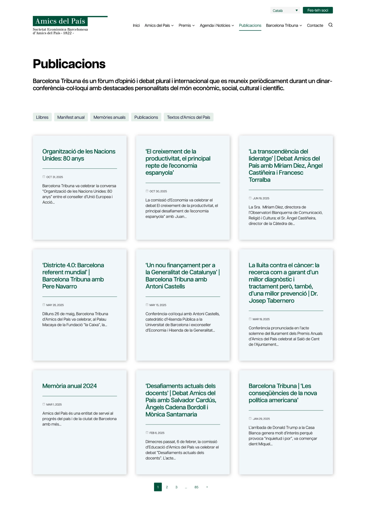
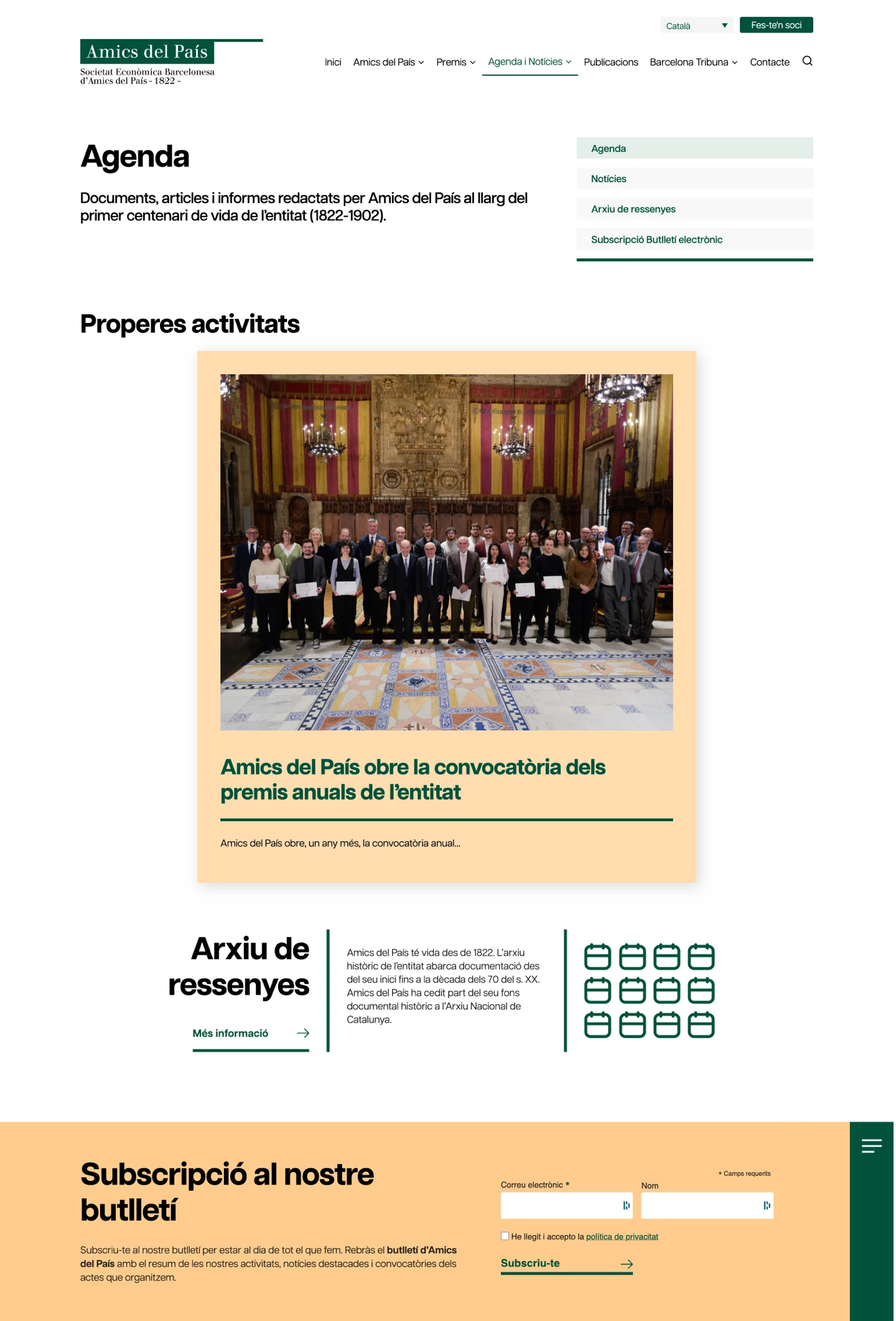
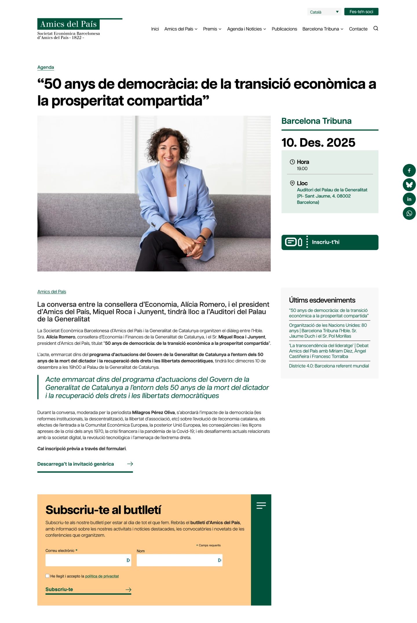
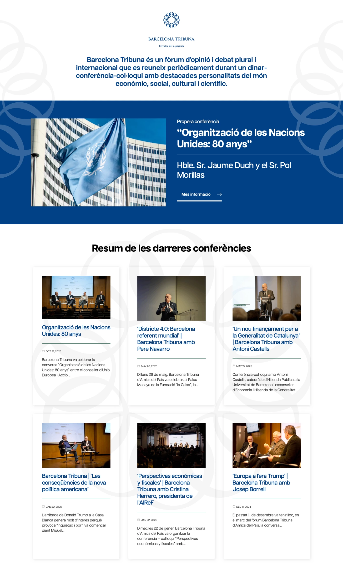
The development of the new Amics del País website began with a previous platform built on a custom CRM. The goal was to integrate it with the Barcelona Tribuna website, already implemented in WordPress. Since this environment offered better growth potential and aligned more effectively with the project’s needs (news, activities and publications), the decision was made to rebuild the entire site in WordPress.

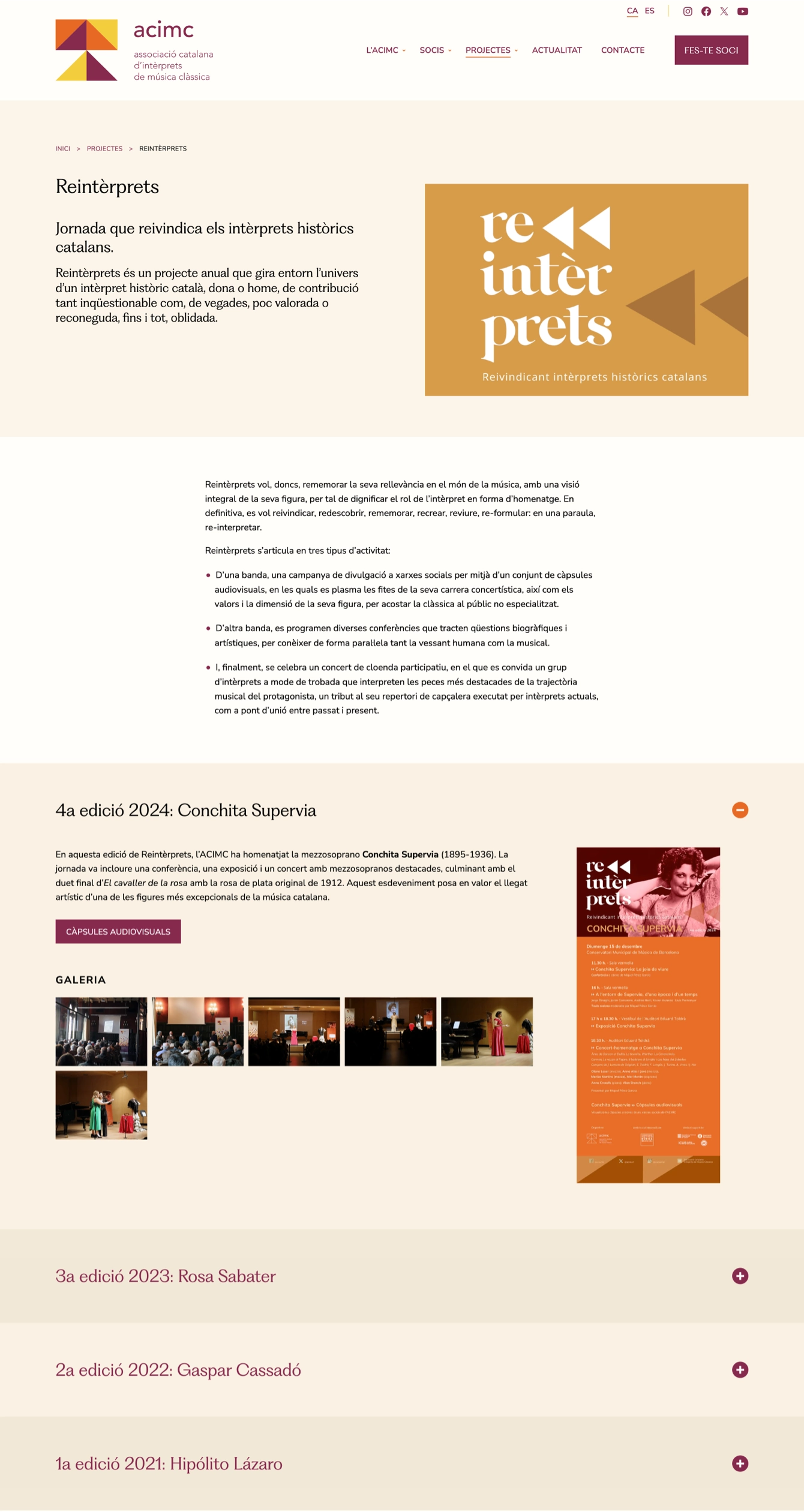
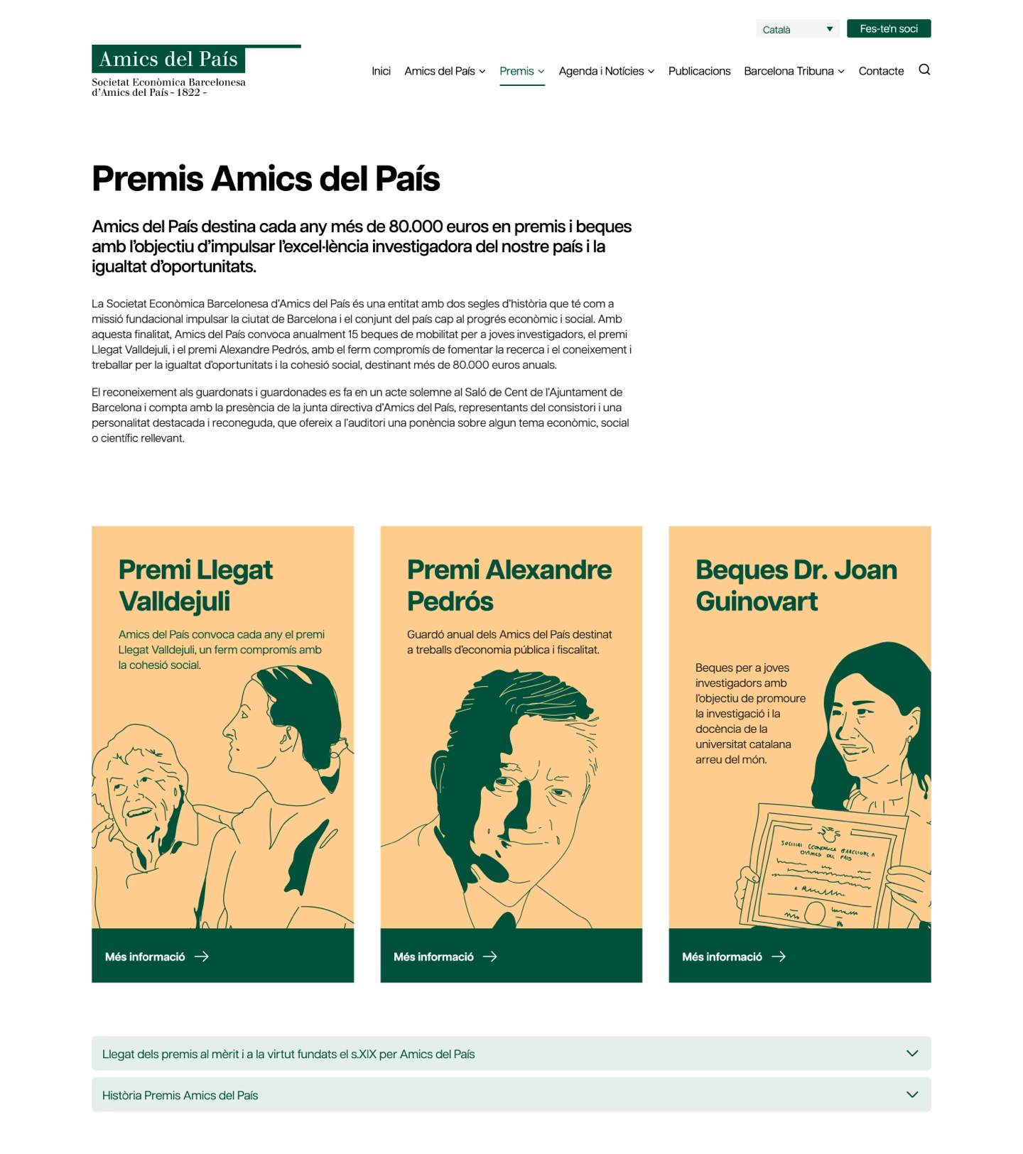
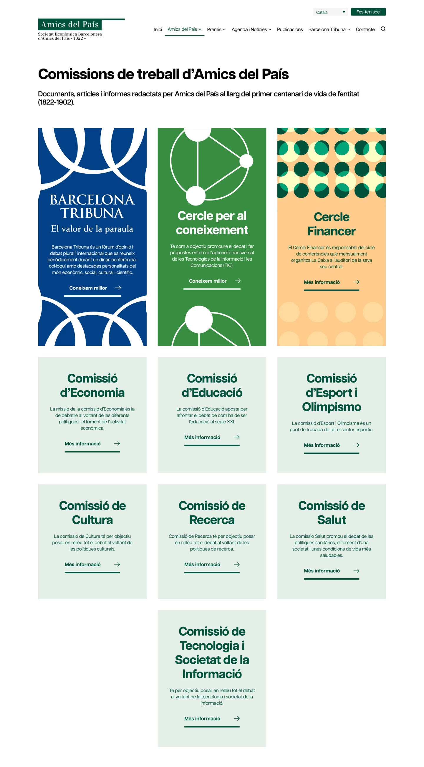
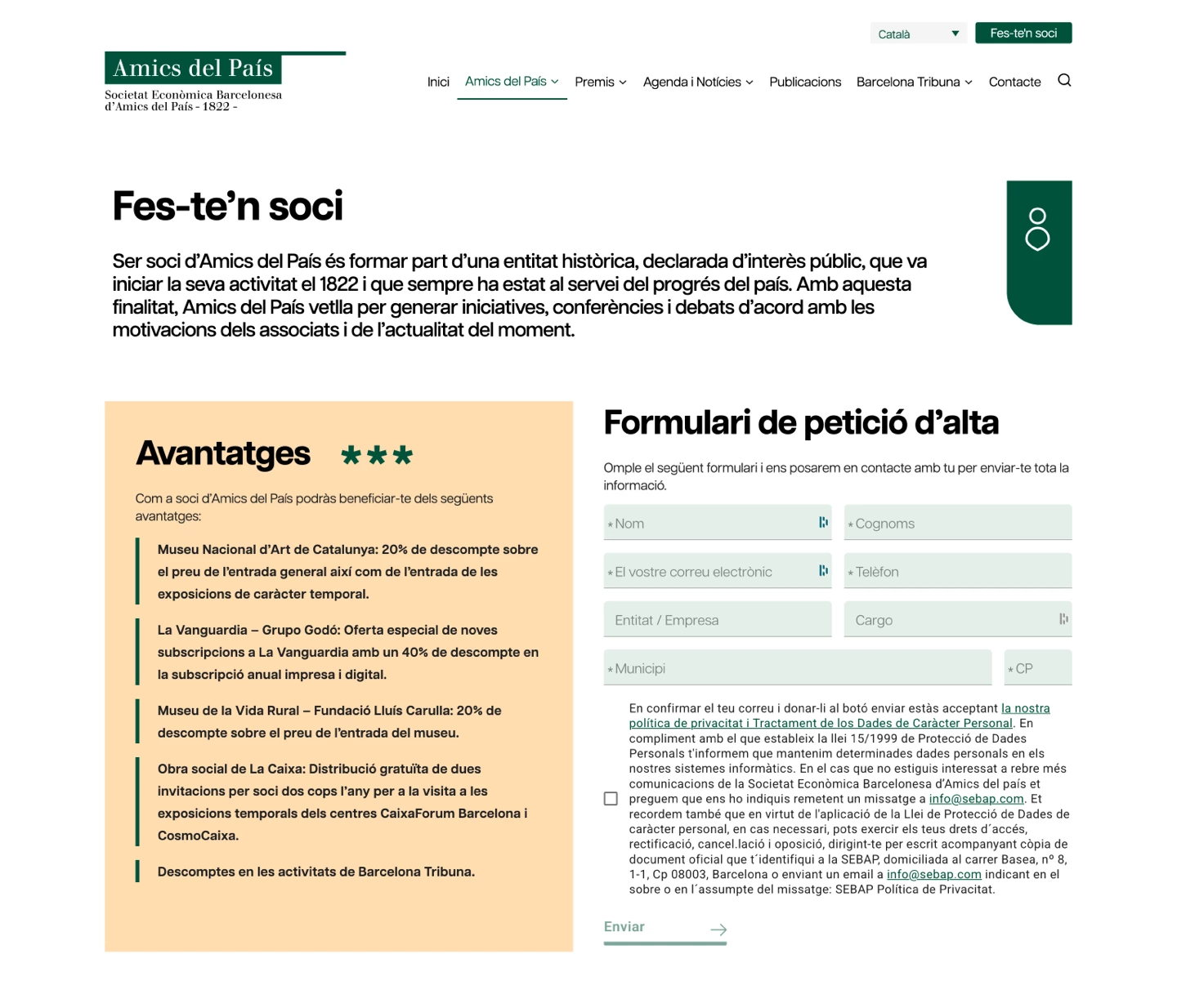
Before starting the design phase, a full restructuring of the content tree was carried out to enable the integration of Barcelona Tribuna’s sections and activities. Based on this new architecture, we defined wireframes that established the different page templates, organised the content types and ensured clear and coherent reading paths.

Pàgina d'inici Amics del País
Pàgina premis Amics del País
Pàgina Comissions Amics del País
Pàgina sobre Amics del País
Formulari

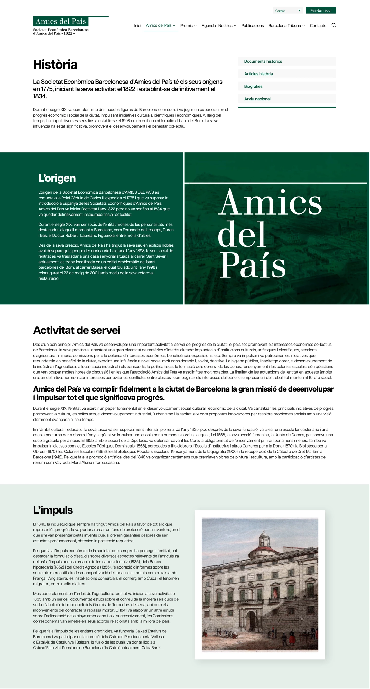
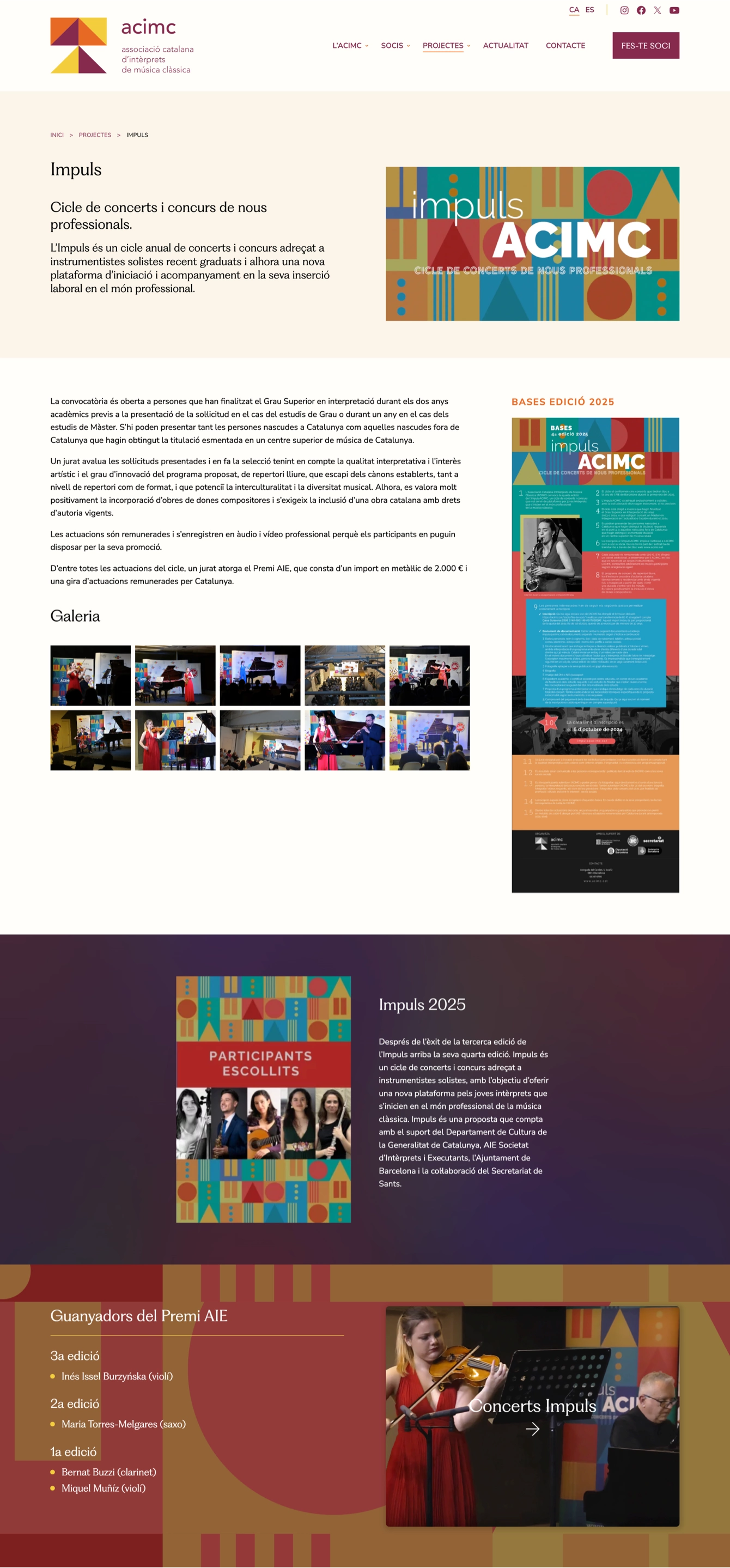
After completing the design stage, we performed a careful import of the previous site’s content, ensuring proper adaptation to the new templates created for the various article types and sections.

The Amics del País website is now in continuous evolution, with new features such as a fellows directory, and we continue to support the organisation in developing upcoming sections and improvements.

Amics del País publicacions
Pàgina Agenda
Fitxa agenda
Barcelona Tribuna

Forest Knowledge Gateway

Forest Knowledge Gateway

The Forest Knowledge portal is the digital platform that connects science and practice to promote the restoration and sustainable management of forests. It offers resources, guides and knowledge applied by professionals, public officials and investors.

Client

European Forest Institute (EFI)

Year of creation

The Forest Knowledge Gateway portal is promoted by the European Forest Institute (EFI) and has the ambition of being an international reference portal in the field of forest wealth management.

The project has led us to develop all the necessary areas: we began with a digital consultancy phase to identify the most suitable workflow for the various contributors to the portal, as well as to define the best usability experience for its audiences. We then gave the project a distinctive and memorable visual identity, appropriate to its theme and the institutions it represents. Finally, we built all the portal’s programming from scratch, since the specific functionalities required would be implemented more effectively if we started from a blank slate.

A great project that we have co-created with the client, complete, ambitious and of which we are particularly proud.

Forest Knowledge Gateway

The client provided the corporate colours, and based on these we developed the entire design along with a series of illustrations in which the depiction of wildlife and vegetation had to be realistic and recognisable, yet still allow the freedom to introduce a distinctive style built on contour lines and colour washes.

The backend was also designed with its own iconography and various graphic elements intended to make users feel comfortable when entering content.

Forest Knowledge Gateway

Rehab-lab

For the new Rehab-Lab website, a project promoted by the iSocial Foundation, we started from a client-defined structure to develop the entire creative identity. The website highlights a non-profit initiative that provides personalized 3D-printed solutions to improve autonomy and quality of life for people with functional support needs.

Client

iSocial

Year of creation

Project Areas

Website

rehab-lab.cat

The design was built from the logo and corporate colors, establishing a coherent and recognizable visual language. Rehab-Lab designs and manufactures personalized functional aids through 3D printing, with the aim of improving the autonomy and quality of life of people with functional support needs. From this central idea, a graphic system was created based on basic geometric shapes such as the square, triangle and circle, used as a visual structure to integrate images and generate clear, functional compositions aligned with the innovative nature of the project.

Projecte web Ideamatic - Rehab-lab pàgina inici
Projecte web Ideamatic - Rehab-lab pàgina interior

The website’s color scheme was resolved using a soft gray background, conceived as a neutral base that provides balance and facilitates reading. On this background, the lines that structure the geometric elements are drawn, combined with blocks of color in a gradient between blue and purple, used occasionally to highlight certain calls to action.

The images were worked on following this same chromatic criterion, applying the gradient as a visual integration resource. In this way, the graphic contents are incorporated naturally into the composition, reinforcing the coherence of the whole and providing a visual identity of its own to the project.

Projecte web Ideamatic - Rehab-lab pàgina interior

1-1-2 Castilla y León

1-1-2 Castilla y León

Web design and development of the information portal for the 1-1-2 emergency service of Castile and León, created to clearly and accessibly explain how to contact the service, available channels and how it operates.

Client

Jasten Fröjen

Year of creation

The project for the 1-1-2 website of Castilla y León was developed in collaboration with the communications company Jasten Fröjen, with the aim of creating a clear and accessible information tool for citizens. The website explains in an understandable way how to communicate with the 1-1-2 service, what services it offers and how it works.

At a graphic level, the project is based on the character Ofelia, which has already been used in communication actions. Based on her colors and the existing corporate identity, the entire chromatic range of the website was defined and new characters were created that help to structure and identify the different sections of content.

1-1-2 Castilla y León pàgina d'inici
1-1-2 Castilla y León pàgina interior

The new characters were created following the graphic line of Ofelia and are placed in different settings and doing different jobs.

One of the key elements of the project is the online virtual tour of the 1-1-2 facilities. The user can navigate interactively through the press room and the operations room, exploring the different elements of the space. As they progress, screens appear with contextual information that allows them to better understand how an emergency is managed and what role the different teams play.

1-1-2 Castilla y León Sala virtual
1-1-2 Castilla y León Sala virtual pantalles

Clínica Dental Arízaga & Ballestar

Clínica Dental Arízaga & Ballestar

Design and development of the website for Clínica Dental Arízaga & Ballestar, with a clear, warm and accessible digital experience that reflects a human, close and holistic approach to dentistry.

Client

Clínica Dental Arízaga & Ballestar

Year of creation

Project areas

This project involved the design and development of the new website for Clínica Dental Arízaga & Ballestar, a dental practice based in Mataró that understands oral health from a holistic, preventive and person centred perspective. The aim was to translate this way of working, based on trust and patient care, into a clear, accessible and coherent digital experience.

The website design was conceived to convey a sense of calm and closeness from the first interaction. A warm colour palette helps create a friendly and reassuring experience, particularly important in the context of a dental clinic. From a formal point of view, the absence of sharp angles and the use of rounded corners across the interface contribute to improving user experience and reducing the perception of rigidity often associated with this type of environment.

PP Woodland Light has been used for the headings, adding an organic and elegant character to the website and helping to humanise the visual language. This typographic choice reinforces the balance between professional rigour and approachability, in line with the clinic’s philosophy.

In terms of content, a clear and easy to follow structure has been defined to explain how the clinic works, the role of the team and the different treatments, prioritising comfortable and accessible reading. The website has been custom developed on WordPress, ensuring simple content management and a structure ready to grow.

The result is a website that acts as a natural extension of the experience offered by Clínica Dental Arízaga & Ballestar in its physical space, designed to inform, build trust and ease the patient’s first step towards the clinic.

Clínica Dental Arízaga & Ballestar

Carles Revilla

Design and development of the new website for Carles Revilla, digital strategy consultant, with a minimalist visual approach based on animated geometric shapes.

Client

Carles Revilla

Year of creation

Website

crevilla.com

This project was especially meaningful for Ideamatic, as it was created for one of our regular digital strategy collaborators. The main challenge was to move away from conventional approaches and propose a visual solution that could communicate his work without relying on photographs or lengthy text.

The concept was built around a system of simple geometric shapes (lines, circles, and basic figures) that, through subtle animations, helped illustrate the different sections and services. The goal was to convey clarity and analytical thinking using as few elements as possible.

To reinforce the personality of the design, we chose Presti Text for the headlines: a typeface with distinctive character that adds contrast and visual interest in an otherwise minimalist environment. The entire website was designed with earth tones and a soft beige background, creating a warm and calming atmosphere.

This project demonstrates how a well-crafted visual language can effectively communicate values, services, and personal style without the need for conventional resources.

Carles Revilla
Carles Revilla
Carles Revilla
Carles Revilla
Carles Revilla
Carles Revilla

Catalan Association of Classical Music Interpreters

Catalan Association of Classical Music Interpreters

The new website of the Catalan Association of Classical Music Interpreters (ACIMC), a non‑profit trade union created over 30 years ago to defend the professional interests of interpreters and teachers of classical music in Catalonia, represented an important challenge.

Client

Catalan Association of Classical Music Interpreters

Year of creation

Project areas

Website

acimc.cat

We started with an existing website that presented various issues—many stemming from its age—in terms of design, usability, and accessibility.

The result was a far more usable, accessible, and dynamic website that allowed the dissemination of the association’s main activities: InformeACIMC, ImpulsACIMC, Reintèrprets, Training, and the new podcast Classificats. Moreover, the platform incorporated a much more complete member profile where, as a novelty, videos, Spotify playlists, and an image gallery could be added. A well‑structured homepage was also designed, featuring the most up‑to‑date news and providing direct, rapid access to organized activities, thus facilitating transversal navigation through a carefully curated array of content.

In structural terms, the design of the pages was conceived with horizontal variability in mind to adapt to any device and with a responsive approach, as well as enabling easy editing of content by ACIMC—one of the project’s key requirements, given the constant production of news and activities.

Associació Catalana d’Intèrprets de Música Clàssica (ACIMC)

To ensure comfortable reading, with clear contrast between headings and body text while minimizing vertical scrolling, we opted for a typographic scale of 1.125 Major Second and worked with 20‑px texts to guarantee a comfortable and accessible reading experience.

Regarding typography, although the original corporate identity used the Avenir font, we chose Nunito Sans for the body text and display PP Fragment for the headings, thus achieving a balance between elegance and functionality.

In terms of color, the palette was based on the tones of the ACIMC logo: we decided to use violet as the primary color for links and buttons, applying orange tones sparingly and complementing them with muted shades to guarantee the necessary contrast for good accessibility.

With this approach, the new ACIMC website greatly improved user experience and SEO, becoming a key tool for showcasing the association’s services and projects, and demonstrating a firm commitment to innovation and quality in its digital communication.

Barcelona Export

Design and development of the new website for Barcelona Export, with a structure rich in templates and a visual identity based on circular shapes and blue tones to highlight services and success stories from this internationalization consultancy.

Client

Barcelona Export

Year of creation

Barcelona Export is a consultancy specialized in business internationalization processes. They came to us with an outdated website that had several functionality issues and a poorly structured content hierarchy, making navigation and service understanding difficult.

The project involved a complete redesign of the website, including a thorough content reorganization, improved information hierarchy, and a communication approach focused on success stories, an essential factor in attracting new clients.

The new site incorporates multiple page types (services, export models, expertise areas, success stories, contact, etc.) and required the design of custom templates to ensure visual consistency and easy content management.

As a design thread, we took inspiration from the Barcelona Export logo, which we subtly refreshed. We based the visual structure on its circular shapes connected by lines, creating a grid system composed of circles in various shades of blue and gray. This grid organizes content blocks clearly and fluidly, providing a unique and recognizable visual identity.

To strengthen this identity, we also developed a simple, functional icon set to identify sections and elements, and created photographic compositions integrated into the circular grid using transparencies and varied formats, bringing visual dynamism without overloading the interface.

Barcelona Export
Barcelona Export
Barcelona Export
Barcelona Export
Barcelona Export

Dmente

Web design and development, as well as logo creation for Dmente, a company specializing in location scouting and management for film productions.

Client

Dmente

Year of creation

Website

dmenteloc.com

Dmente is a company specializing in location scouting and management for film, television, and commercial productions. With extensive experience in the audiovisual sector, Dmente aimed to renew its online presence to project a more professional and appealing image to its current and potential clients.

The previous website, created internally by the company, had significant design and usability issues, failing to properly reflect the quality of its work and its industry reputation.

The project began with a complete restructuring of the website, designing a new content architecture that improved navigation and clearly highlighted the services offered by Dmente.

The primary focus was organizing information so that visitors could easily explore different location types and learn about the audiovisual projects the company had worked on, including films, series, and advertising campaigns. To achieve this, a content structure was developed that clearly divided the services and showcased location images alongside details of the productions they had contributed to.

For the visual design, a minimalist and elegant style was chosen, based on a monochromatic black-and-white palette. This strong contrast allowed the large-format location images to take center stage. Structured visual blocks contributed to a sense of order and professionalism, reinforcing Dmente’s position as a reliable and experienced player in the audiovisual sector.

One of the final tasks was redesigning the iconic illustration of monkeys with cameras, a visual element the client wanted to retain. The updated illustration maintained the original concept but with a more stylized and cohesive look that aligned with the website’s overall aesthetic. The graffiti-style execution was intended to reflect Dmente’s dynamic nature, as if it were an element found in a real filming location.

Detall disseny web pàgina inici Dmente
Detall disseny web pàgina interior Dmente

In addition to web design, logo creation was also part of the project, as the company lacked a defined visual identity.

Following the global aesthetic of the website, we developed a logo proposal that combined simplicity with strong character.

We played with the “D” in the name, placing it at the beginning as the sole symbol, eliminating empty space, and highlighting its external shape. We also adjusted the spacing between the “D” and “mente” to create a balanced visual feel while maintaining uniform letter spacing. This resulted in a solid and minimalist logo.

The logo design not only complemented the website’s style but also reinforced the overall brand identity.

Logo Dmente aplicació

Transformit

Web design and development for Transformit, a project by the European Forest Institute aimed at conserving forest biodiversity.

Client

European Forest Institute (EFI)

Year of creation

Project areas

Transformit is an initiative by the European Forest Institute focused on sustainable forest management, biodiversity conservation, and the promotion of ecosystem services. Its primary goal is to protect Europe’s forests through innovative and collaborative approaches that support nature conservation.

For the homepage, we designed an animation where various graphic elements move, reinforcing the idea of transformation in forest management. This animation not only adds dynamism to the site but also captures the innovative spirit of the Transformit project.

We also integrated an interactive map displaying the different “Living Labs,” specific areas where concrete actions are carried out for biodiversity conservation and the development of sustainable forestry practices. This map allows users to explore the different regions and access detailed information about the work being conducted in each area.

The final result is a website that combines an engaging visual experience with intuitive navigation, effectively spreading awareness of the Transformit project’s initiatives.

Our role was to design a website that reflected these values and served as an effective platform for communicating the project’s actions and outcomes.

We built upon the existing corporate identity and the central idea of the logo, which evokes the image of a stained glass window where various elements interconnect through lines that define their shapes. This visual metaphor inspired the design concept, where website images are framed in ways that mimic the effect of stained glass. This approach is not only visually appealing but also ensures coherence with the project’s graphic identity.

Pàgina inici web Transformit
Pàgina interior web Transformit

The website’s graphic style follows a minimalist approach, featuring large blocks of color that contrast with striking images, creating a balance between clarity and modernity. Simple line graphics integrate seamlessly with these visual elements, reinforcing a clean and contemporary aesthetic. This approach highlights the project’s core values, such as sustainability and ecosystem conservation.

Overall, the website not only conveys the importance of forest conservation but also serves as an effective communication tool for the Transformit project’s efforts.