Transformit
Transformit
Web design and development for Transformit, a project by the European Forest Institute aimed at conserving forest biodiversity.
Client
European Forest Institute (EFI)
Year of creation
Project areas
Website
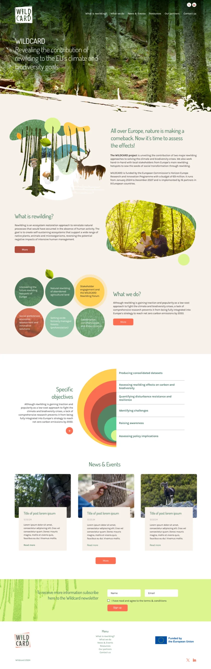
Transformit is an initiative by the European Forest Institute focused on sustainable forest management, biodiversity conservation, and the promotion of ecosystem services. Its primary goal is to protect Europe’s forests through innovative and collaborative approaches that support nature conservation.
For the homepage, we designed an animation where various graphic elements move, reinforcing the idea of transformation in forest management. This animation not only adds dynamism to the site but also captures the innovative spirit of the Transformit project.
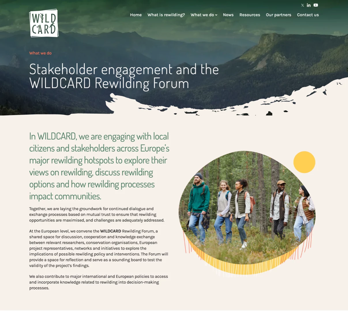
We also integrated an interactive map displaying the different “Living Labs,” specific areas where concrete actions are carried out for biodiversity conservation and the development of sustainable forestry practices. This map allows users to explore the different regions and access detailed information about the work being conducted in each area.
The final result is a website that combines an engaging visual experience with intuitive navigation, effectively spreading awareness of the Transformit project’s initiatives.
Our role was to design a website that reflected these values and served as an effective platform for communicating the project’s actions and outcomes.
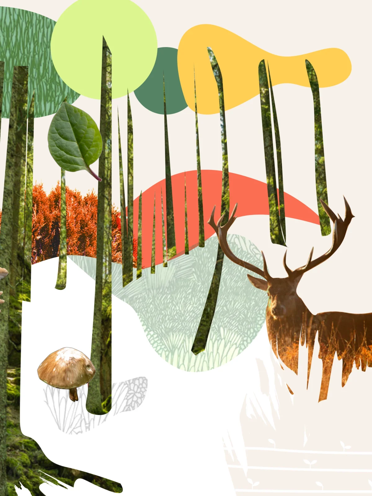
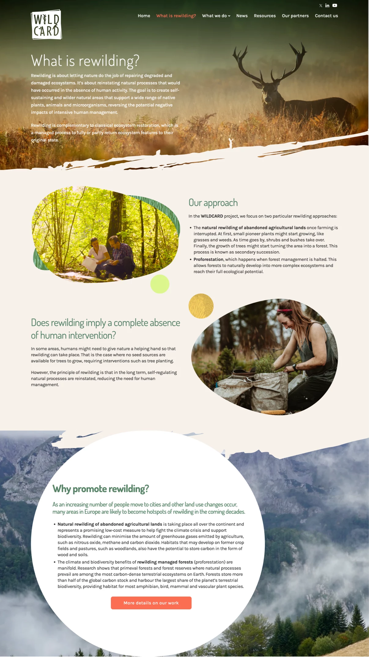
We built upon the existing corporate identity and the central idea of the logo, which evokes the image of a stained glass window where various elements interconnect through lines that define their shapes. This visual metaphor inspired the design concept, where website images are framed in ways that mimic the effect of stained glass. This approach is not only visually appealing but also ensures coherence with the project’s graphic identity.
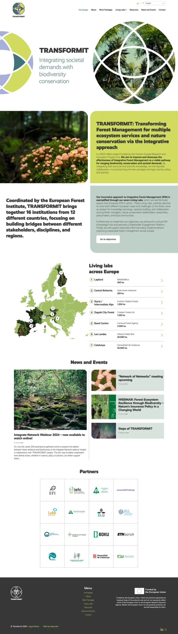
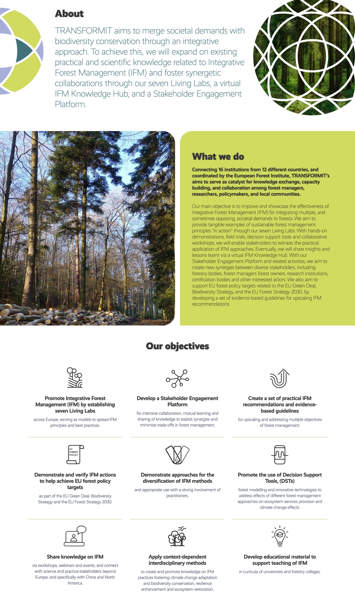
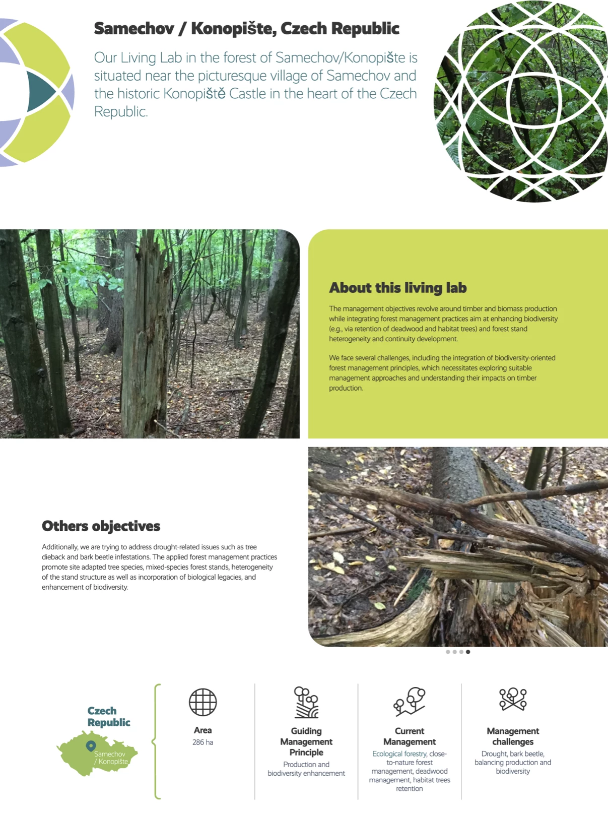
The website’s graphic style follows a minimalist approach, featuring large blocks of color that contrast with striking images, creating a balance between clarity and modernity. Simple line graphics integrate seamlessly with these visual elements, reinforcing a clean and contemporary aesthetic. This approach highlights the project’s core values, such as sustainability and ecosystem conservation.
Overall, the website not only conveys the importance of forest conservation but also serves as an effective communication tool for the Transformit project’s efforts.