Atelier de Chronométrie

Atelier de Chronométrie

Web design and development for Atelier de Chronométrie, a Barcelona-based company crafting high-end, handmade vintage-inspired watches.

Client

Atelier de Chronométrie

Year of creation

Project scope

Our collaboration with Atelier de Chronométrie had been ongoing for several years, starting with the design of the website for Mimandcrocket, another company specializing in vintage-style watchmaking. This long-term partnership allowed us to gain deep insight into both their products and their craftsmanship.

The Atelier de Chronométrie website was designed with the goal of conveying simplicity in messaging while establishing a flexible architecture that would allow for the easy creation of new pages for future watch models, without being constrained by a rigid design.

The client provided high-quality images, which became the focal point of the website, emphasizing product photography to highlight every intricate detail of the watches. Additionally, we showcased images of the manufacturing process, capturing the precision and craftsmanship involved in every piece.

Atelier de Chronométrie

Praxis

Web design and development for Praxis Resilient Buildings, an engineering company focused on healthy and energy-efficient buildings.

Client

Praxis Resilient Buildings

Year of creation

Website

praxis-rb.com

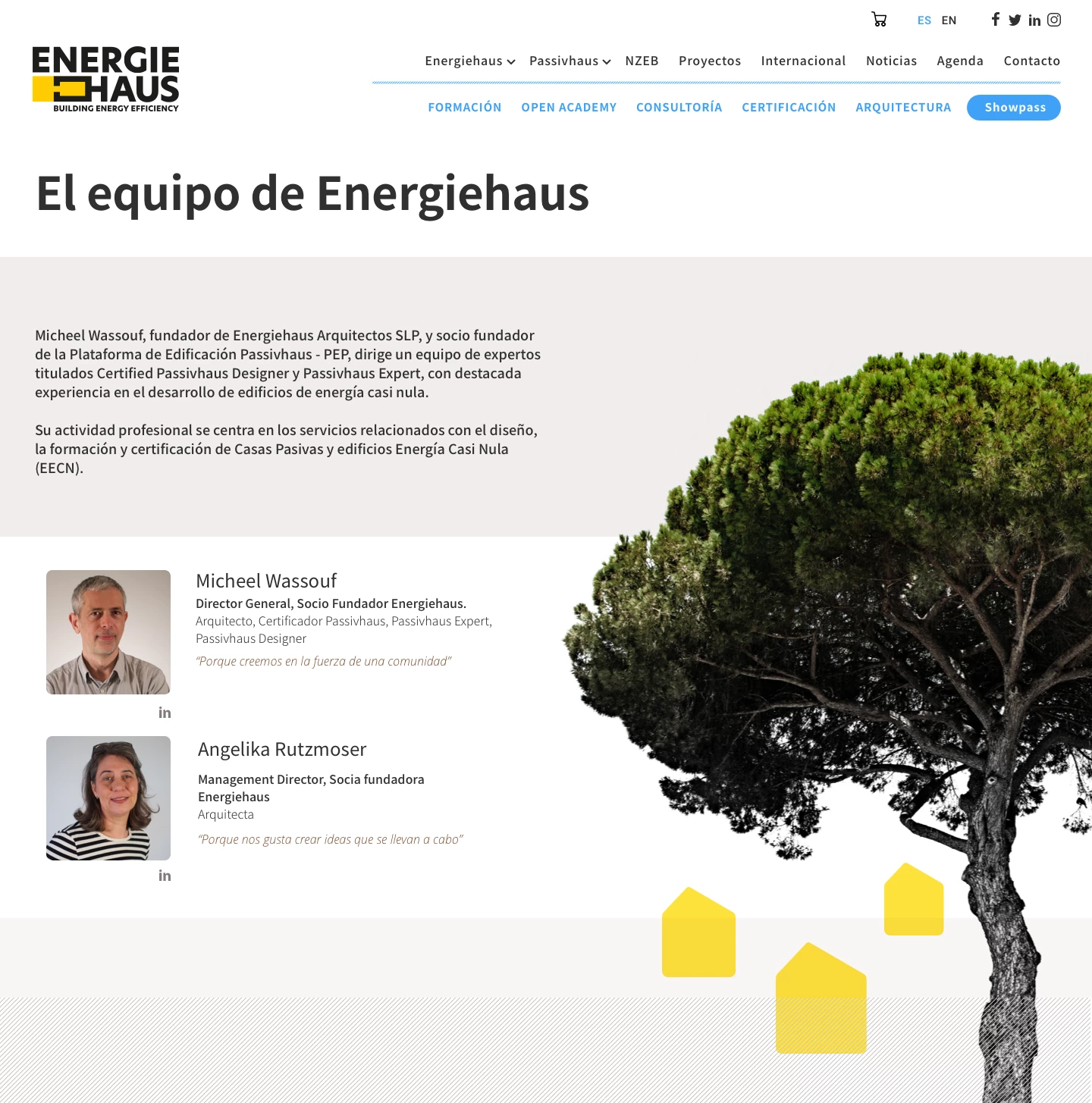
Praxis Resilient Buildings specializes in engineering, energy consulting, and Passivhaus certification, dedicated to creating sustainable, healthy, and efficient buildings.

The website project was completed in two phases: in the first phase, a basic website was developed, along with the integration of an online course platform, allowing users to easily access specialized training.

In the second phase, a content strategy and SEO consultancy was conducted, during which the website’s content and structure were adapted to optimize its search engine ranking, improving visibility and attracting new clients. Additionally, further design modifications were made, refining the layout to meet the company’s needs and reinforcing its visual identity to clearly and attractively communicate its values of sustainability and efficiency.

Pàgina d'inici web Praxis
Detall web Praxis
Detall web Praxis

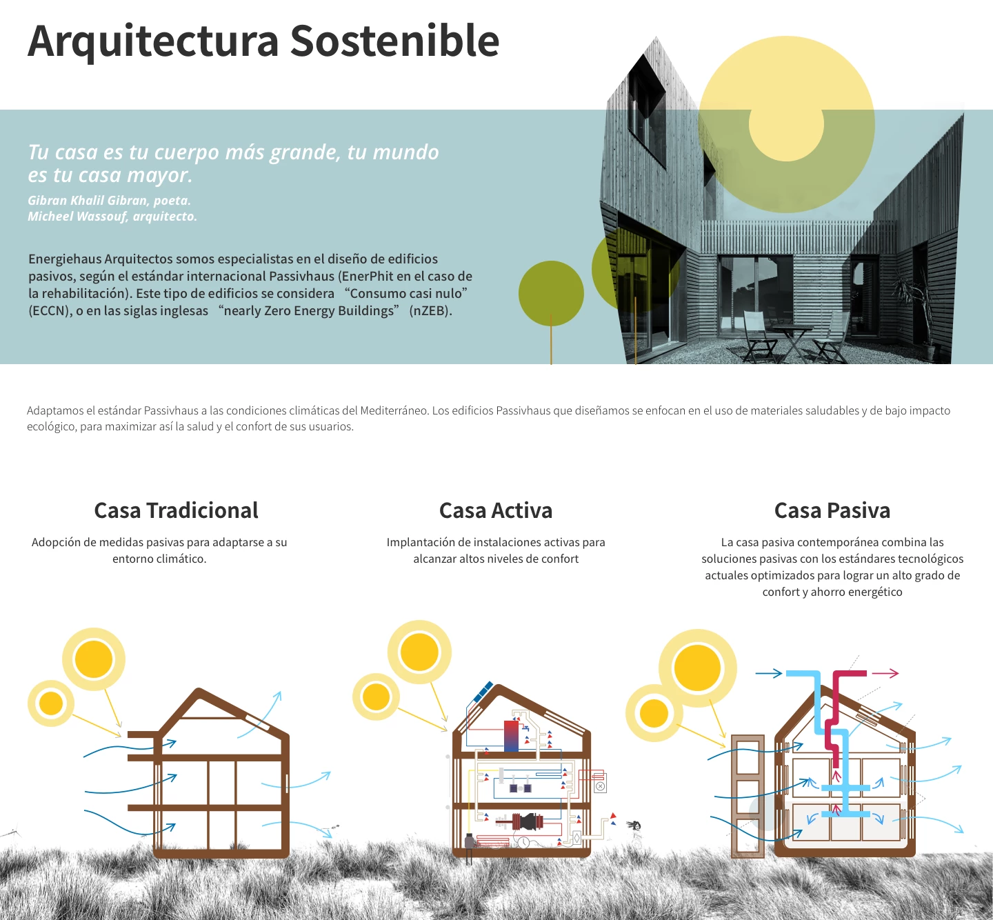
We designed custom icons to represent the different services and online courses, ensuring graphic consistency with the overall design and enhancing user navigation.

QSL Serveis Culturals

QSL Serveis Culturals

Web design and development for QSL as part of its corporate identity renewal. Founded in 1995, QSL manages public service projects in culture, education, and participation.

Client

QSL Serveis Culturals

Year of creation

Website

qsl.cat

This project marks the culmination of a collaboration that began years ago with the redesign of QSL’s corporate identity.
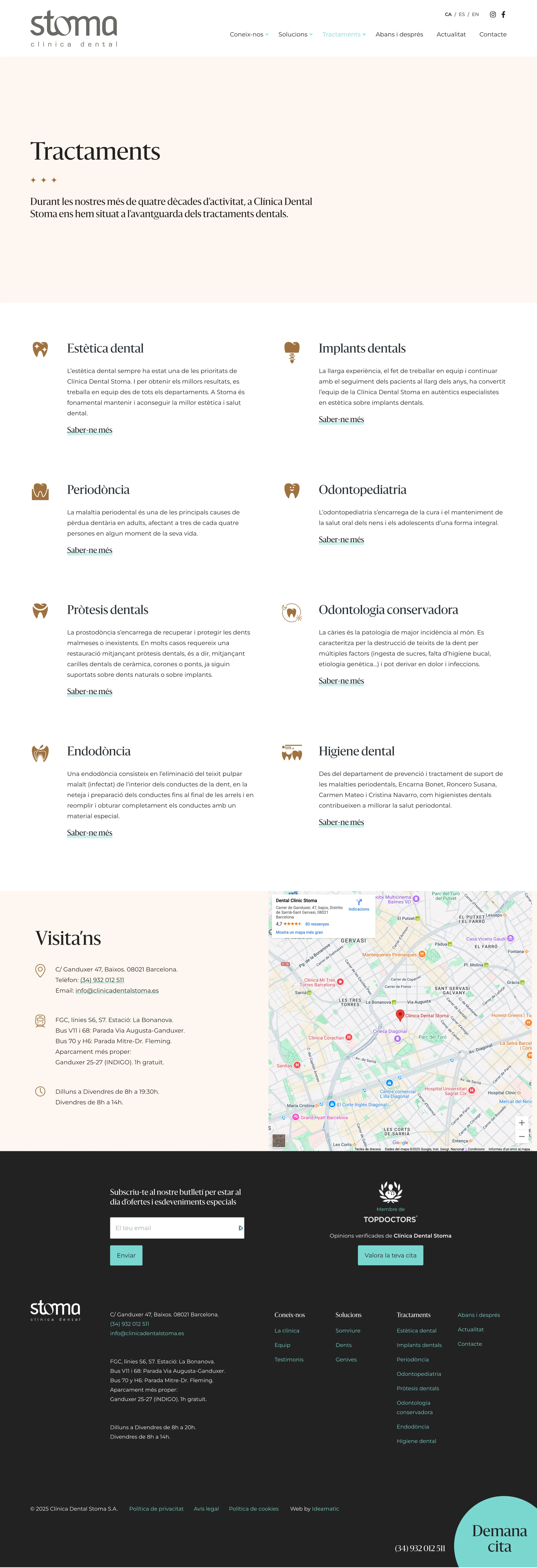
The previous website had numerous shortcomings: it featured an outdated design, was not responsive, and lacked proper SEO optimization. It did not include meta tags, its content was not easily indexable, and despite QSL’s significance, the website had little visibility in Google search results.

Our primary task was to create a new website using WordPress to resolve these issues, aligning it with the organization’s new corporate identity while presenting its areas of work, services, and key projects in a clear and intuitive way.

As with similar projects, the website’s creation was structured into consecutive phases, beginning with analysis, strategic definition, and prototyping.

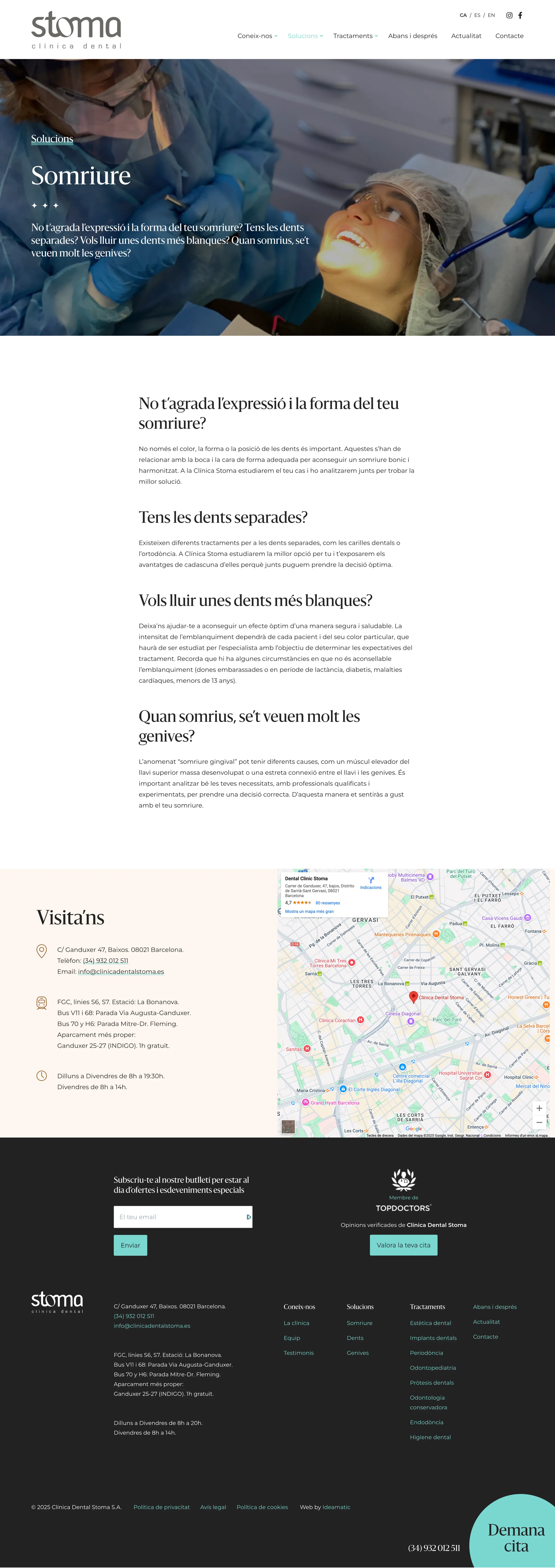
Prototypes or wireframes serve as preliminary structure and content distribution proposals before the design phase. They allow for a strategic overview, defining content hierarchy and user navigation paths.

Based on the strategic definition and prototyping phase, a custom design was developed that perfectly aligns with QSL’s new corporate image. The website emphasizes key areas such as news and updates, fields of work, services, and completed projects.

QSL Serveis Culturals

For the Services section, we also designed a custom set of illustrations that give the website a distinct personality—something that would have been difficult to achieve with stock photography alone.

8 Artist Management

8 Artist Management

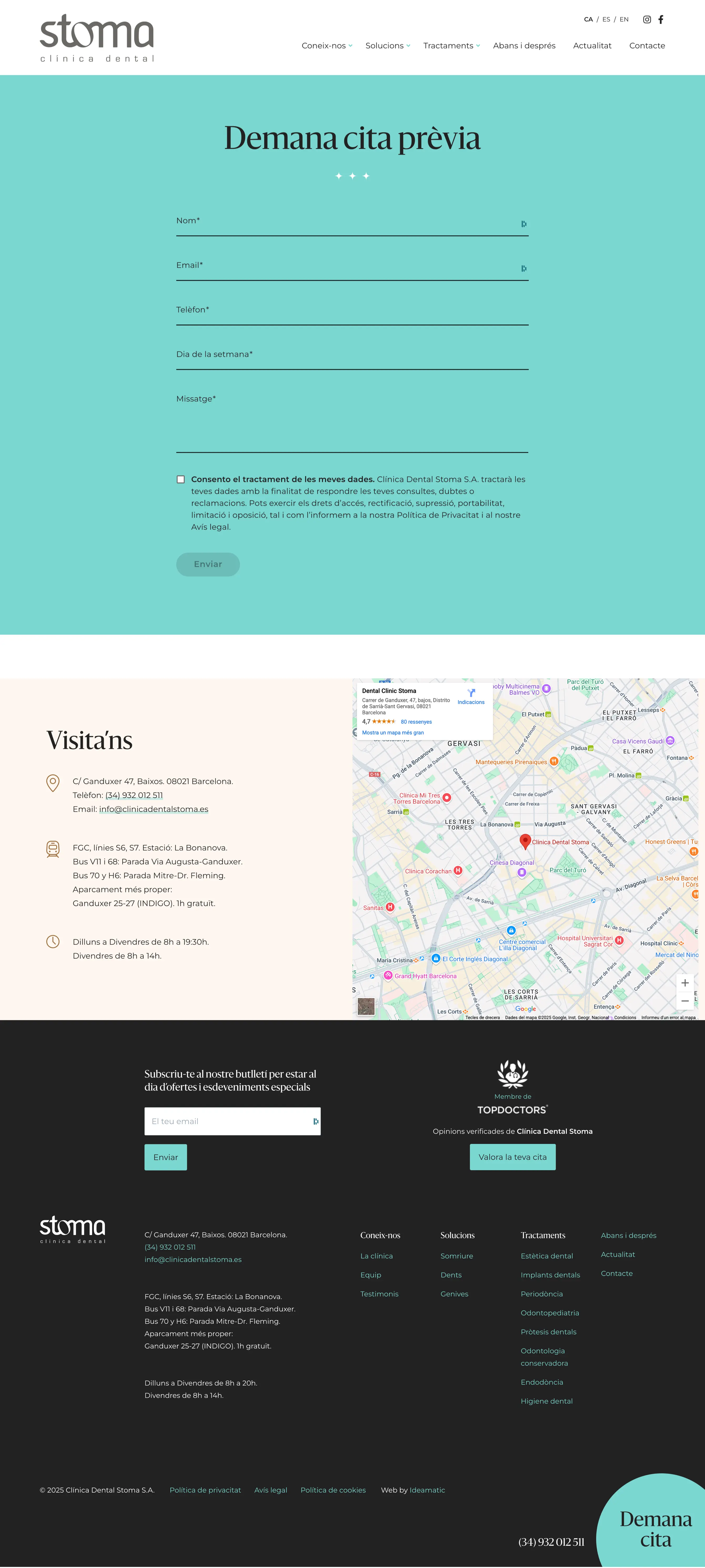
Corporate website design and development for 8 Artist Management, primarily focused on showcasing the portfolios of the artists it represents through their photography and video projects. The project also included the design of the logo, defining a cohesive brand identity.
Client

8 Artist Management

Year of creation

8 Artist Management is an agency representing photographers, videographers, and stylists on both a national and international scale. Their previous website had compatibility issues with newer WordPress formats, and with an internal evolution within the company, they decided to develop a new site with a structure that allows for the continuous addition of new artists and projects.

The new website was designed with an architecture that categorizes artists by their specialty, giving each of them an individual page featuring their projects in a portfolio-style format.

For the design, we opted for a minimalist approach since the site is primarily intended to display a large volume of visual content from client portfolios. One of the key graphic elements considered was the treatment of title line spacing, adjusting it so that text lines remained connected, forming a unified graphic element similar to a logo for each artist’s name.

We also redesigned the logo, using a finer typeface with increased spacing between letters, achieving a more cohesive and harmonious integration with the overall web design.

8 Artist Management
8 Artist Management
8 Artist Management

European University (eUniv)

European University (eUniv)

Web design and development for the European University (eUniv). The project’s objective was to increase online visibility for this online university by clearly and systematically presenting all the educational information it offers.

Client

Universitas Europaea IMF

Year of creation

Website

euniv.eu

The European University (eUniv) website project was initiated with the idea of creating a platform that would enable the university’s growth and display a set of restructured content derived from its old website, highlighting both the university’s organizational model and its entire educational offering.

Based on this, a forward-thinking, fully flexible design was implemented that allows new content to be showcased or the prominence of certain sections to be modified as the project evolves.

We were provided with corporate design guidelines that needed to be incorporated, such as the training iconography and decorative initials.

From this, other graphic elements were developed: backgrounds with lines and dots, elements with rounded edges, a range of colors, etc.

EUNIV Universitat Europea

In the training section, the client required an individual color scheme for each field, as well as a specific illustration for each sector. A different graphic treatment was chosen for each illustration, using as a guiding element the three vertical base rectangles that represent the progression of studies: Bachelor, Master, and Doctorate.

These shapes change color according to the type of training. For the illustrations, various techniques were employed, such as vector drawing, pencil, markers, and watercolor.

23:45 Arquitectes

23:45 Arquitectes

SEO audit and strategic analysis, content creation, design, and development of the website for the Barcelona-based architecture studio 23:45 Arquitectes. Two of the challenges were modernizing the design and improving the website’s positioning to attract higher quality traffic.

Client

23:45 Arquitectes

Year of creation

When we were approached to revamp the studio’s website, we encountered several challenges, as the previous site had significant shortcomings: an outdated design, lack of 100% responsiveness, pages with almost no textual content, and a URL that contained no keywords—factors that severely harmed its search ranking.

Another challenge for the new website was to generate quality traffic to connect the studio with its desired clientele.

We began with an SEO audit to identify, first and foremost, the issues that needed to be addressed and avoided in the future. We defined the website’s objectives and the target search segments we aimed to reach.

We analyzed its current ranking, the competition, and the relevant keywords, and prepared the on-page SEO for each page. The resulting report also helped define the content hierarchy of the website before its execution.

23:45 Arquitectes
23:45 Arquitectes
23:45 Arquitectes

Florcare Power Plants

Florcare Power Plants

Web design and development with an online store for Florcare Power Plants, a social and ecological project through the sale of sustainable plants and products. We also created a set of illustrations to further enhance the website’s personality.

Client

Kairos Network

Year of creation

Florcare Power Plants is a social and ecological economy project and a marketplace for sustainable plants and products. A fully customized WordPress website with an online store was created for them.
The idea was not to be just another plant store, but to provide social benefits to young people at risk of exclusion who cultivate and sell them. In this way, the buyer felt empowered to change the social situation of these young people.

The illustrations we developed were based on a comic-style approach, with plants transformed into superheroes.

Florcare Power Plants

Progetic and Solgetic Websites

Progetic and Solgetic Websites

Corporate identity design and website creation for Progetic and Solgetic, sister companies specializing in providing engineering and consultancy services for sustainable building construction. For this reason, we worked by referencing the three pillars of sustainability: social, economic, and ecological.

Client

Progetic Projectes Sostenibles

Year of creation

Progetic and Solgetic are sister companies in engineering and consultancy for healthy buildings. It was an integrated project in which we began by renewing the corporate image, logo, and overall branding, and as a second phase we developed the websites based on this new image.

These are corporate websites that primarily showcase all of their projects, and they are growing as an online training section for courses is currently being developed.

Progetic
Solgetic

Websites for the Florists’ Guild of Catalonia

Websites for the Florists’ Guild of Catalonia

Web design and development of websites and eCommerce for florists belonging to the Florists’ Guild of Catalonia.

Client

Gremi de Floristes de Catalunya

Year of creation

The Florists’ Guild of Catalonia commissioned us to design and develop websites using WordPress—with or without an online store—so that its members could easily and seamlessly digitize their florist businesses.

Starting from an initially designed template, we customized each site according to the corporate identity of each florist to adapt it to the style of each shop.

The online store was customized based on the type of product sold, considering not only the end user but also the florist, ensuring that the sales process was simple.

Gremi de Floristes de Catalunya

World Allergy Organization

World Allergy Organization

Design of a series of illustrations and infographics for a medical guide on allergies for the World Allergy Organization.

Client

World Allergy Organization

Year of creation

The World Allergy Organization offered us the opportunity to design five illustrations for a medical guide on allergies. It involved redesigning the diagrams with new drawings and a simpler, cleaner aesthetic to improve the user’s understanding of the content.

It was a very interesting project, as, starting from very simple figures, it was necessary to represent different symptomatologies and actions. The information flow was also restructured to facilitate comprehension.

World Allergy Organization