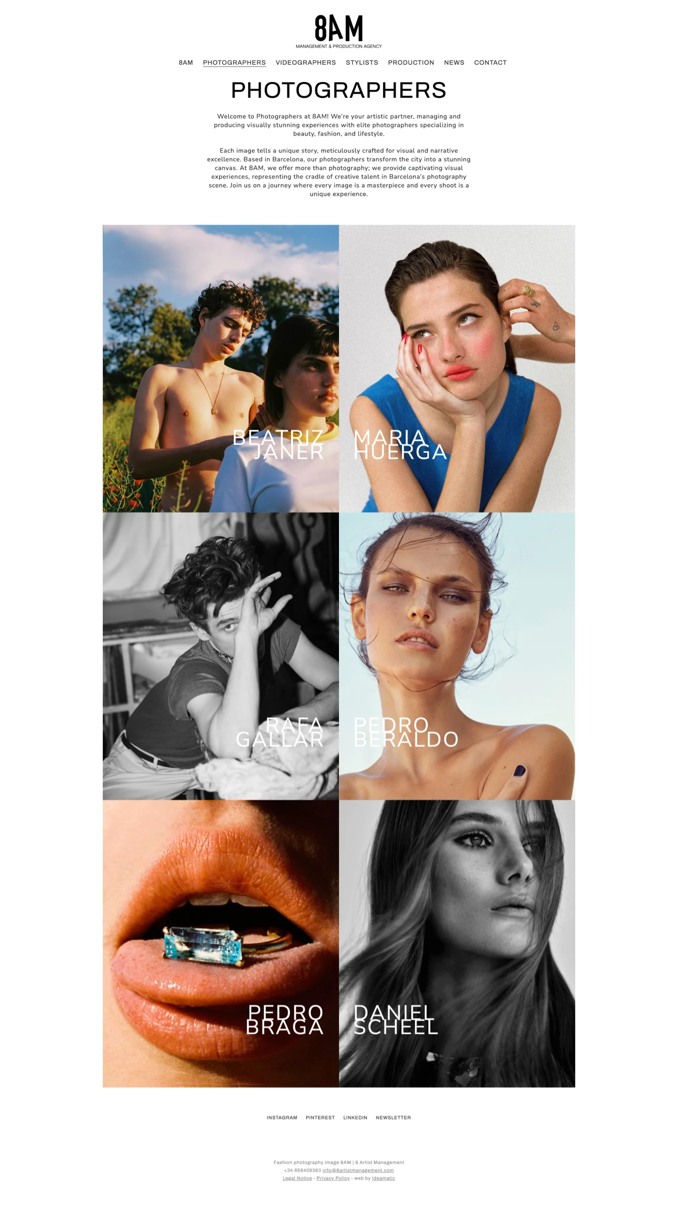
Dmente

Web design and development, as well as logo creation for Dmente, a company specializing in location scouting and management for film productions.

Client

Dmente

Year of creation

Website

dmenteloc.com

Dmente is a company specializing in location scouting and management for film, television, and commercial productions. With extensive experience in the audiovisual sector, Dmente aimed to renew its online presence to project a more professional and appealing image to its current and potential clients.

The previous website, created internally by the company, had significant design and usability issues, failing to properly reflect the quality of its work and its industry reputation.

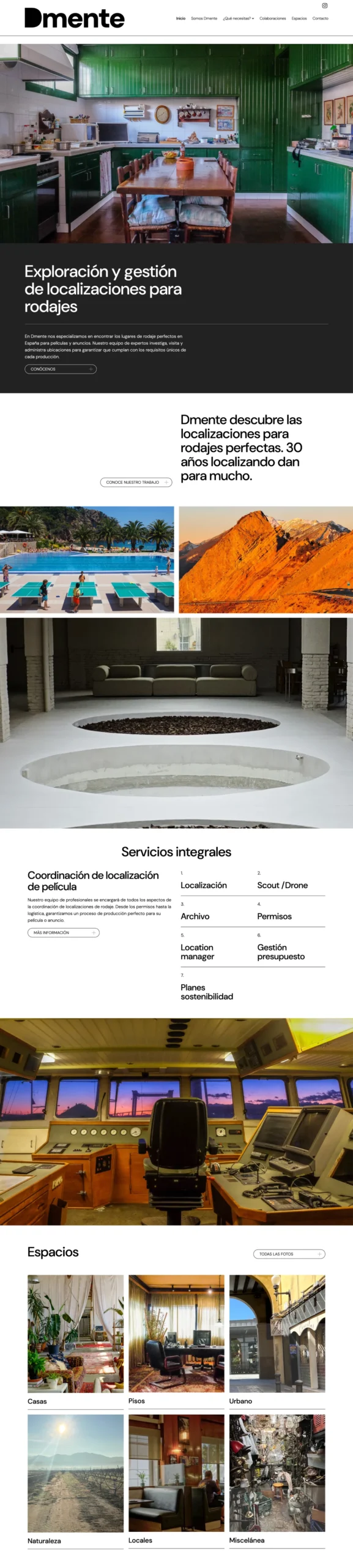
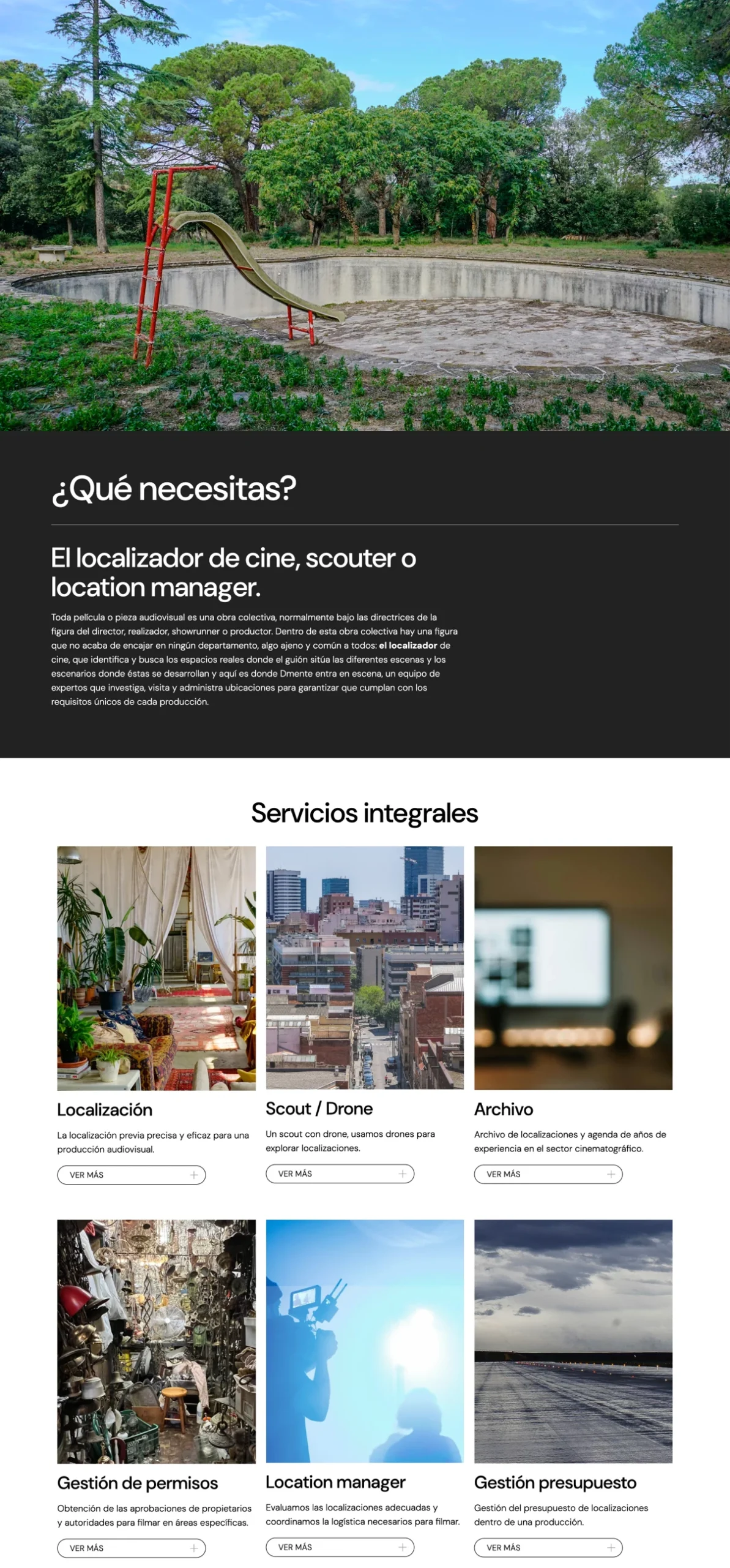
The project began with a complete restructuring of the website, designing a new content architecture that improved navigation and clearly highlighted the services offered by Dmente.

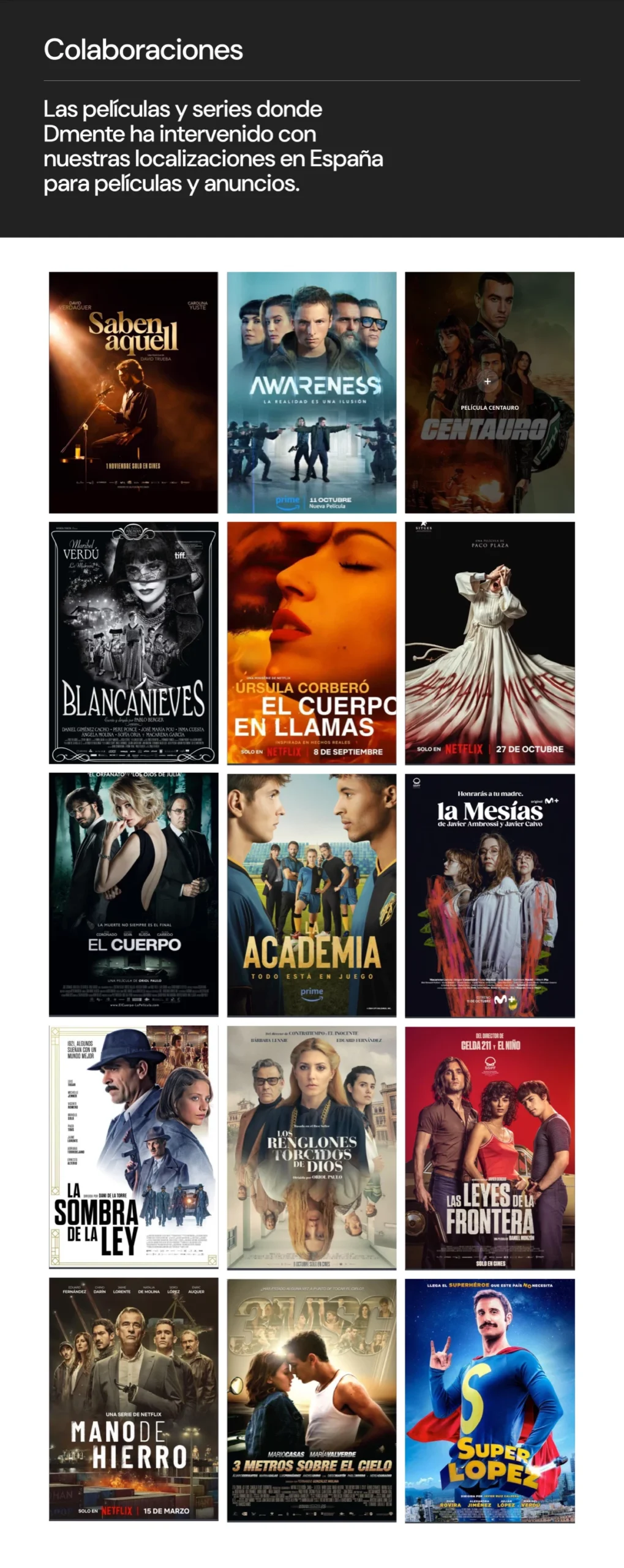
The primary focus was organizing information so that visitors could easily explore different location types and learn about the audiovisual projects the company had worked on, including films, series, and advertising campaigns. To achieve this, a content structure was developed that clearly divided the services and showcased location images alongside details of the productions they had contributed to.

For the visual design, a minimalist and elegant style was chosen, based on a monochromatic black-and-white palette. This strong contrast allowed the large-format location images to take center stage. Structured visual blocks contributed to a sense of order and professionalism, reinforcing Dmente’s position as a reliable and experienced player in the audiovisual sector.

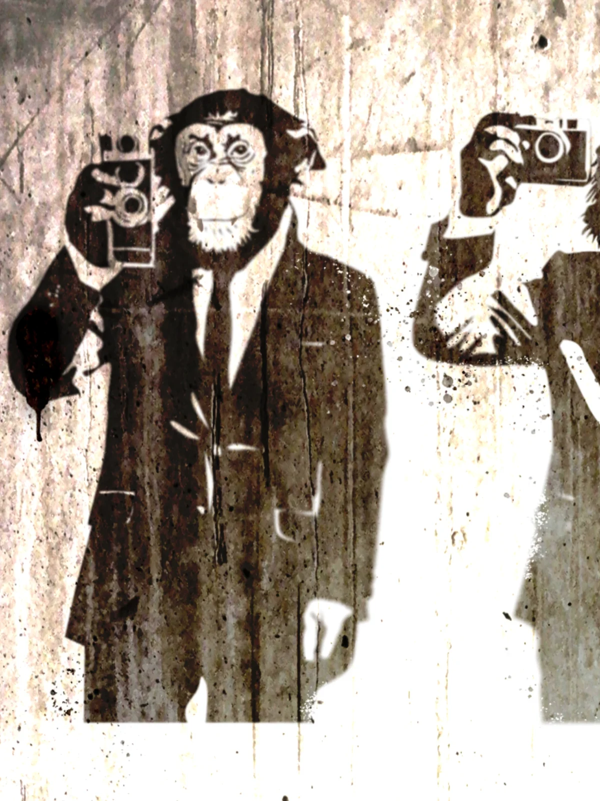
One of the final tasks was redesigning the iconic illustration of monkeys with cameras, a visual element the client wanted to retain. The updated illustration maintained the original concept but with a more stylized and cohesive look that aligned with the website’s overall aesthetic. The graffiti-style execution was intended to reflect Dmente’s dynamic nature, as if it were an element found in a real filming location.

Detall disseny web pàgina inici Dmente
Detall disseny web pàgina interior Dmente

In addition to web design, logo creation was also part of the project, as the company lacked a defined visual identity.

Following the global aesthetic of the website, we developed a logo proposal that combined simplicity with strong character.

We played with the “D” in the name, placing it at the beginning as the sole symbol, eliminating empty space, and highlighting its external shape. We also adjusted the spacing between the “D” and “mente” to create a balanced visual feel while maintaining uniform letter spacing. This resulted in a solid and minimalist logo.

The logo design not only complemented the website’s style but also reinforced the overall brand identity.

Logo Dmente aplicació

Wildcard Project

Web design and development for Wildcard Project, an initiative by the European Forest Institute focused on the self-recovery of degraded and damaged ecosystems.

Client

European Forest Institute (EFI)

Year of creation

Wildcard Project is a European Forest Institute initiative focused on the natural regeneration of affected ecosystems, promoting biodiversity restoration and the balance of forest environments. The website design needed to reflect this vision of renewal and environmental connection while maintaining coherence with the project’s corporate identity.

One of the defining aspects of the design was the use of collages and infographics, which visually conveyed key concepts about ecosystem restoration. To ensure visual consistency, we unified the collages with a consistent color palette, rounded shapes, and soft lines. This combination helped maintain a harmonious look throughout the site, creating a visually engaging and smooth user experience.

The final result is a website that blends creativity, functionality, and strong visual identity, providing a platform that not only communicates the mission of Wildcard Project but also inspires visitors to understand the importance of restoring damaged ecosystems.

From the start of the project, we opted for a visual approach that evoked forest ecosystems through a collage that symbolized the diversity and complexity of forests. To bring this concept to life, we carefully selected a mix of photographs, textures, and colored shapes that represented the richness of natural landscapes. These graphic elements were consistently used across the site, creating a cohesive and dynamic visual aesthetic that captured the essence of the project.

Wildcard Project pàgina inici
Wildcard Project pàgina interior

The corporate colors of Wildcard Project served as the foundation for the design, though we had creative freedom to develop additional graphic elements. This flexibility allowed us to explore bold combinations of textures and colors, reinforcing the project’s distinctive character. Nature-inspired images, organic shapes, and earthy tones were integrated to bring to life the concept of regeneration and natural growth.

A key feature of the website was the integration of videos as background visuals, framed by color strokes that acted as borders. This added dynamism to the user experience, making the site more immersive while emphasizing the project’s key visual elements. The videos vividly showcased ecosystems in the process of regeneration, perfectly aligning with the mission of Wildcard Project.

Hachazuela

Design and development of Hachazuela’s new website, an e-commerce platform specializing in handcrafted wooden pieces. The project includes a logo redesign, a new typographic identity, and a functional, elegant interface to enhance the shopping experience.

Client

Hachazuela

Year of creation

Website

hachazuela.com

The Hachazuela project involved a complete digital identity revamp, starting with a refreshed logo and continuing with the design of a new e-commerce platform aimed at improving user experience and streamlining the purchasing process. The main goal was to achieve a balance between originality and functionality, ensuring the workshop’s unique character stood out without compromising usability.

The website’s design was developed around a warm and neutral color palette, creating an appealing yet distraction-free visual environment. The approach prioritized clarity and cleanliness, with intuitive navigation and ease of use as key factors in enhancing the shopping experience.

For typography, two fonts were chosen to provide both personality and readability. Queens Condensed Light was used for headings and highlighted texts, an elegant display typeface with strong visual presence, whose condensed format is particularly effective for mobile versions. As a complement for body text, Brown Pro was selected, a slightly condensed sans-serif font that ensures comfortable and fluid reading in both uppercase and lowercase. The combination of these two fonts established a clear and effective typographic hierarchy.

The website’s architecture was designed with a high-impact homepage, capturing the user’s attention while conveying the workshop’s values. Across the rest of the site, the focus was on clean design, generous white space, and efficient navigation, ensuring that products were easy to find and the checkout process was seamless and frictionless.

Hachazuela
Hachazuela
Hachazuela
Hachazuela

For the logo, the design was developed based on the Arsenica Variable display typeface, adapting some of its characteristics to achieve a more distinctive identity. The undulations in the horizontal strokes, subtly reminiscent of wood grain, served as a starting point to reinforce the connection with Hachazuela’s craftsmanship, clearly distinguishing it from the previous version displayed on the website.

The final result is an attractive, highly functional e-commerce platform with a strong graphic identity and an optimized user experience, transforming Hachazuela’s new website into an intuitive, high-quality digital showcase that aligns with the craftsmanship and excellence of its products.

Flors Lloveras

Web design with integrated online store for Flors Lloveras, a Barcelona-based florist known for detailed attention and quality floral compositions.

Client

Flors Lloveras

Year of creation

Flors Lloveras is a florist with a long-standing tradition in Barcelona, known for its attention to detail and the quality of its floral arrangements. The project’s goal was to create a new website that reflected the unique style of the florist while integrating the existing online store, enhancing both its functionality and appearance. The design needed to convey the delicacy and beauty of flowers while providing an intuitive and efficient user experience.

A key element of the design was the incorporation of a series of pencil drawings of floral details, which acted as a unifying thread across all the web pages. These drawings, evoking the delicacy and natural beauty of flowers, served as decorative and cohesive elements, creating a distinct visual identity. Alongside these illustrations, carefully selected photo collages captured the essence of Flors Lloveras’ artisanal work. These images not only showcased the products but also conveyed the atmosphere and dedication of the florist, creating an emotional connection with users.

The color palette was adapted from the florist’s corporate identity, maintaining visual consistency that respected the brand’s identity. Soft and natural tones were combined to create a harmonious and elegant design, in line with Flors Lloveras’ style.

Pàgina web Flors Lloveras

The project posed a particular challenge: the florist already had an online store that the owners wanted to retain. Our task was to adapt the store to the new design, ensuring that the aesthetic change did not affect the functionality or user experience. We also conducted a comprehensive review of the eCommerce platform to ensure it was up-to-date and functioning optimally, both in terms of technical performance and usability.

The result is a website that combines elegant and emotive design with a fully functional online store. This solution allowed Flors Lloveras to maintain an updated digital presence, offering their customers an attractive and user-friendly platform for purchasing their products. The combination of graphic elements, carefully curated photographs, and an intuitive store layout highlighted the artisanal work and dedication of this florist.

MARQuitectura

Web design and development for MARQuitectura, a Barcelona-based sustainable architecture studio.

Client

MARQuitectura

Year of creation

MARQuitectura is an architecture studio based in Barcelona, specializing in sustainable projects with a strong commitment to energy efficiency and responsible resource use. Despite its solid track record in the industry, the studio needed to update its website, which had become outdated both in design and functionality.

The previous website did not adequately reflect the quality and vision of MARQuitectura. Navigation was unclear, as content was split between the main site and an external blog, complicating the user experience and failing to present a cohesive visual identity.

The project focused on a complete website redesign, emphasizing a clean and modern approach to showcase the studio’s projects visually. Large-format images were prioritized, leveraging the high-quality photography of MARQuitectura’s featured projects. These images were combined with subtle visual elements, such as neutral color blocks, which complemented the studio’s corporate palette while maintaining its brand identity.

Pàgina d'inici web Marquitectura
Pàgina interior web Marquitectura

In addition to the website development, the project included a logo redesign. Based on the original concept, adjustments were made to modernize it and create a softer, more approachable look. The lines were refined into rounded, friendlier shapes, while the typography was updated to convey a more contemporary and professional image.

The new website not only improved the brand’s visual presentation but also simplified navigation and reinforced MARQuitectura’s identity with a more cohesive and polished digital presence.

Logo Marquitectura

Energiehaus

Web design, development, and corporate identity for Energiehaus.

Client

Energiehaus

Year of creation

The new website for Energiehaus, a Barcelona-based architecture and consultancy firm specializing in sustainable architecture and construction under Passivhaus standards, was a complex challenge for us. The new platform needed to integrate a corporate site with multiple services, a Showroom, the Showpass section, an online store for course sales, an events area, and a blog, requiring a comprehensive development process that covered both corporate identity creation and website design and development.

The project began with the creation of prototypes or wireframes to structure the pages clearly and functionally. Intuitive navigation was a priority, allowing users to easily access Energiehaus’ broad range of services. Each section, from the online store to the blog, was designed with its own visual identity while maintaining overall brand coherence.

The client opted for a design based on collages that combined natural elements such as trees and other environmental motifs with black-and-white cut-out photographs. This distinctive aesthetic reinforced the message of sustainability while maintaining a modern and elegant look. We also designed a series of infographics and icons that followed this visual style to clearly and attractively communicate Energiehaus’ services.

Pàgina d'inici detall
Pàgina interior Energiehaus
Pàgina d'inici detall Energiehaus
Pàgina interior Energiehaus

Examples of collages created for website headers and elements.

In parallel, we developed a new logo inspired by the Passivhaus concept, where external energy surrounds and benefits the interior of a building. The logo featured a house icon, representing this energy flow in a simple yet powerful way. The contrast between the black logo and the bright yellow surrounding it reinforced the brand’s visual identity, symbolizing the energy that surrounds and protects—an essential element of Energiehaus’ philosophy.

The final result was a dynamic, visually compelling, and highly functional website that perfectly captured the values of innovation, sustainability, and energy efficiency, strengthening Energiehaus’ online presence and improving the communication of its expertise in sustainable architecture.

Logo Energiehaus

QSL Serveis Culturals

Web design and development for QSL as part of its corporate identity renewal. Founded in 1995, QSL manages public service projects in culture, education, and participation.

Client

QSL Serveis Culturals

Year of creation

Website

qsl.cat

This project marks the culmination of a collaboration that began years ago with the redesign of QSL’s corporate identity.

The previous website had numerous shortcomings: it featured an outdated design, was not responsive, and lacked proper SEO optimization. It did not include meta tags, its content was not easily indexable, and despite QSL’s significance, the website had little visibility in Google search results.

Our primary task was to create a new website using WordPress to resolve these issues, aligning it with the organization’s new corporate identity while presenting its areas of work, services, and key projects in a clear and intuitive way.

As with similar projects, the website’s creation was structured into consecutive phases, beginning with analysis, strategic definition, and prototyping.

Prototypes or wireframes serve as preliminary structure and content distribution proposals before the design phase. They allow for a strategic overview, defining content hierarchy and user navigation paths.

Based on the strategic definition and prototyping phase, a custom design was developed that perfectly aligns with QSL’s new corporate image. The website emphasizes key areas such as news and updates, fields of work, services, and completed projects.

QSL Serveis Culturals

For the Services section, we also designed a custom set of illustrations that give the website a distinct personality—something that would have been difficult to achieve with stock photography alone.

8 Artist Management

Corporate website design and development for 8 Artist Management, primarily focused on showcasing the portfolios of the artists it represents through their photography and video projects. The project also included the design of the logo, defining a cohesive brand identity.

Client

8 Artist Management

Year of creation

8 Artist Management is an agency representing photographers, videographers, and stylists on both a national and international scale. Their previous website had compatibility issues with newer WordPress formats, and with an internal evolution within the company, they decided to develop a new site with a structure that allows for the continuous addition of new artists and projects.

The new website was designed with an architecture that categorizes artists by their specialty, giving each of them an individual page featuring their projects in a portfolio-style format.

For the design, we opted for a minimalist approach since the site is primarily intended to display a large volume of visual content from client portfolios. One of the key graphic elements considered was the treatment of title line spacing, adjusting it so that text lines remained connected, forming a unified graphic element similar to a logo for each artist’s name.

We also redesigned the logo, using a finer typeface with increased spacing between letters, achieving a more cohesive and harmonious integration with the overall web design.

8 Artist Management
8 Artist Management
8 Artist Management

European University (eUniv)

European University (eUniv)

Web design and development for the European University (eUniv). The project’s objective was to increase online visibility for this online university by clearly and systematically presenting all the educational information it offers.

Client

Universitas Europaea IMF

Year of creation

Website

euniv.eu

The European University (eUniv) website project was initiated with the idea of creating a platform that would enable the university’s growth and display a set of restructured content derived from its old website, highlighting both the university’s organizational model and its entire educational offering.

Based on this, a forward-thinking, fully flexible design was implemented that allows new content to be showcased or the prominence of certain sections to be modified as the project evolves.

We were provided with corporate design guidelines that needed to be incorporated, such as the training iconography and decorative initials.

From this, other graphic elements were developed: backgrounds with lines and dots, elements with rounded edges, a range of colors, etc.

EUNIV Universitat Europea

In the training section, the client required an individual color scheme for each field, as well as a specific illustration for each sector. A different graphic treatment was chosen for each illustration, using as a guiding element the three vertical base rectangles that represent the progression of studies: Bachelor, Master, and Doctorate.

These shapes change color according to the type of training. For the illustrations, various techniques were employed, such as vector drawing, pencil, markers, and watercolor.

Florcare Power Plants

Web design and development with an online store for Florcare Power Plants, a social and ecological project through the sale of sustainable plants and products. We also created a set of illustrations to further enhance the website’s personality.

Client

Kairos Network

Year of creation

Florcare Power Plants is a social and ecological economy project and a marketplace for sustainable plants and products. A fully customized WordPress website with an online store was created for them.

The idea was not to be just another plant store, but to provide social benefits to young people at risk of exclusion who cultivate and sell them. In this way, the buyer felt empowered to change the social situation of these young people.

The illustrations we developed were based on a comic-style approach, with plants transformed into superheroes.

Florcare Power Plants