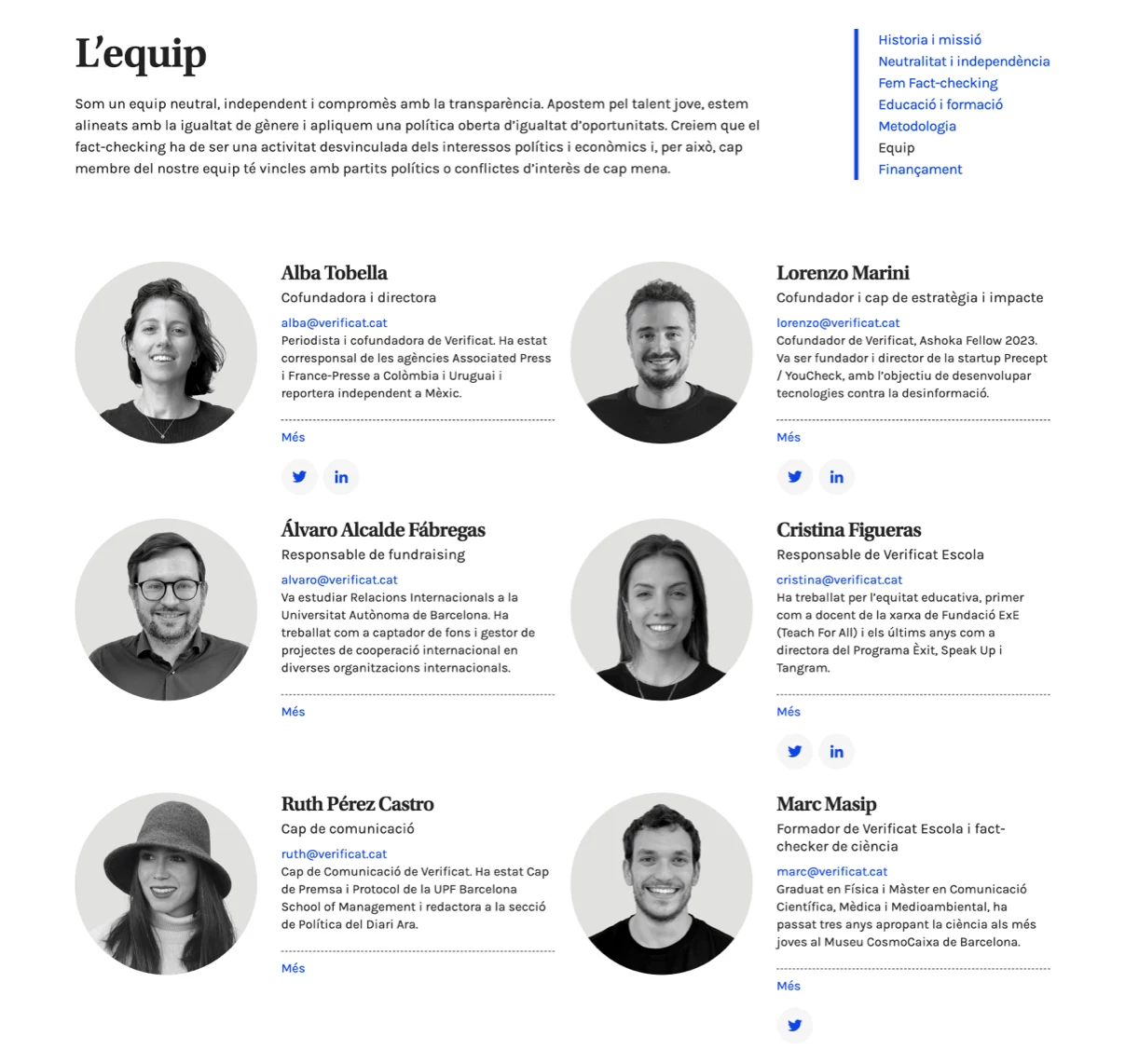
Wildcard Project
Wildcard Project
Web design and development for Wildcard Project, an initiative by the European Forest Institute focused on the self-recovery of degraded and damaged ecosystems.
Client
European Forest Institute (EFI)
Year of creation
Project areas
Website
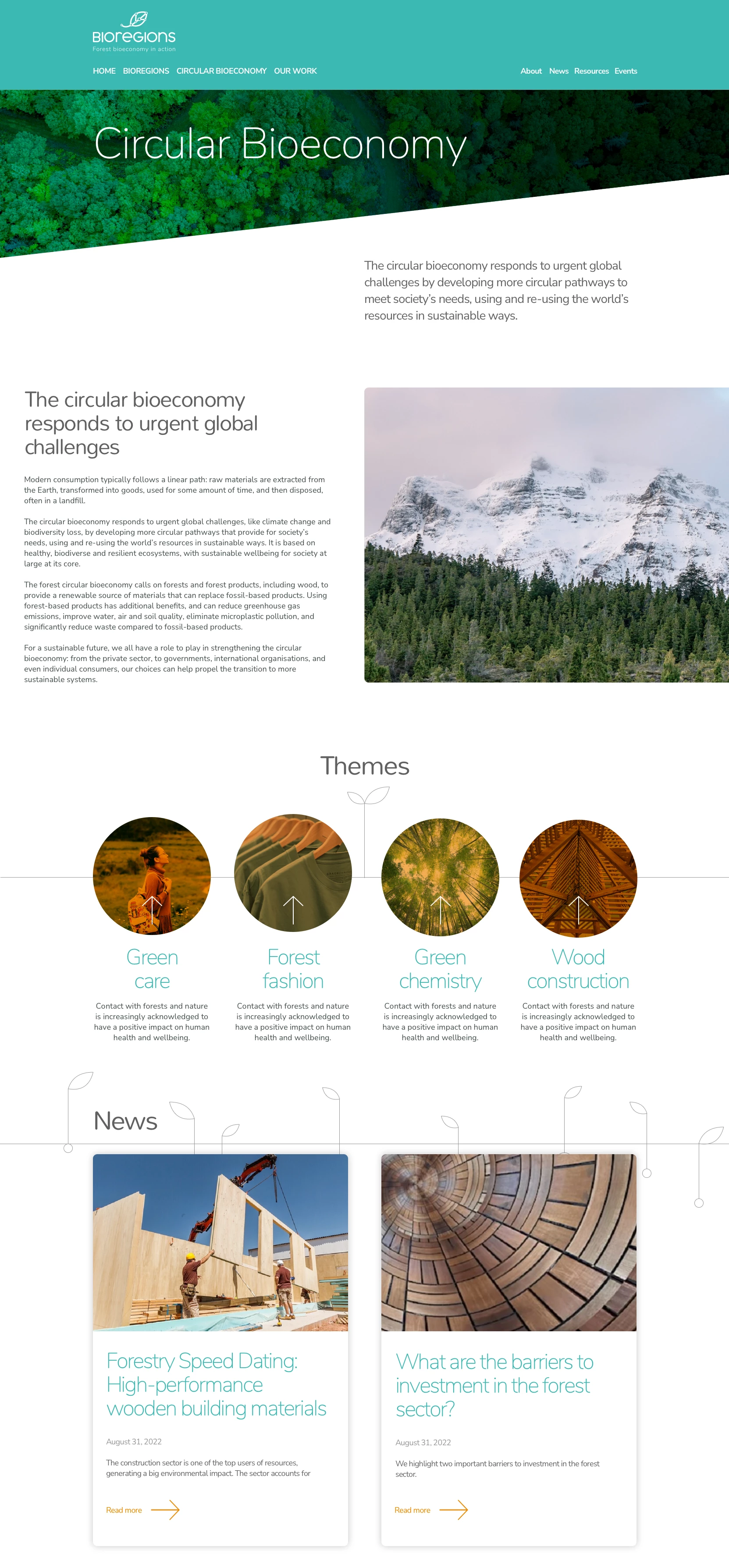
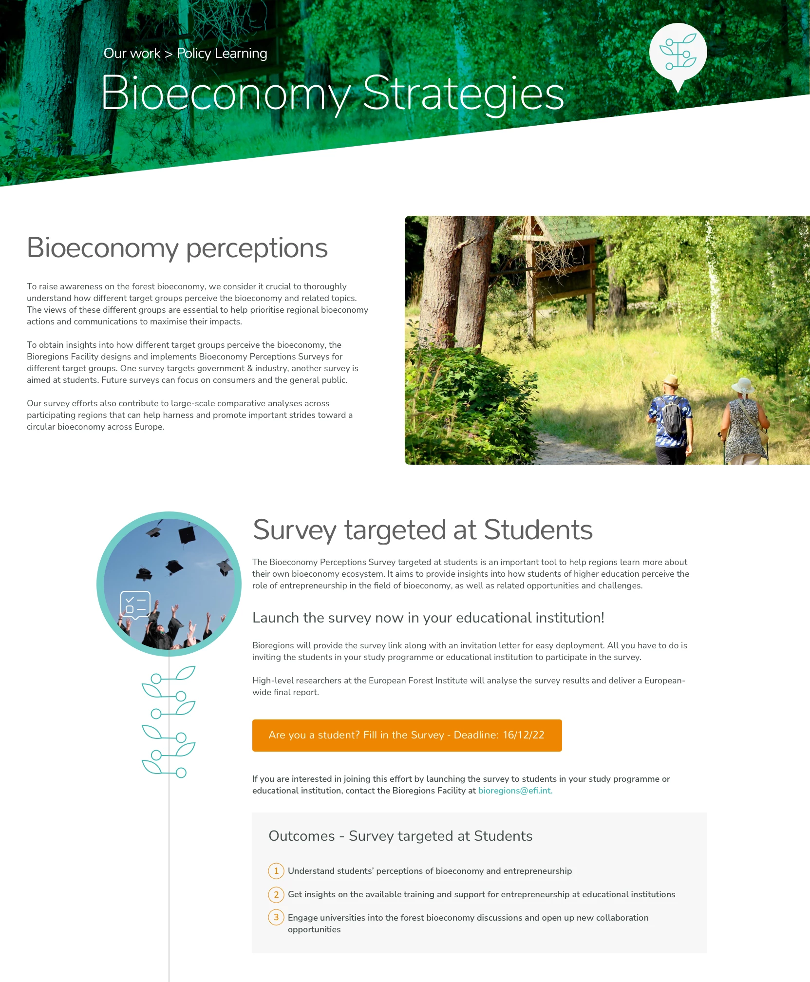
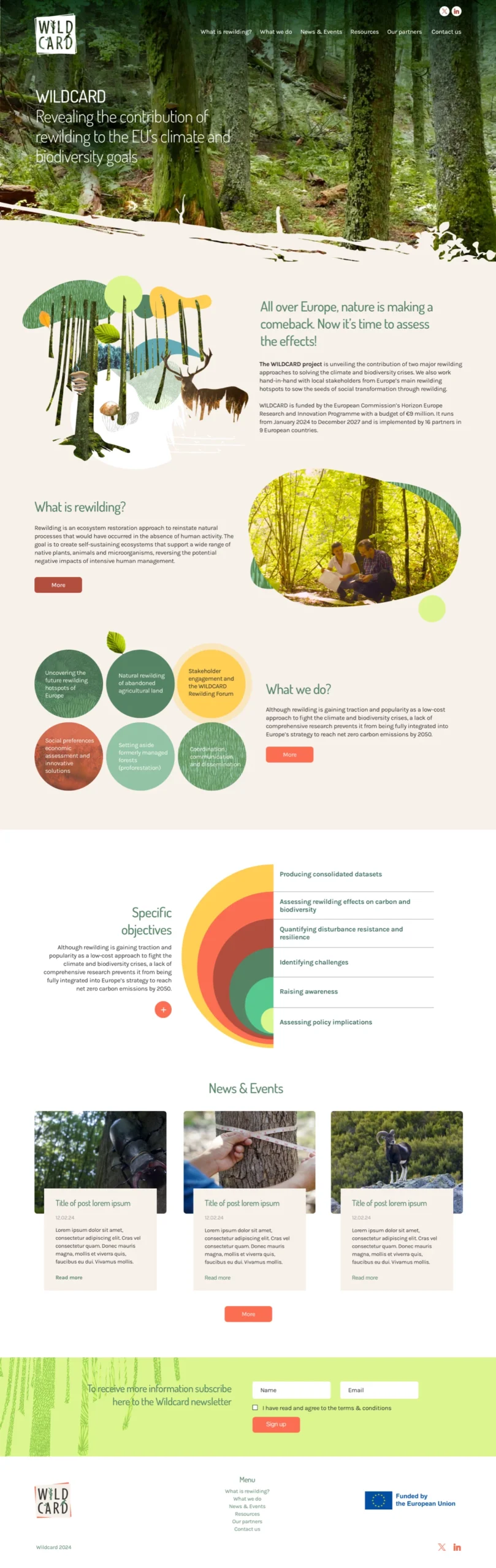
Wildcard Project is a European Forest Institute initiative focused on the natural regeneration of affected ecosystems, promoting biodiversity restoration and the balance of forest environments. The website design needed to reflect this vision of renewal and environmental connection while maintaining coherence with the project’s corporate identity.
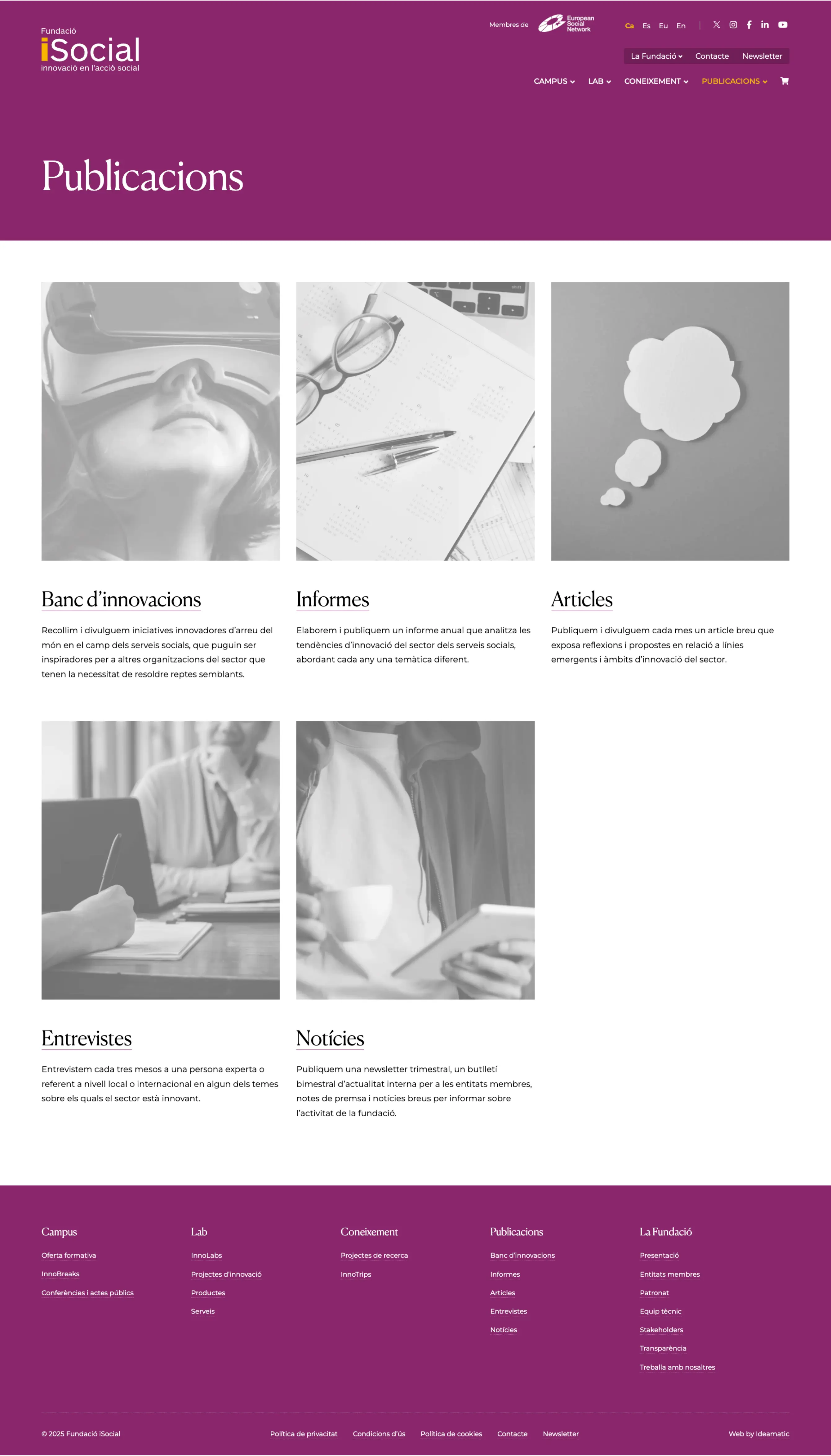
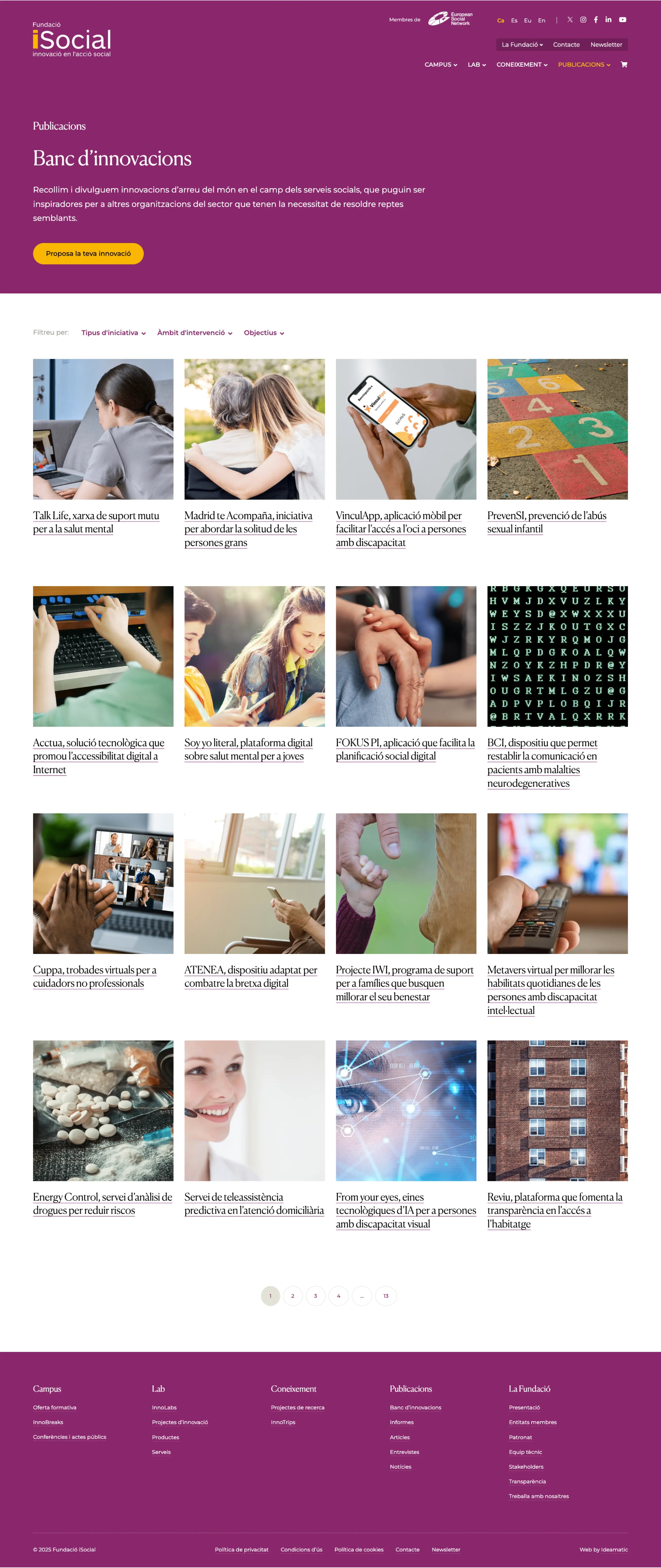
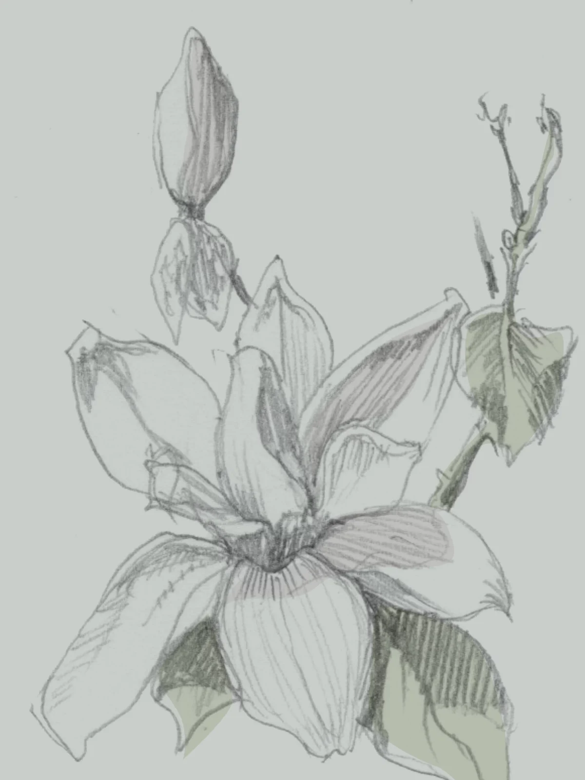
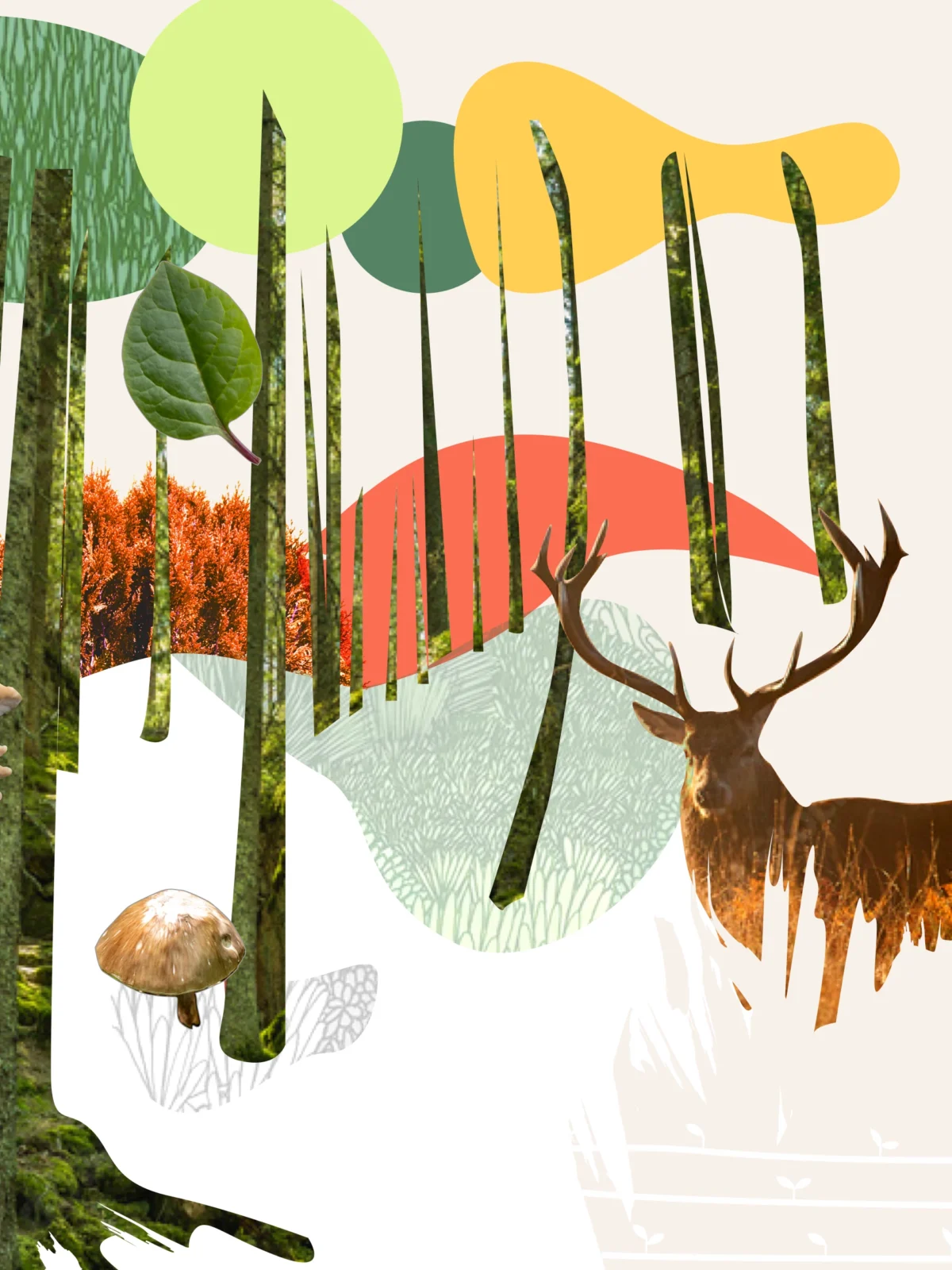
One of the defining aspects of the design was the use of collages and infographics, which visually conveyed key concepts about ecosystem restoration. To ensure visual consistency, we unified the collages with a consistent color palette, rounded shapes, and soft lines. This combination helped maintain a harmonious look throughout the site, creating a visually engaging and smooth user experience.
The final result is a website that blends creativity, functionality, and strong visual identity, providing a platform that not only communicates the mission of Wildcard Project but also inspires visitors to understand the importance of restoring damaged ecosystems.
From the start of the project, we opted for a visual approach that evoked forest ecosystems through a collage that symbolized the diversity and complexity of forests. To bring this concept to life, we carefully selected a mix of photographs, textures, and colored shapes that represented the richness of natural landscapes. These graphic elements were consistently used across the site, creating a cohesive and dynamic visual aesthetic that captured the essence of the project.
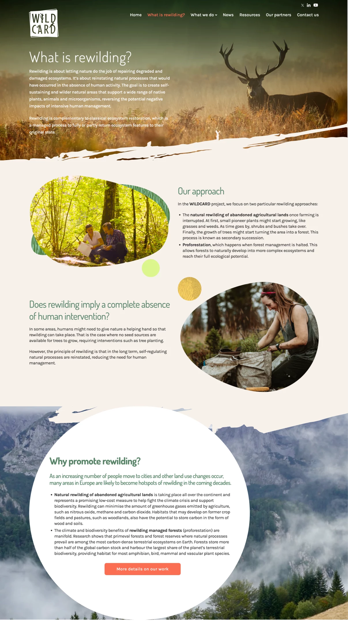
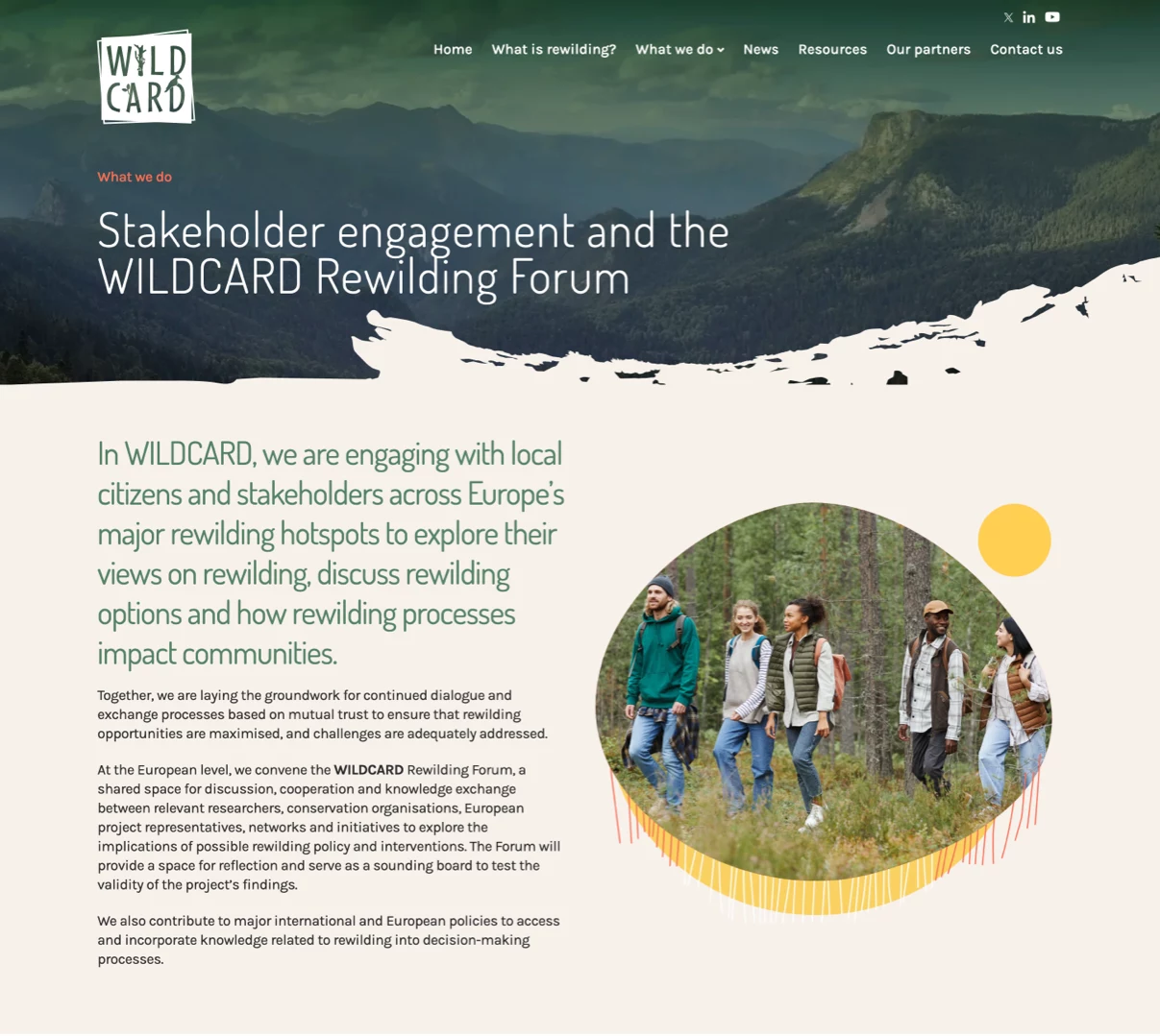
The corporate colors of Wildcard Project served as the foundation for the design, though we had creative freedom to develop additional graphic elements. This flexibility allowed us to explore bold combinations of textures and colors, reinforcing the project’s distinctive character. Nature-inspired images, organic shapes, and earthy tones were integrated to bring to life the concept of regeneration and natural growth.
A key feature of the website was the integration of videos as background visuals, framed by color strokes that acted as borders. This added dynamism to the user experience, making the site more immersive while emphasizing the project’s key visual elements. The videos vividly showcased ecosystems in the process of regeneration, perfectly aligning with the mission of Wildcard Project.