Càritas Andorrana

Càritas Andorrana

Web design and development for Càritas Andorrana, including an online donation system to support vulnerable individuals.

Client

Pampliega & Associats

Year of creation

Website

caritas.ad

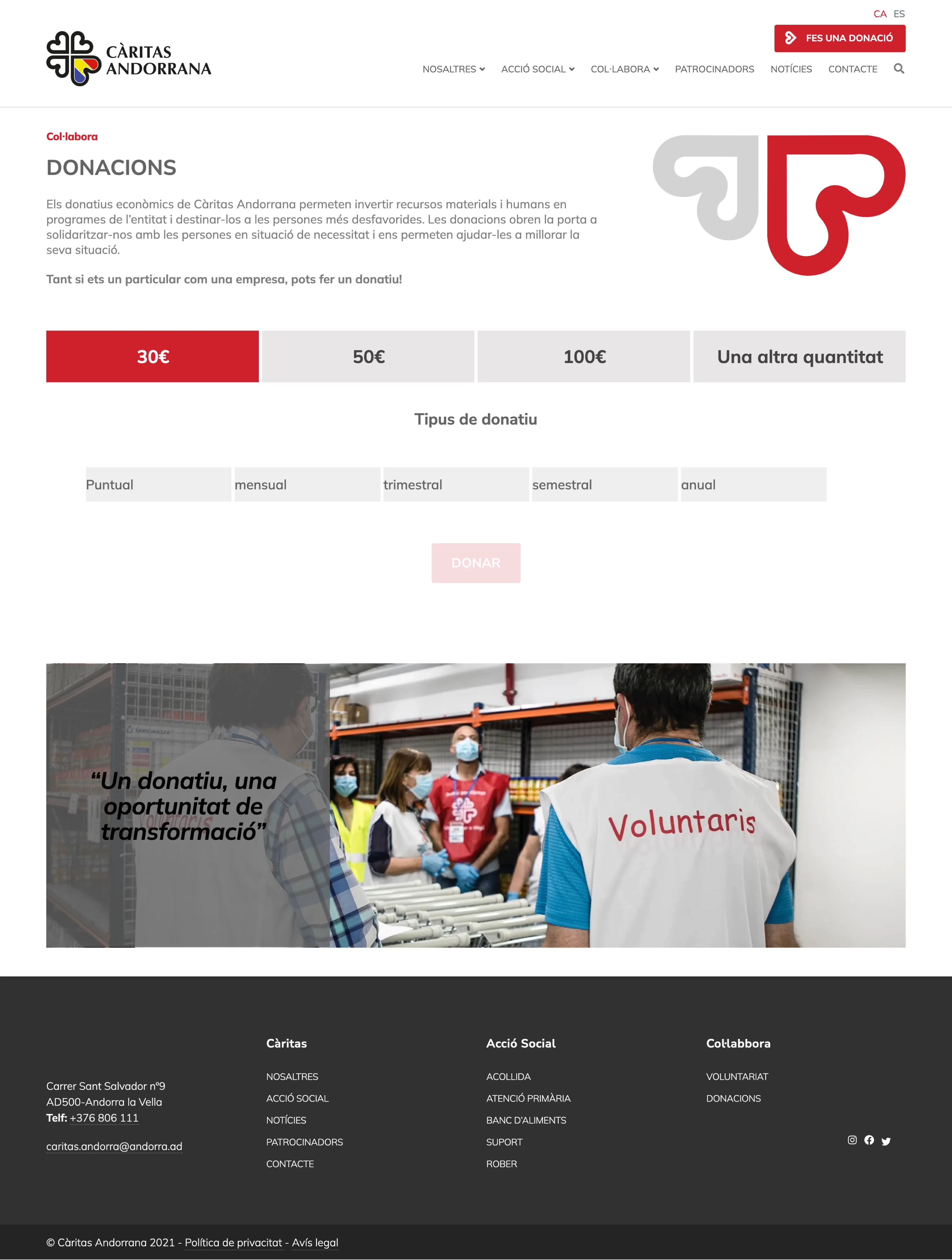
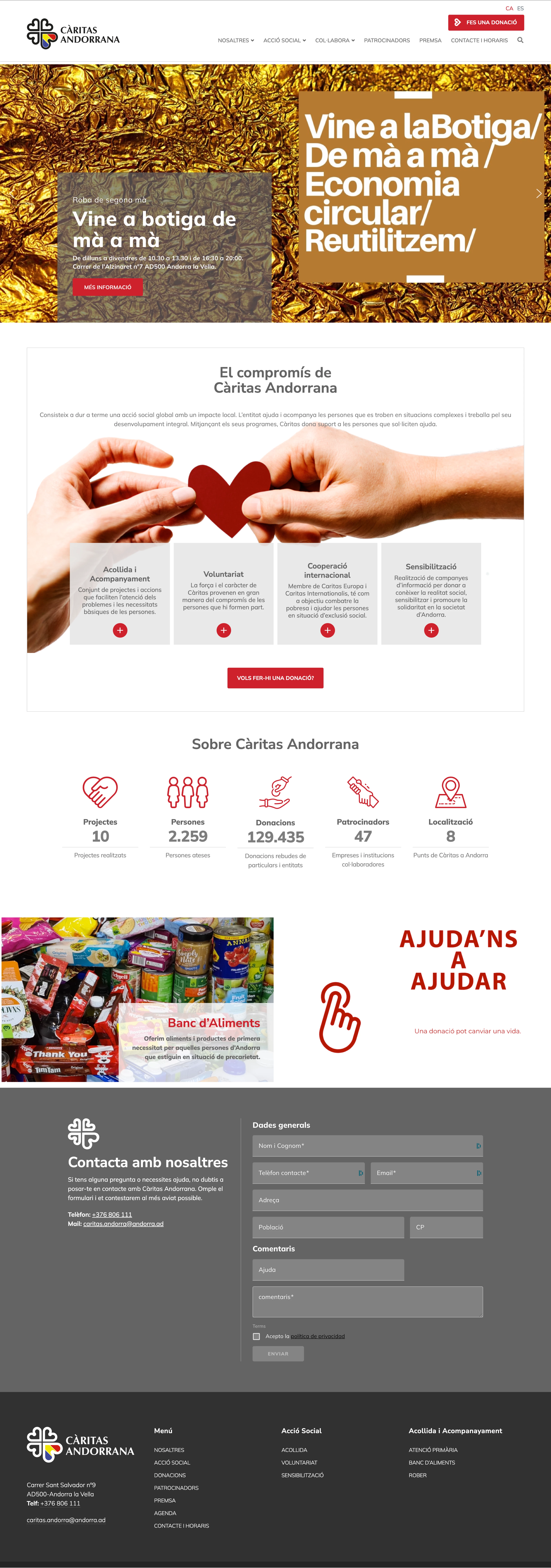
The project for the design and development of Càritas Andorrana’s website was carried out in collaboration with Pampliega & Associats, who had already structured the initial content. The previous website had not been updated or renewed for many years, making it outdated and misaligned both with modern web standards in functionality and accessibility and with the design guidelines of other Càritas websites at the national level.

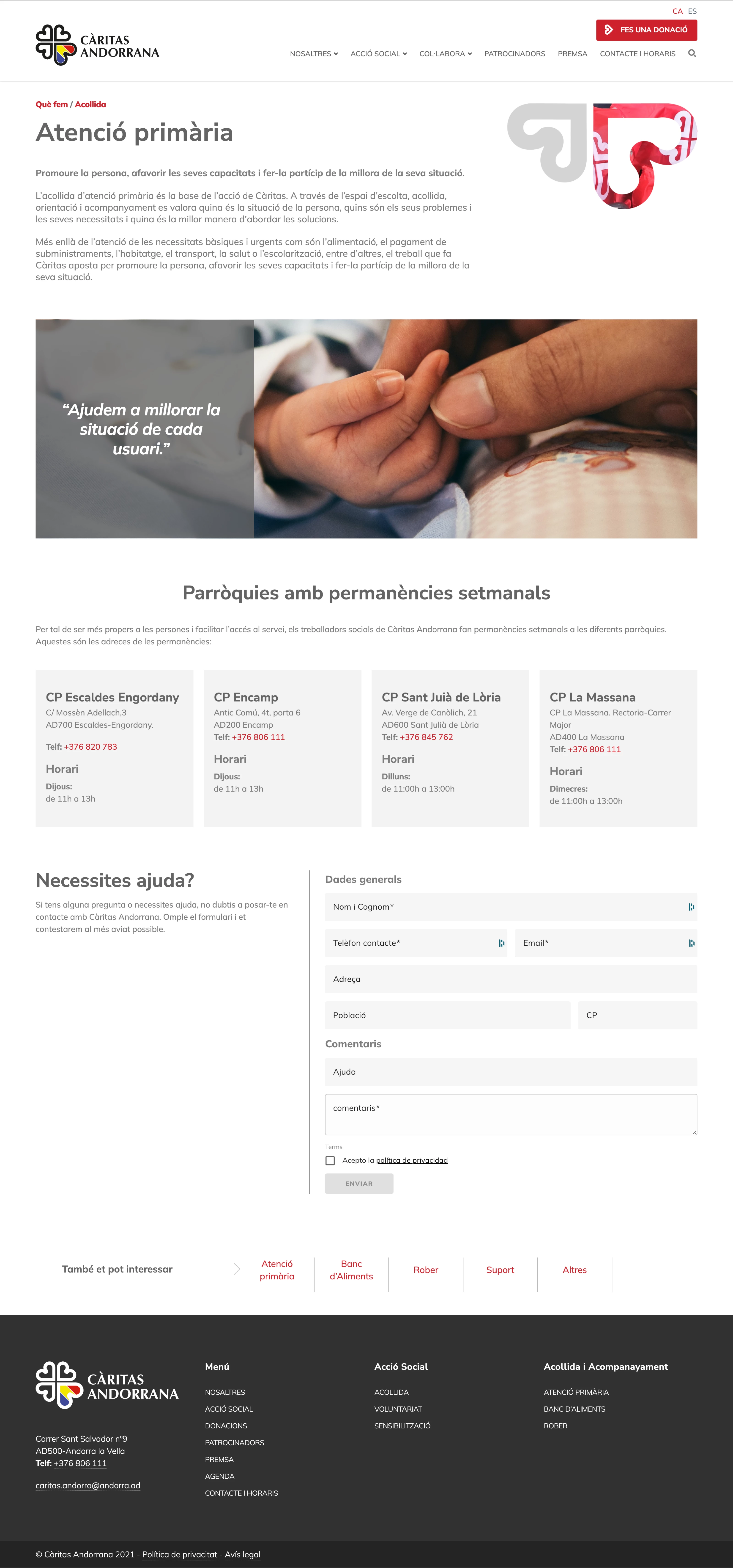
Since there was no specific corporate manual, we analyzed several Càritas websites across Spain to extract key visual references, such as corporate colors, typography, and graphic elements, which served as a foundation for the new design. Based on these insights, we developed a modern and clear user interface, structuring the pages with a combination of large photographs, solid color blocks, generous white space, and prominent headlines to ensure readability and comprehension of key messages.

A central aspect of the project was the development of the online donation system, a crucial element for the institution as it provides a direct way for users to contribute. This system not only made online donations easier but also streamlined the management of offline donations for the organization.

Finally, we placed special emphasis on presenting the institution’s services with a structure that includes constant calls to action, encouraging users to request help or information quickly and easily.
Càritas Andorrana
Càritas Andorrana
Càritas Andorrana

Circular Bioeconomy Alliance

Circular Bioeconomy Alliance

Web project for the European Forest Institute promoting Circular Bioeconomy through healthy, biodiverse, and resilient forest ecosystems.

Client

European Forest Institute (EFI)

Year of creation

Project areas

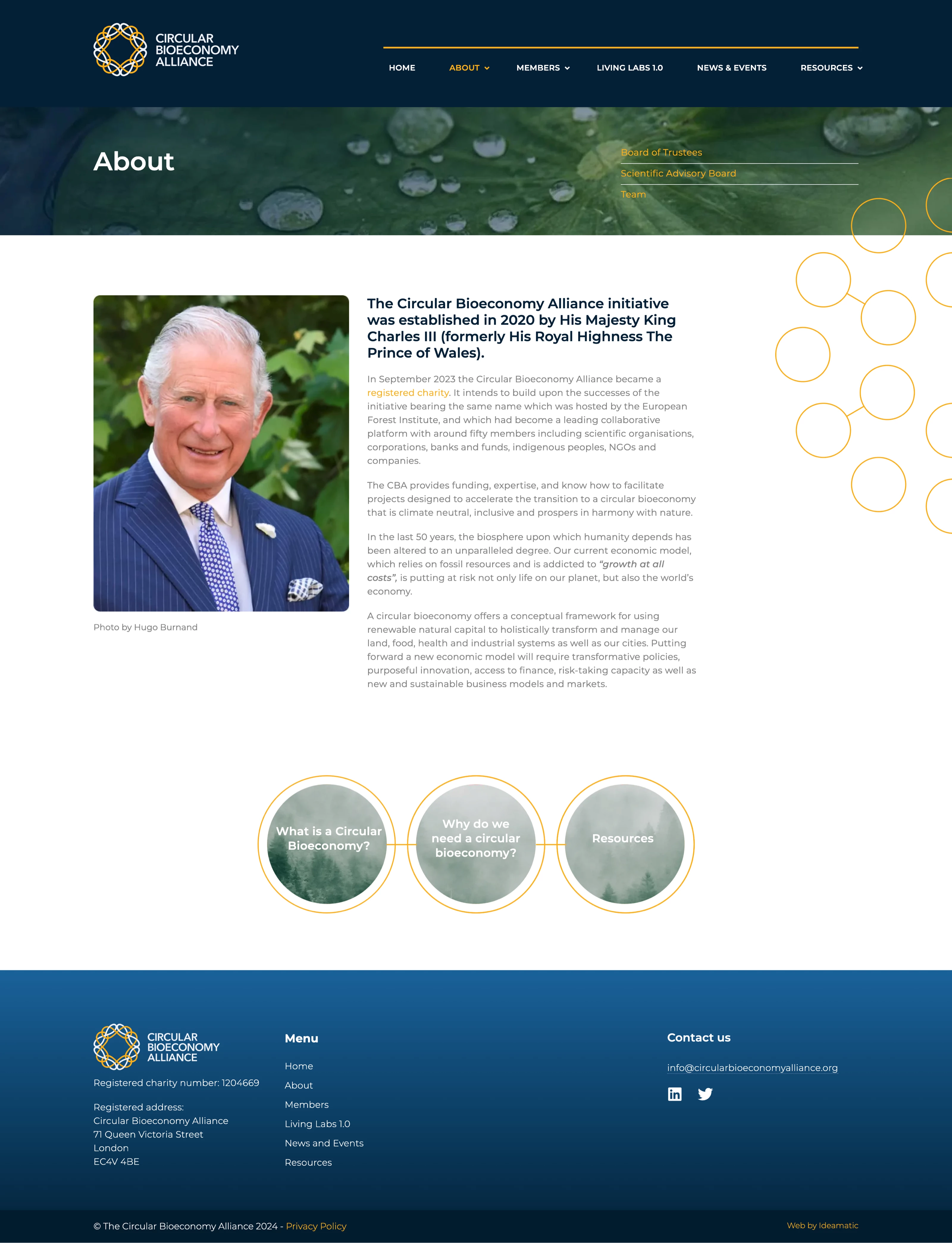
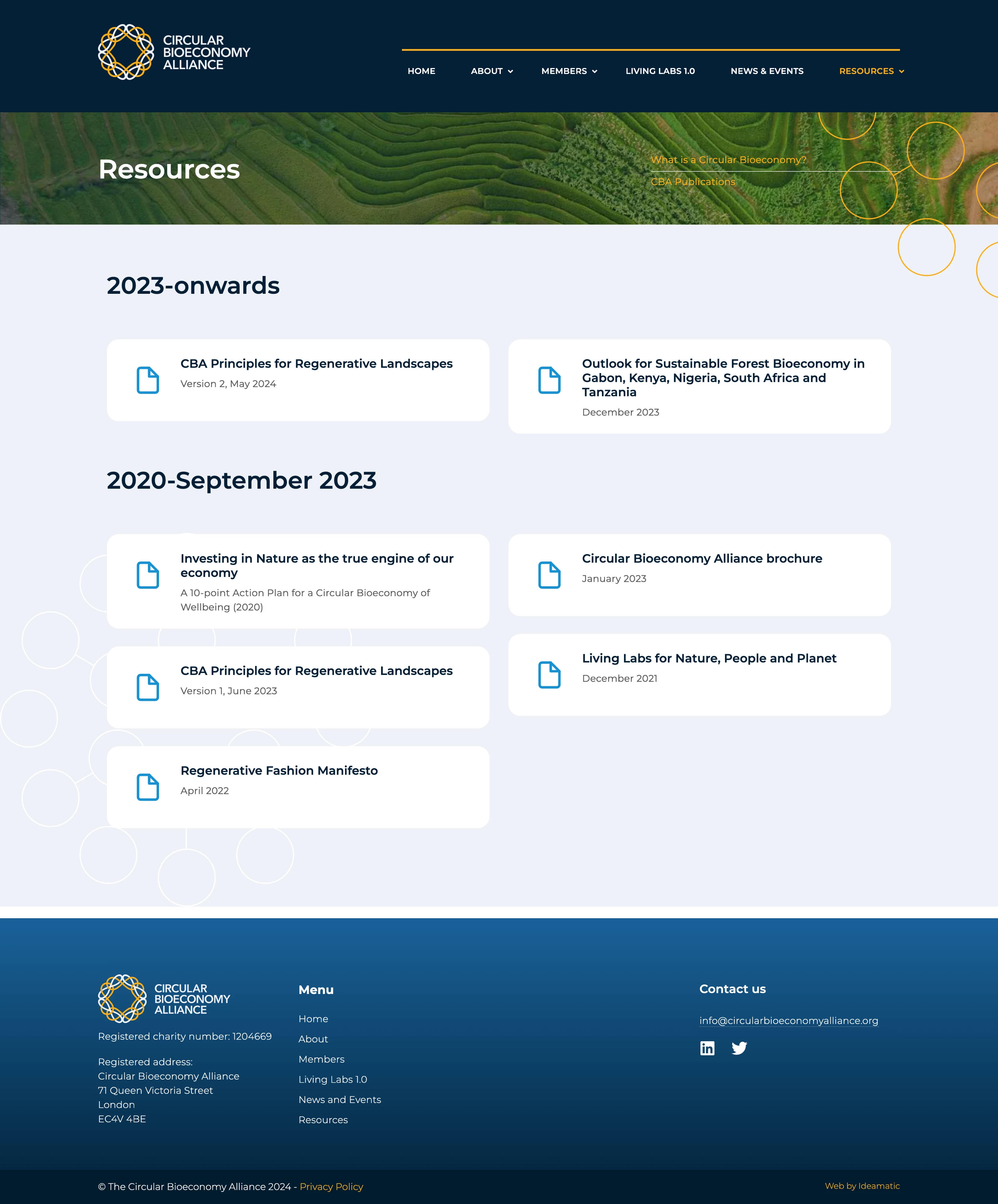
This web project was developed to enhance the communication of the Circular Bioeconomy Alliance, an initiative committed to the sustainability of European forest ecosystems. Based on the corporate identity guidelines provided by the European Forest Institute (EFI), we created a design that not only adhered to the established visual directives but also introduced new graphic elements to enrich the digital experience.

We incorporated custom icons to clearly illustrate different sections of the website, improving content comprehension. The design was structured around circular elements that appear throughout the site, reinforcing the central concept of circularity and the natural cycles that the organization promotes. These shapes are interconnected by subtle lines symbolizing the connection and interdependence of ecosystems.

The color palette and typography were adapted for web use while maintaining consistency with EFI’s institutional identity, ensuring a cohesive visual experience. The result is a website that offers a fluid and clear reading experience, making information easily accessible.

Currently, all EFI graphic materials, including brochures and other resources, follow this same design approach, establishing a strong visual identity aligned with the Circular Bioeconomy Alliance.

Circular Bioeconomy Alliance

Associació Catalana de Professionals de Joventut

Associació Catalana de Professionals de Joventut

New website for the Associació Catalana de Professionals de Joventut, promoting the regulation and rights of youth work professionals.

Client

Associació Catalana de Professionals de Joventut (ACPJ)

Year of creation

Project areas

Website

joventut.info

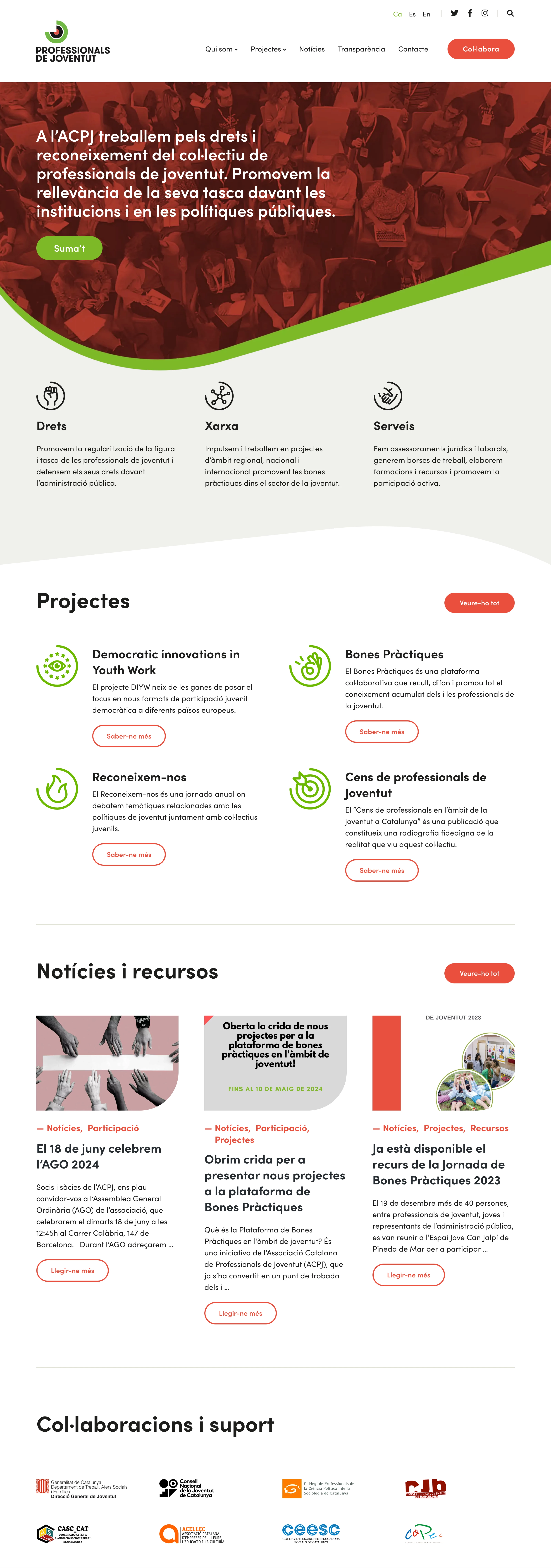
Our collaboration with the association began in 2018 when we took over the technical maintenance of their old website. In 2021, coinciding with the launch of their new corporate identity, we were commissioned to create a new website that better suited their needs.

The old website had several issues, mainly due to its outdated structure. The most obvious problem was its obsolete design, which no longer reflected the association’s current reality. Additionally, the content distribution was confusing and disorganized, making it difficult for visitors to find relevant information such as the organization’s projects, news categories, or key areas of action.

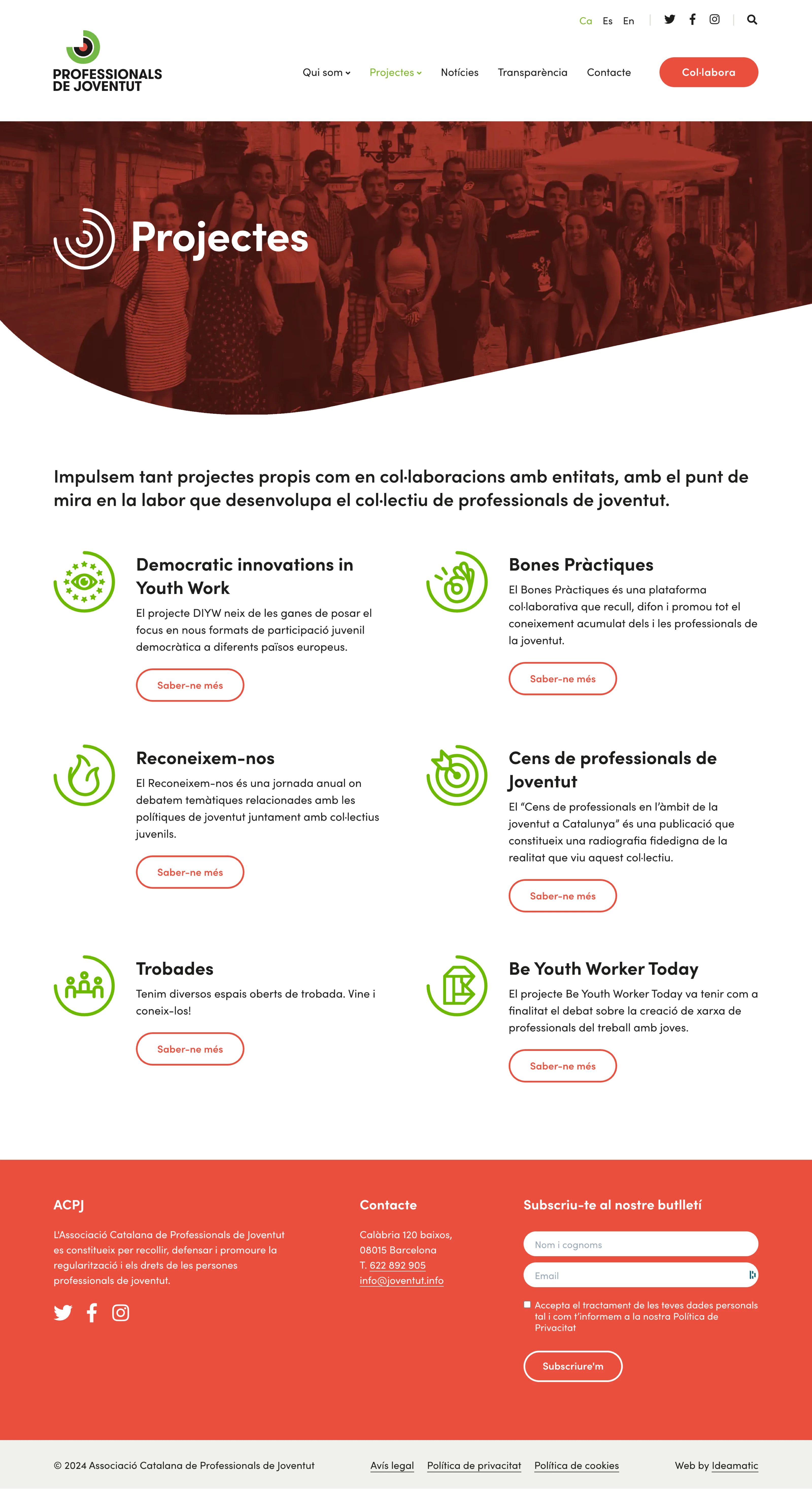
The goal of the new website was twofold: first, it needed to align with the new corporate identity to strengthen brand recognition through a modern and visually appealing design; second, it required a restructuring of the content through a prior information architecture study, ensuring a clearer hierarchy that made information more accessible and understandable.

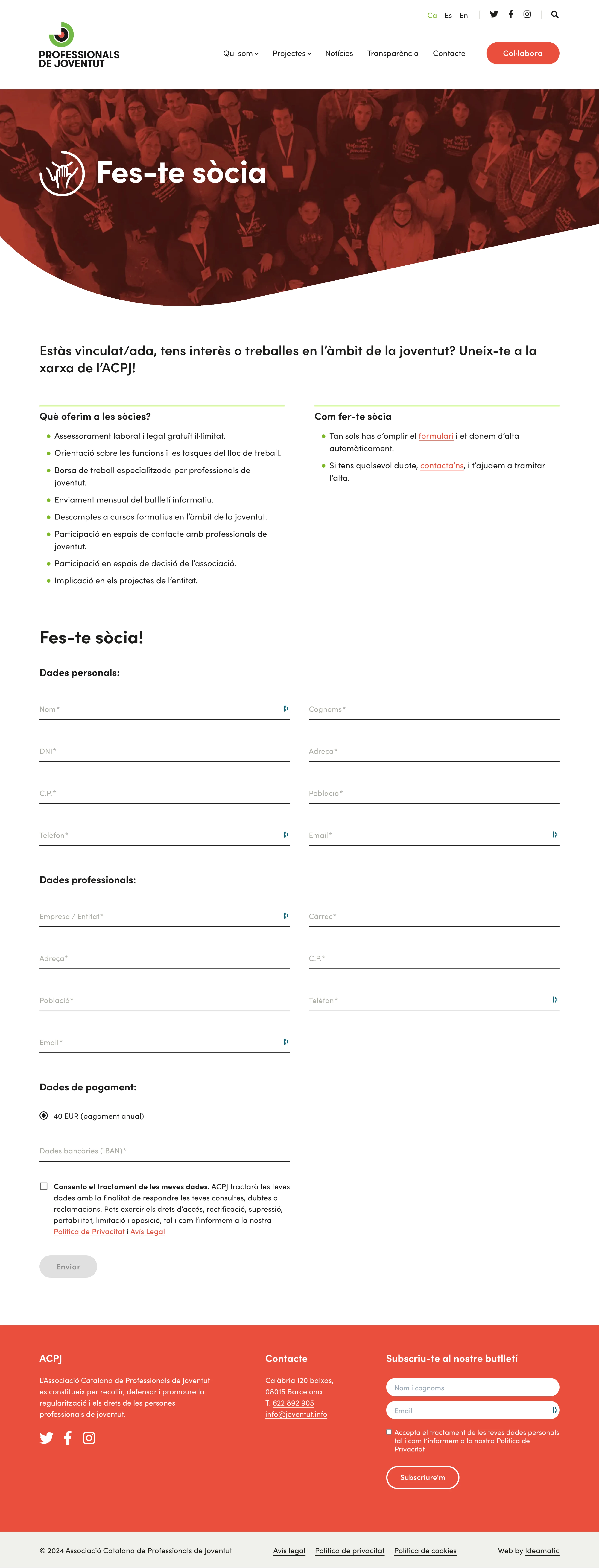
The new website also addressed a major shortcoming of the previous version: it significantly improved visibility for calls to action, encouraging new memberships and making the registration process smoother and more direct through the site.

Associació Catalana de Professionals de Joventut

Atelier de Chronométrie

Atelier de Chronométrie

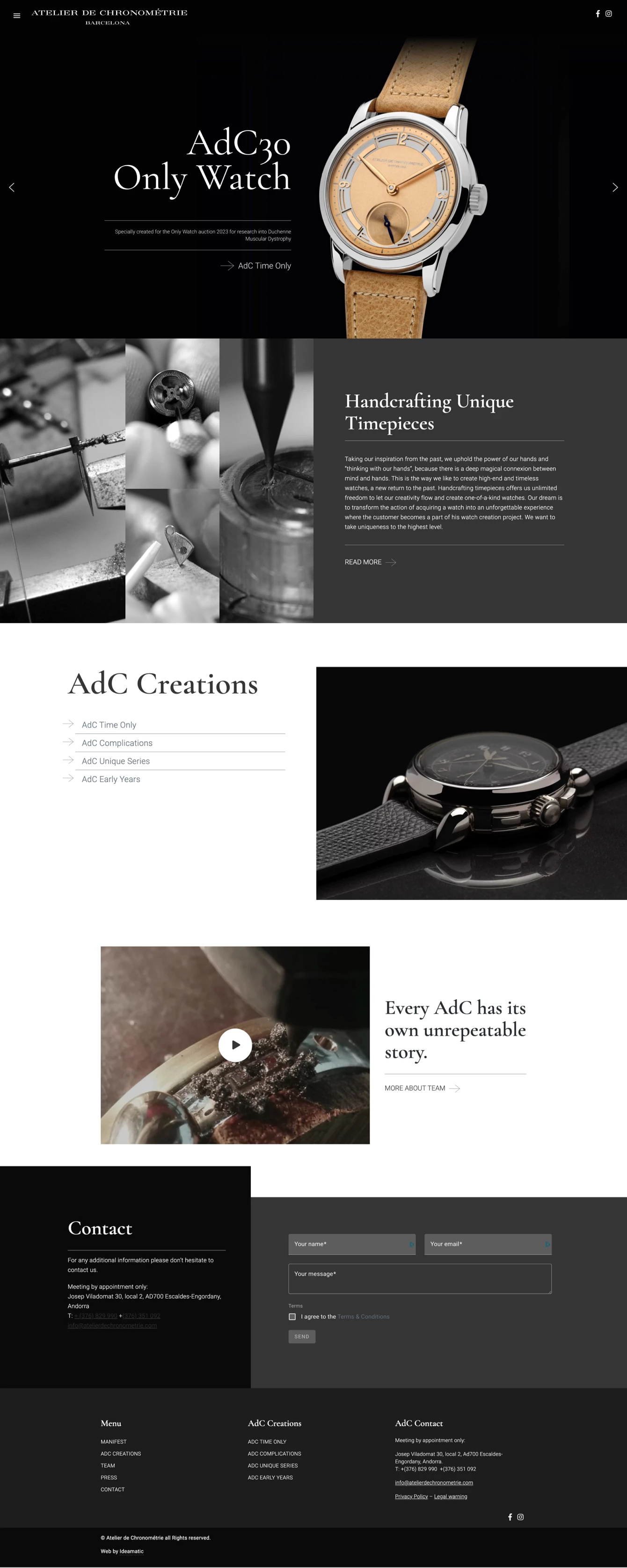
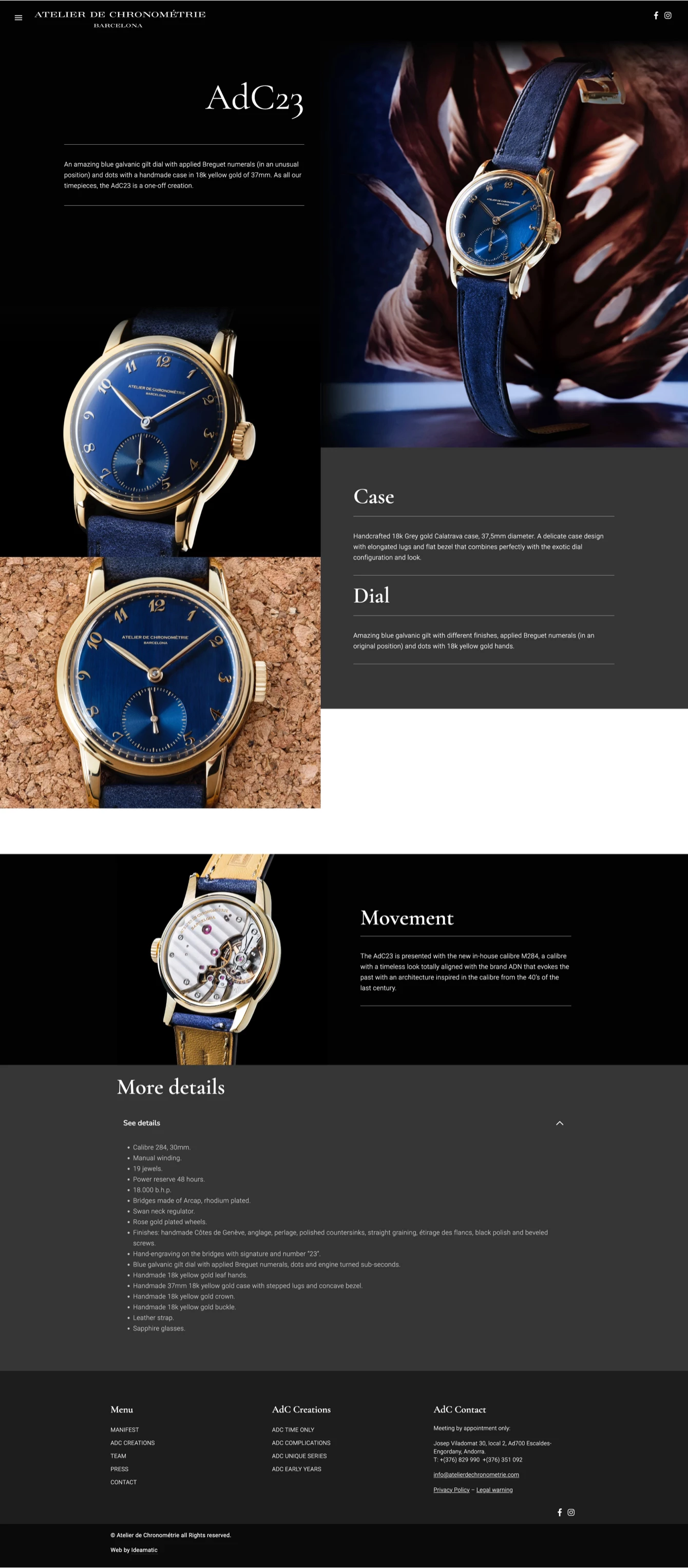
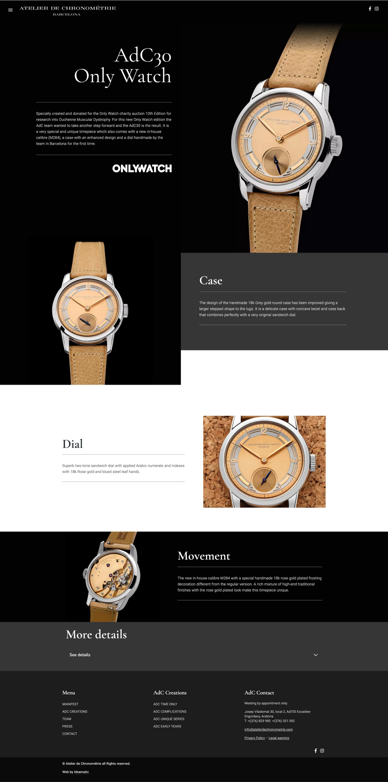
Web design and development for Atelier de Chronométrie, a Barcelona-based company crafting high-end, handmade vintage-inspired watches.

Client

Atelier de Chronométrie

Year of creation

Project areas

Our collaboration with Atelier de Chronométrie had been ongoing for several years, starting with the design of the website for Mimandcrocket, another company specializing in vintage-style watchmaking. This long-term partnership allowed us to gain deep insight into both their products and their craftsmanship.

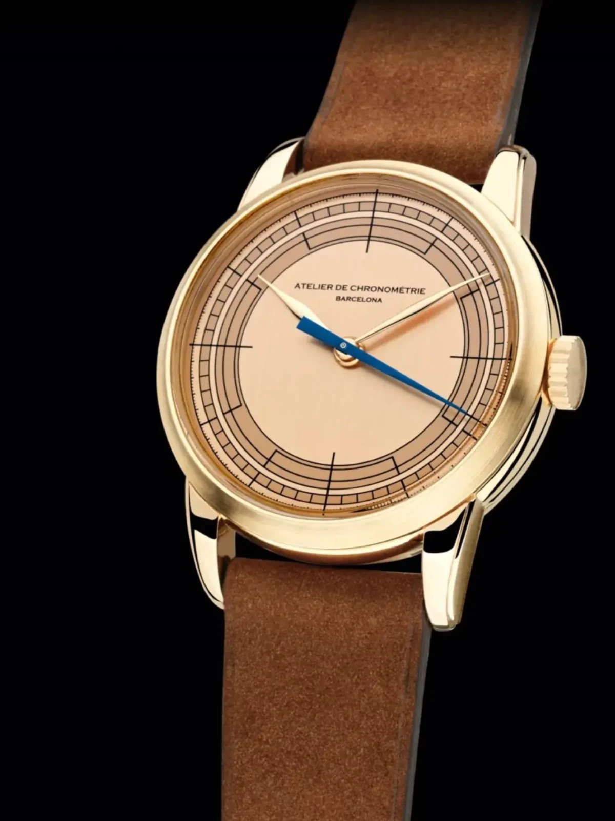
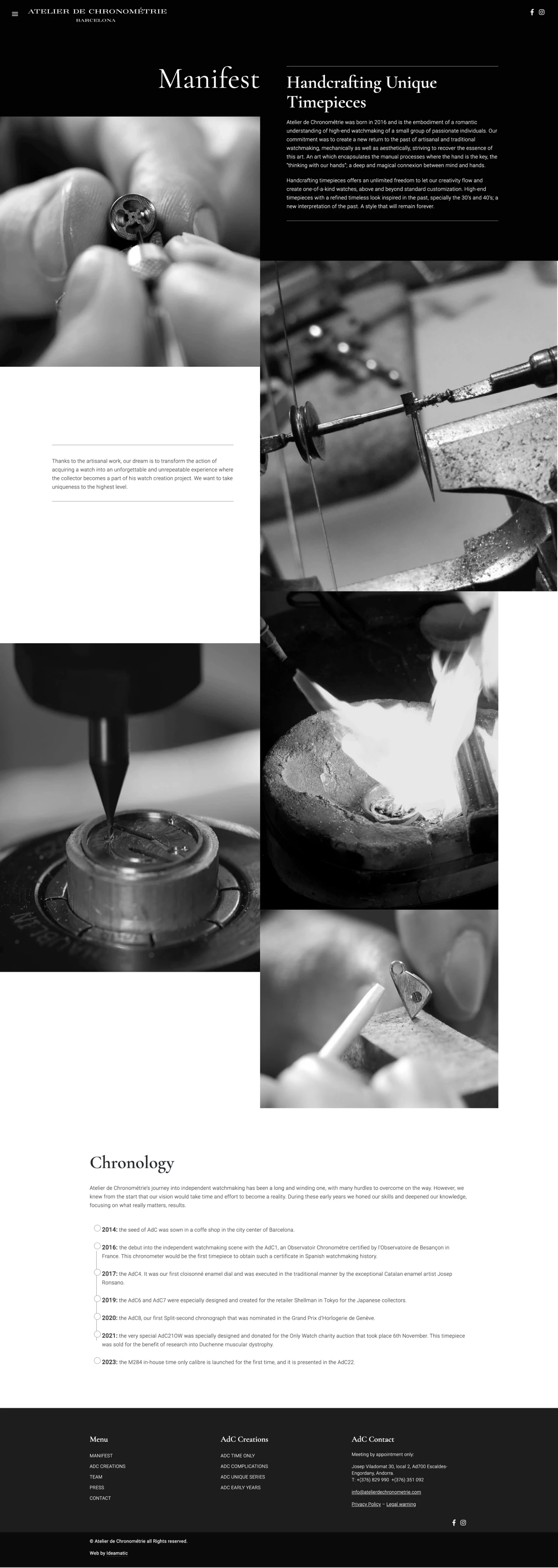
The Atelier de Chronométrie website was designed with the goal of conveying simplicity in messaging while establishing a flexible architecture that would allow for the easy creation of new pages for future watch models, without being constrained by a rigid design.

The client provided high-quality images, which became the focal point of the website, emphasizing product photography to highlight every intricate detail of the watches. Additionally, we showcased images of the manufacturing process, capturing the precision and craftsmanship involved in every piece.

Atelier de Chronométrie

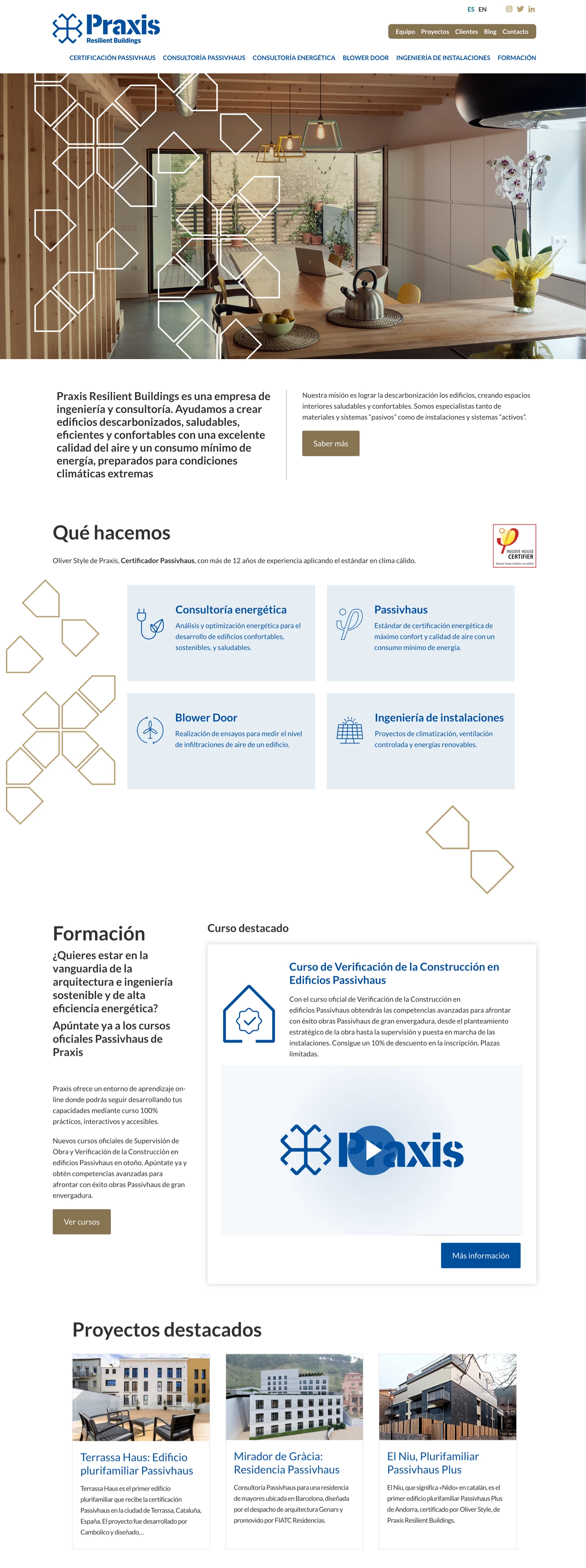
Praxis

Web design and development for Praxis Resilient Buildings, an engineering company focused on healthy and energy-efficient buildings.

Client

Praxis Resilient Buildings

Year of creation

Website

praxis-rb.com

Praxis Resilient Buildings specializes in engineering, energy consulting, and Passivhaus certification, dedicated to creating sustainable, healthy, and efficient buildings.

The website project was completed in two phases: in the first phase, a basic website was developed, along with the integration of an online course platform, allowing users to easily access specialized training.

In the second phase, a content strategy and SEO consultancy was conducted, during which the website’s content and structure were adapted to optimize its search engine ranking, improving visibility and attracting new clients. Additionally, further design modifications were made, refining the layout to meet the company’s needs and reinforcing its visual identity to clearly and attractively communicate its values of sustainability and efficiency.

Pàgina d'inici web Praxis
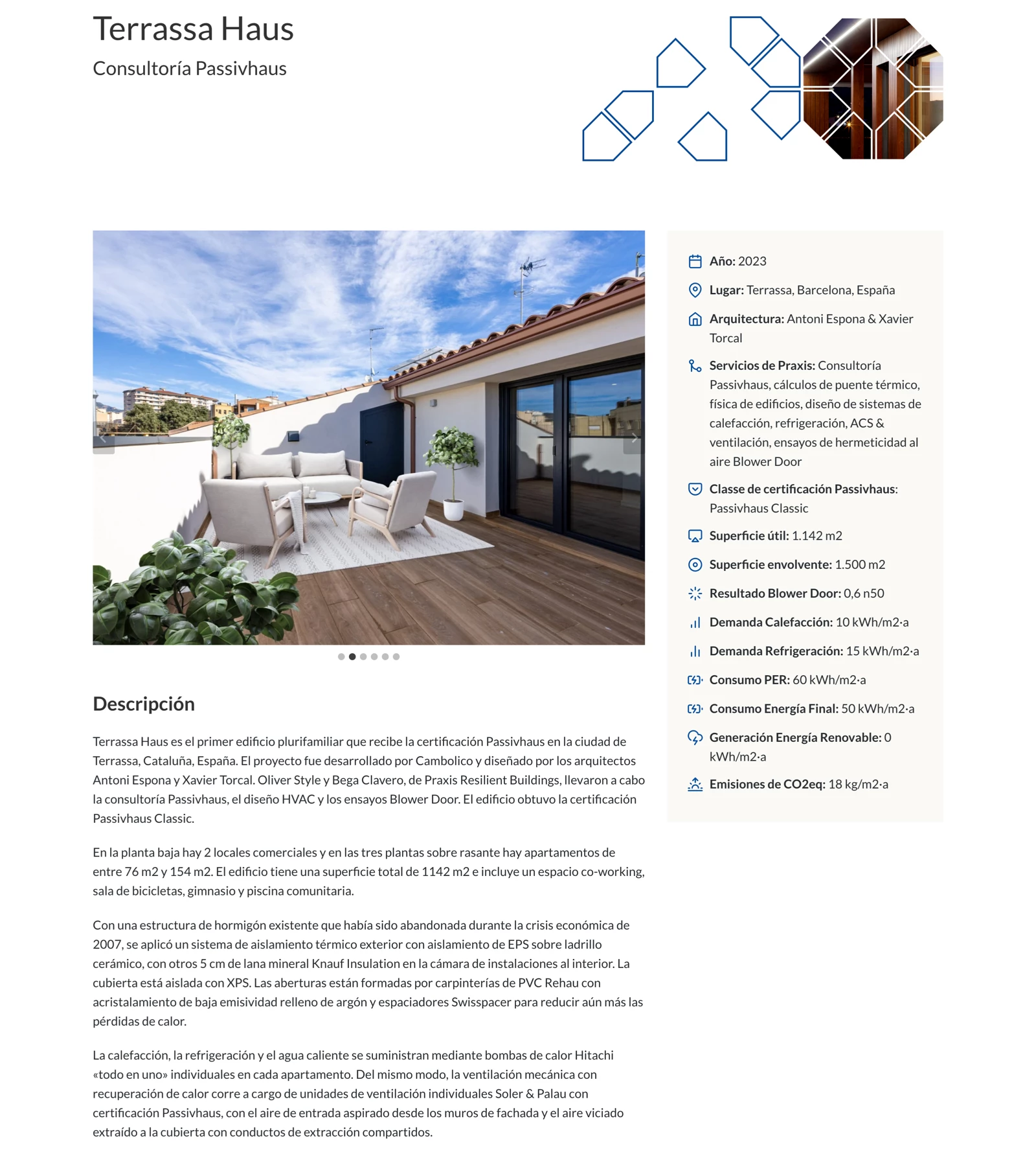
Detall web Praxis
Detall web Praxis

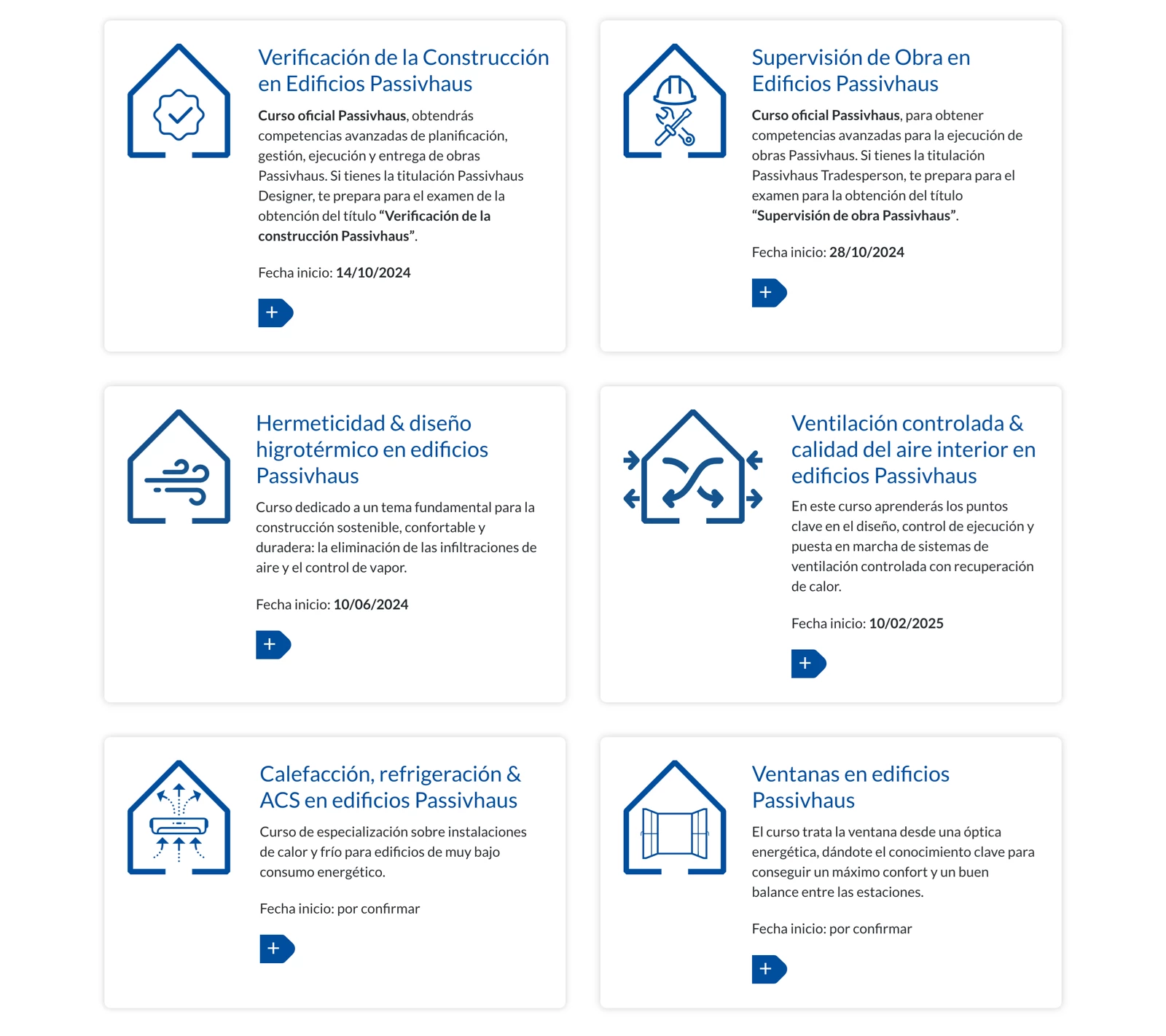
We designed custom icons to represent the different services and online courses, ensuring graphic consistency with the overall design and enhancing user navigation.

QSL Serveis Culturals

Web design and development for QSL as part of its corporate identity renewal. Founded in 1995, QSL manages public service projects in culture, education, and participation.

Client

QSL Serveis Culturals

Year of creation

Website

qsl.cat

This project marks the culmination of a collaboration that began years ago with the redesign of QSL’s corporate identity.

The previous website had numerous shortcomings: it featured an outdated design, was not responsive, and lacked proper SEO optimization. It did not include meta tags, its content was not easily indexable, and despite QSL’s significance, the website had little visibility in Google search results.

Our primary task was to create a new website using WordPress to resolve these issues, aligning it with the organization’s new corporate identity while presenting its areas of work, services, and key projects in a clear and intuitive way.

As with similar projects, the website’s creation was structured into consecutive phases, beginning with analysis, strategic definition, and prototyping.

Prototypes or wireframes serve as preliminary structure and content distribution proposals before the design phase. They allow for a strategic overview, defining content hierarchy and user navigation paths.

Based on the strategic definition and prototyping phase, a custom design was developed that perfectly aligns with QSL’s new corporate image. The website emphasizes key areas such as news and updates, fields of work, services, and completed projects.

QSL Serveis Culturals

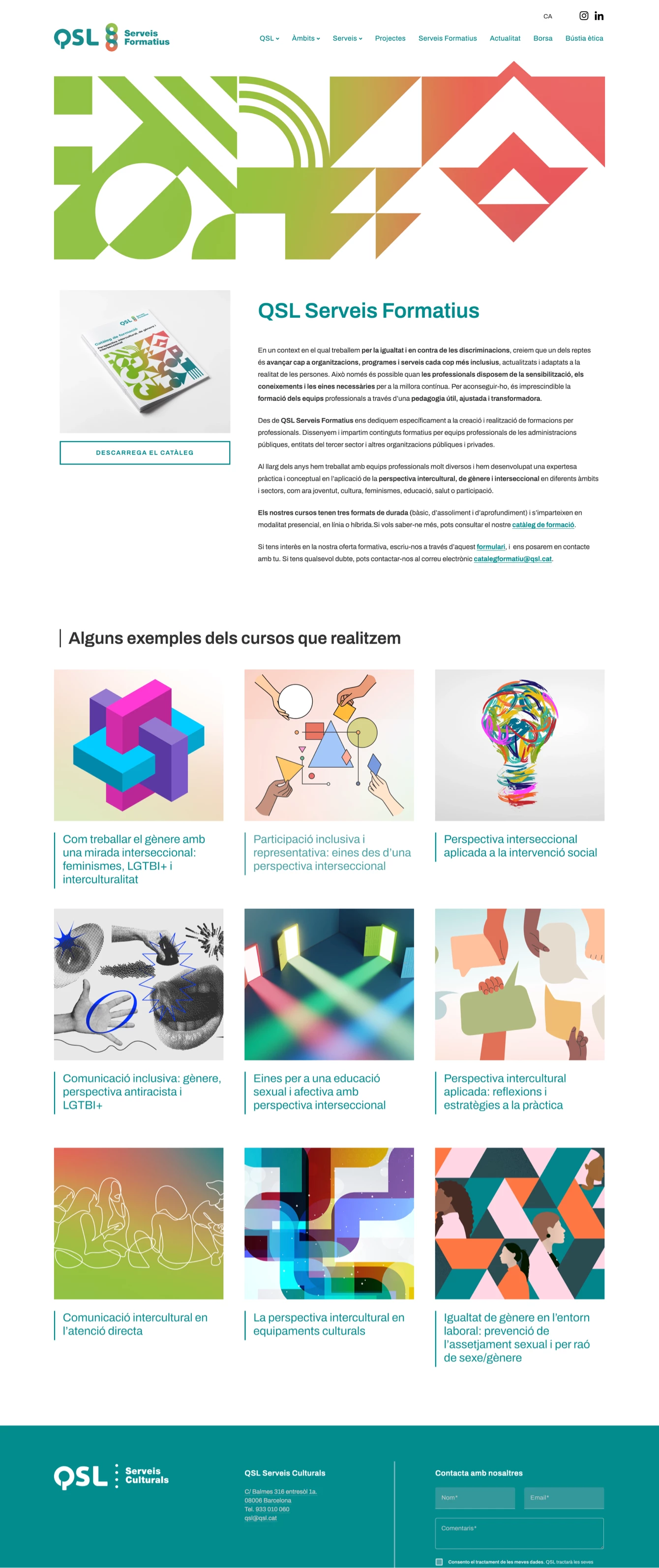
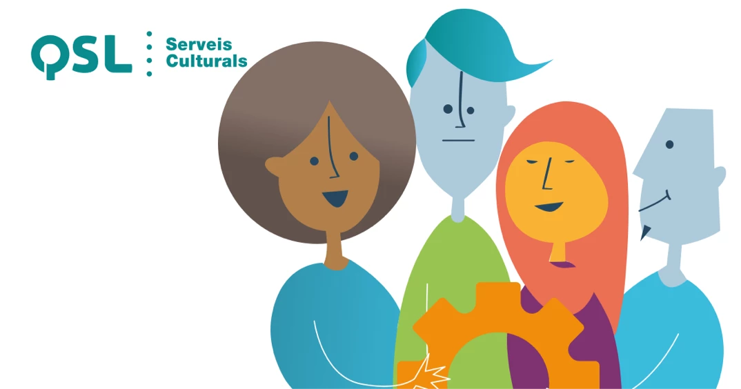
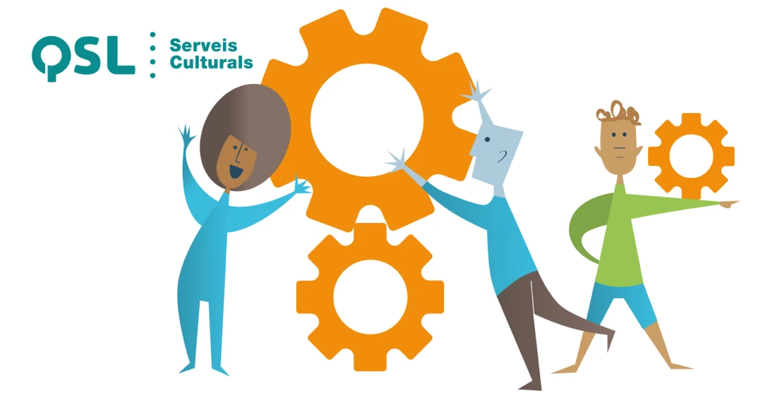
For the Services section, we also designed a custom set of illustrations that give the website a distinct personality—something that would have been difficult to achieve with stock photography alone.

8 Artist Management

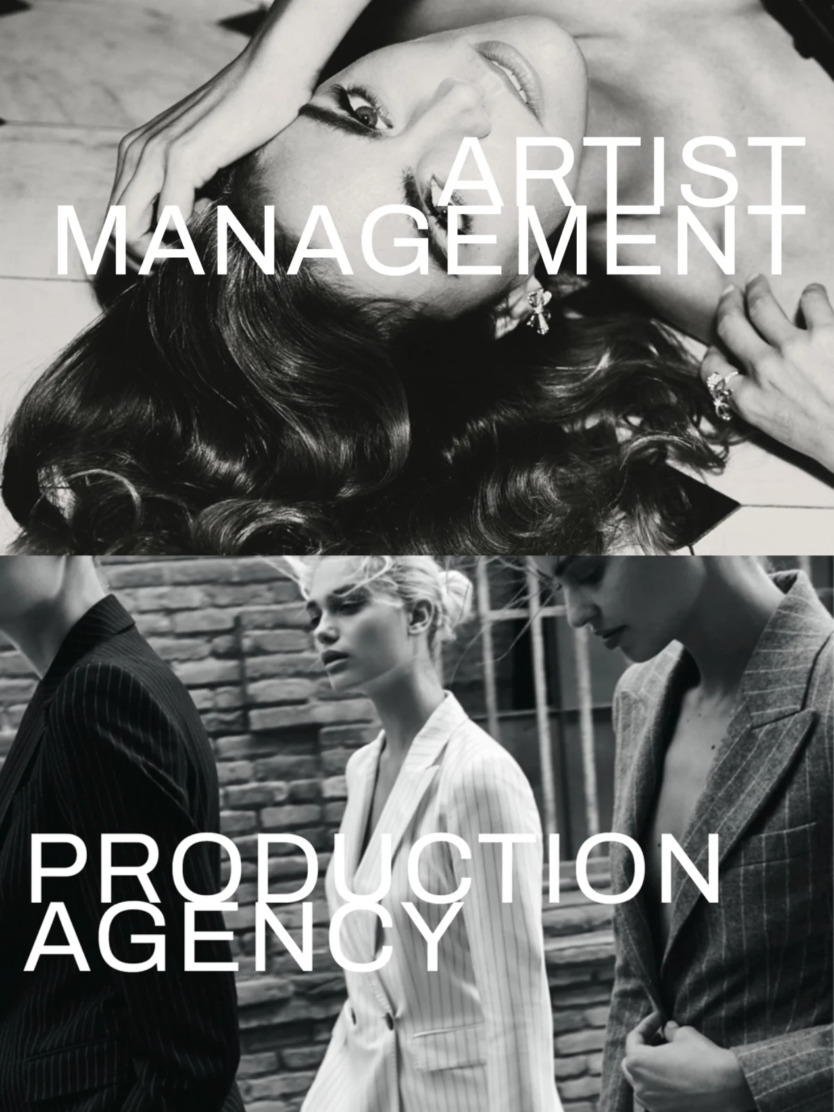
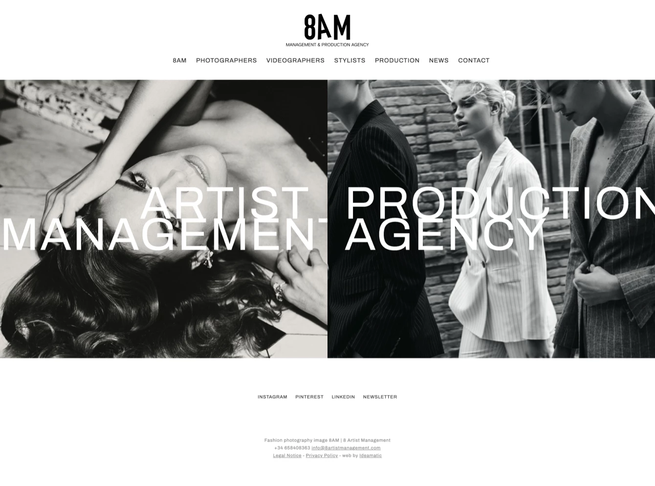
Corporate website design and development for 8 Artist Management, primarily focused on showcasing the portfolios of the artists it represents through their photography and video projects. The project also included the design of the logo, defining a cohesive brand identity.

Client

8 Artist Management

Year of creation

8 Artist Management is an agency representing photographers, videographers, and stylists on both a national and international scale. Their previous website had compatibility issues with newer WordPress formats, and with an internal evolution within the company, they decided to develop a new site with a structure that allows for the continuous addition of new artists and projects.

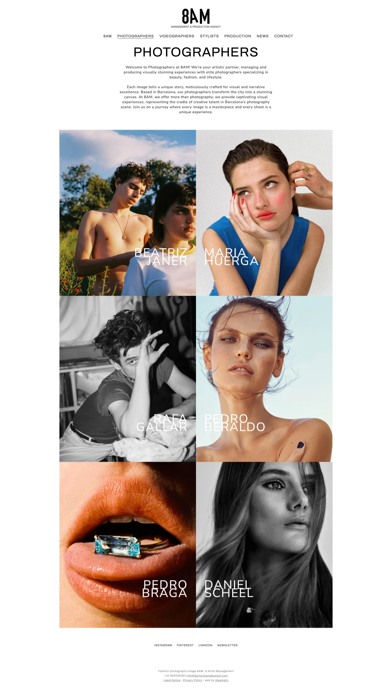
The new website was designed with an architecture that categorizes artists by their specialty, giving each of them an individual page featuring their projects in a portfolio-style format.

For the design, we opted for a minimalist approach since the site is primarily intended to display a large volume of visual content from client portfolios. One of the key graphic elements considered was the treatment of title line spacing, adjusting it so that text lines remained connected, forming a unified graphic element similar to a logo for each artist’s name.

We also redesigned the logo, using a finer typeface with increased spacing between letters, achieving a more cohesive and harmonious integration with the overall web design.

8 Artist Management
8 Artist Management
8 Artist Management

European University (eUniv)

European University (eUniv)

Web design and development for the European University (eUniv). The project’s objective was to increase online visibility for this online university by clearly and systematically presenting all the educational information it offers.

Client

Universitas Europaea IMF

Year of creation

Website

euniv.eu

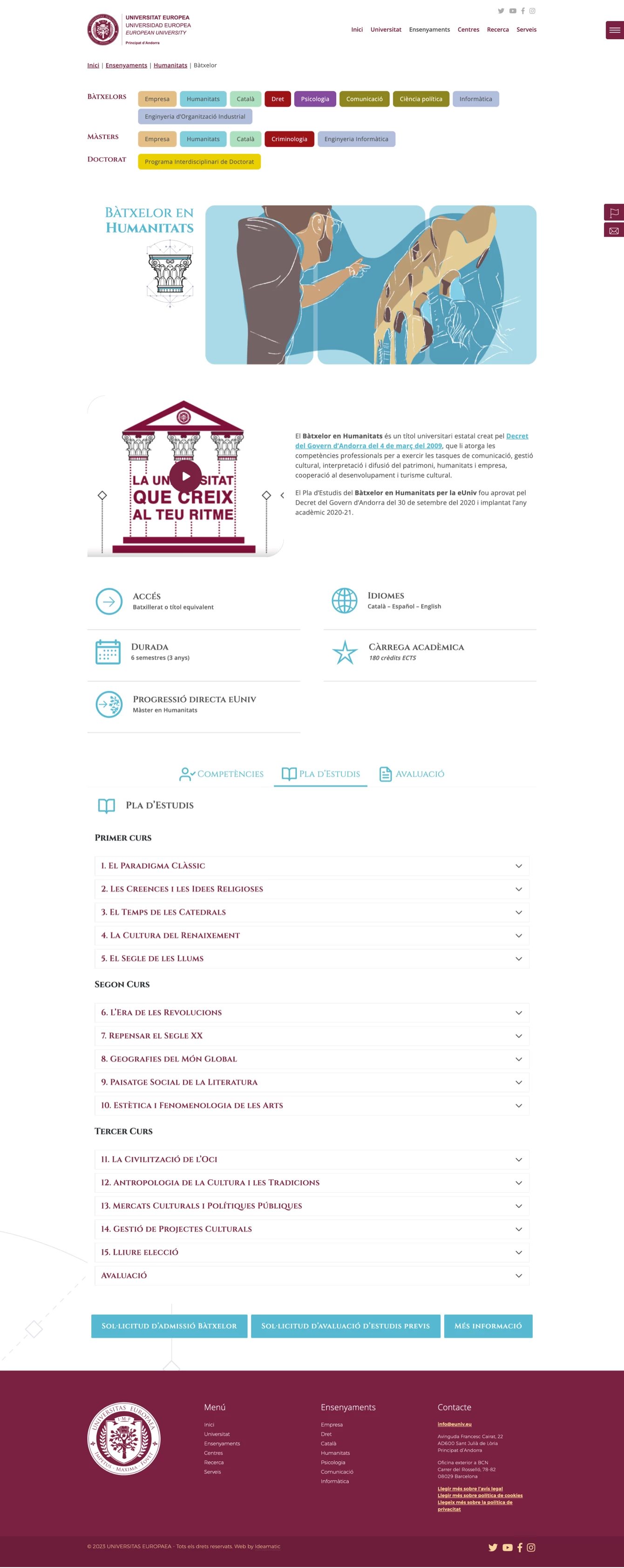
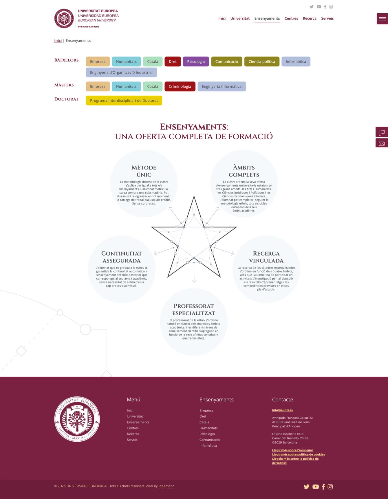
The European University (eUniv) website project was initiated with the idea of creating a platform that would enable the university’s growth and display a set of restructured content derived from its old website, highlighting both the university’s organizational model and its entire educational offering.

Based on this, a forward-thinking, fully flexible design was implemented that allows new content to be showcased or the prominence of certain sections to be modified as the project evolves.

We were provided with corporate design guidelines that needed to be incorporated, such as the training iconography and decorative initials.

From this, other graphic elements were developed: backgrounds with lines and dots, elements with rounded edges, a range of colors, etc.

EUNIV Universitat Europea

In the training section, the client required an individual color scheme for each field, as well as a specific illustration for each sector. A different graphic treatment was chosen for each illustration, using as a guiding element the three vertical base rectangles that represent the progression of studies: Bachelor, Master, and Doctorate.

These shapes change color according to the type of training. For the illustrations, various techniques were employed, such as vector drawing, pencil, markers, and watercolor.

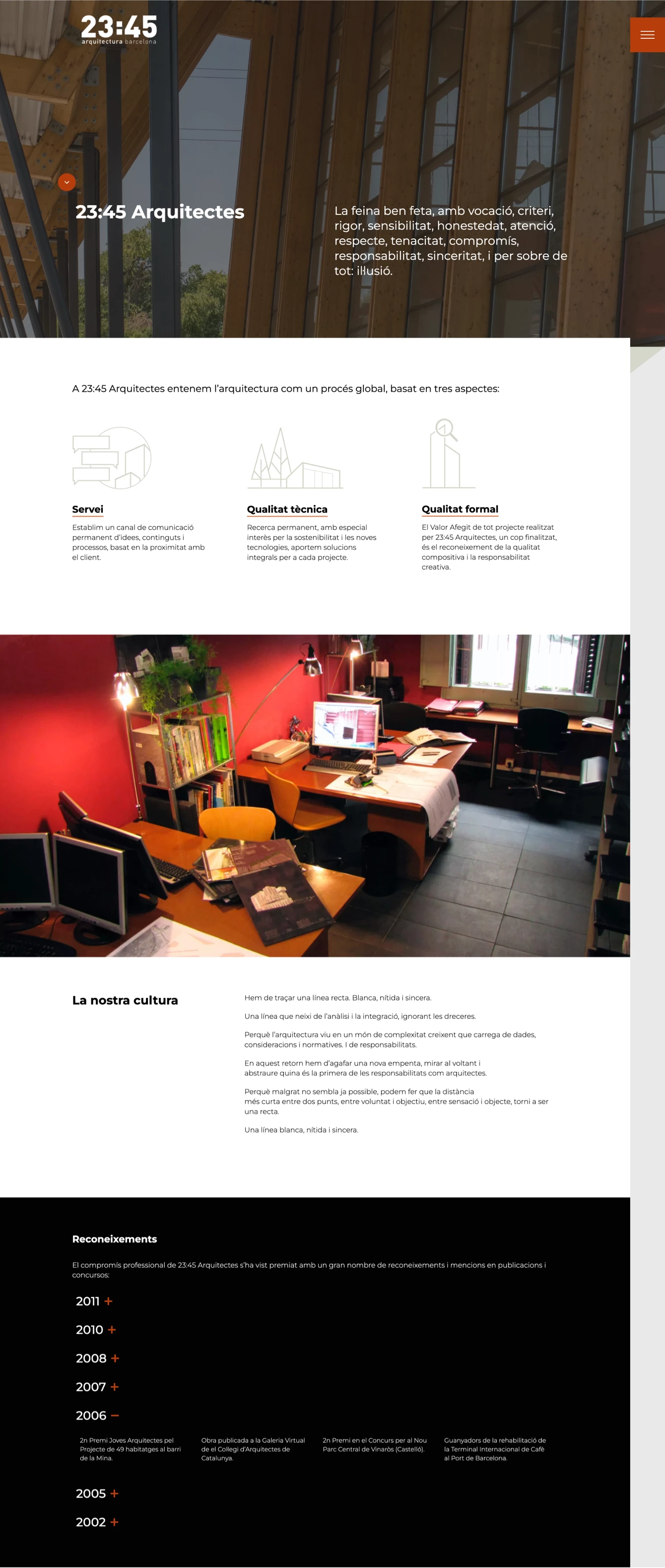
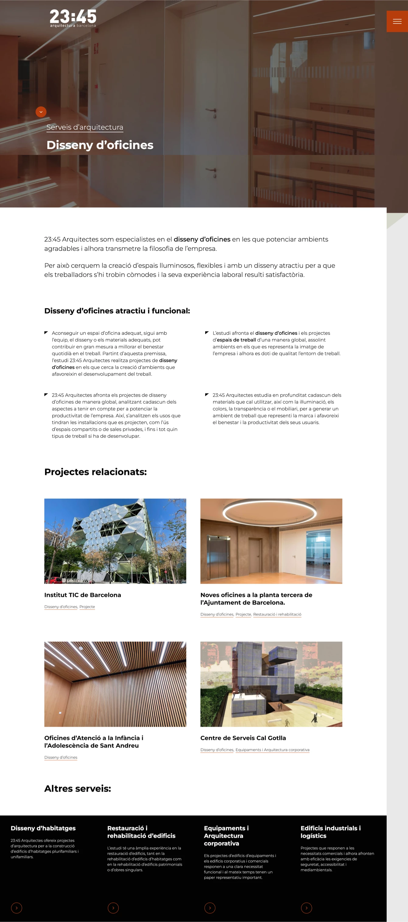
23:45 Arquitectes

SEO audit and strategic analysis, content creation, design, and development of the website for the Barcelona-based architecture studio 23:45 Arquitectes. Two of the challenges were modernizing the design and improving the website’s positioning to attract higher quality traffic.

Client

23:45 Arquitectes

Year of creation

When we were approached to revamp the studio’s website, we encountered several challenges, as the previous site had significant shortcomings: an outdated design, lack of 100% responsiveness, pages with almost no textual content, and a URL that contained no keywords—factors that severely harmed its search ranking.

Another challenge for the new website was to generate quality traffic to connect the studio with its desired clientele.

We began with an SEO audit to identify, first and foremost, the issues that needed to be addressed and avoided in the future. We defined the website’s objectives and the target search segments we aimed to reach.

We analyzed its current ranking, the competition, and the relevant keywords, and prepared the on-page SEO for each page. The resulting report also helped define the content hierarchy of the website before its execution.

23:45 Arquitectes
23:45 Arquitectes
23:45 Arquitectes

Florcare Power Plants

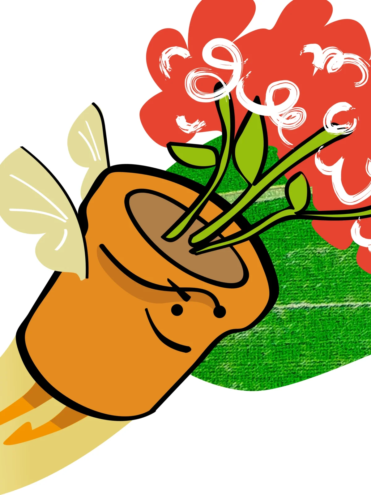
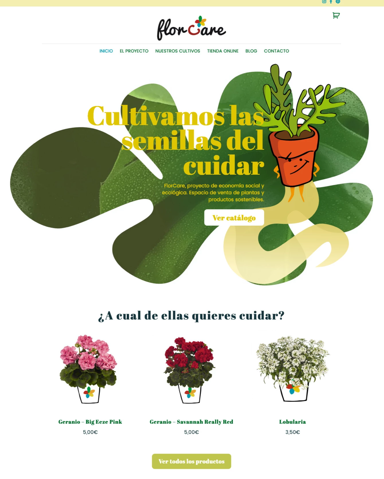
Web design and development with an online store for Florcare Power Plants, a social and ecological project through the sale of sustainable plants and products. We also created a set of illustrations to further enhance the website’s personality.

Client

Kairos Network

Year of creation

Florcare Power Plants is a social and ecological economy project and a marketplace for sustainable plants and products. A fully customized WordPress website with an online store was created for them.

The idea was not to be just another plant store, but to provide social benefits to young people at risk of exclusion who cultivate and sell them. In this way, the buyer felt empowered to change the social situation of these young people.

The illustrations we developed were based on a comic-style approach, with plants transformed into superheroes.

Florcare Power Plants